Tutorial 1
Mostly a tutorial for a specific look, will work for pretty much any program.
Go from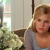
to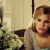
First you want to find your image. I started with this one from Lost-Media. Everyone has their own base-modifying steps. For this picture I resized it, sharpened once, and lightened it up a little bit with Colors -> Adjust -> Brightness & Contrast. The settings don't matter too much, but you don't want it to be dark, cause we're going to use layer settings that want to make the image darker. Then I smoothened out Shannon's skin so the final image would be much prettier.
So after all my base-prettifying, I'm left with this:

Now we start having fun with the base. Duplicate your base layer and set it to Hard Light 100%. I almost always do this, cause it intensifies the colors and personally makes it look a lot better in the end.
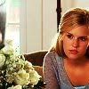
A little too harsh. Duplicate that layer and set it to Screen 100%. That's nice and pretty, but I decided to duplicate that layer again, so you now have two Screen layers on top of the Hard Light one.

We need just a little bit more color contrast, so duplicate the layer and set it to Soft Light 100%.
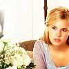
This next effect is one of my favorites. Duplicate the base layer and set it to Hard Light 100%. Since the colors look reeally ugly when you do that, desaturate the layer. It keeps some of the colors while adding contrast but softening that contrast so you don't feel like your eyes are being burned out by really bright colors.
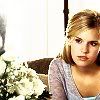
You can hardly even see the wall behind Shannon, so we need to fix that. Duplicate the base layer, drag it up to the top, and leave it on Normal at between 30-40%, depending on your image. A good number that I typically use is 34%, but I used 37% here.

So so far we've gone from
to
.
Now that looks really good. Time for some lovely color fun. Go on over to of the sky to get a texture. I chose a brown-green one, but instead of putting it on my image straight like that, I Gaussian Blurred it with a radius of 15.
-
Put it in a new layer and set it to Multiply 100%.
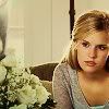
That looks good, but it's lighter than I wanted it to be. Add a new layer and put a dark blue color (I used #161836) in it and set it to Exclusion 100%.
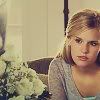
Now there's not enough contrast. Duplicate the base layer, drag it up to the top, desaturate it, and set it to Soft Light 100%.
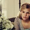
Almost done. But now the colors a little too gone, and I know just how to get some of the color back and make it darker. Once again, go to of the sky, take this texture, and also Gaussian Blur it with a radius of 15.
-
Put the now-blurred texture in a new layer on top and set it to Soft Light at about 77%.

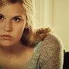
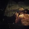
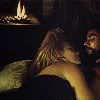
And your done! Add text or whatever else you might like. And here's some more examples of the exact same style, so you can see how it looks on darker icons too:
Hope the tutorial helped!
Go from

to

First you want to find your image. I started with this one from Lost-Media. Everyone has their own base-modifying steps. For this picture I resized it, sharpened once, and lightened it up a little bit with Colors -> Adjust -> Brightness & Contrast. The settings don't matter too much, but you don't want it to be dark, cause we're going to use layer settings that want to make the image darker. Then I smoothened out Shannon's skin so the final image would be much prettier.
So after all my base-prettifying, I'm left with this:

Now we start having fun with the base. Duplicate your base layer and set it to Hard Light 100%. I almost always do this, cause it intensifies the colors and personally makes it look a lot better in the end.

A little too harsh. Duplicate that layer and set it to Screen 100%. That's nice and pretty, but I decided to duplicate that layer again, so you now have two Screen layers on top of the Hard Light one.

We need just a little bit more color contrast, so duplicate the layer and set it to Soft Light 100%.

This next effect is one of my favorites. Duplicate the base layer and set it to Hard Light 100%. Since the colors look reeally ugly when you do that, desaturate the layer. It keeps some of the colors while adding contrast but softening that contrast so you don't feel like your eyes are being burned out by really bright colors.

You can hardly even see the wall behind Shannon, so we need to fix that. Duplicate the base layer, drag it up to the top, and leave it on Normal at between 30-40%, depending on your image. A good number that I typically use is 34%, but I used 37% here.

So so far we've gone from

to

.
Now that looks really good. Time for some lovely color fun. Go on over to of the sky to get a texture. I chose a brown-green one, but instead of putting it on my image straight like that, I Gaussian Blurred it with a radius of 15.

-

Put it in a new layer and set it to Multiply 100%.

That looks good, but it's lighter than I wanted it to be. Add a new layer and put a dark blue color (I used #161836) in it and set it to Exclusion 100%.

Now there's not enough contrast. Duplicate the base layer, drag it up to the top, desaturate it, and set it to Soft Light 100%.

Almost done. But now the colors a little too gone, and I know just how to get some of the color back and make it darker. Once again, go to of the sky, take this texture, and also Gaussian Blur it with a radius of 15.

-

Put the now-blurred texture in a new layer on top and set it to Soft Light at about 77%.

And your done! Add text or whatever else you might like. And here's some more examples of the exact same style, so you can see how it looks on darker icons too:
Hope the tutorial helped!