round five; challenge nine; results
Thanks to everyone who participated!!! :D Great icons!! Just remember, if you have time to make an icon, you have time to vote you don't have to give reasons if you can't think of any! Thank you to all of you that gave crit!
CHALLENGE 10 IS GONNA BE POSTED TONIGHT. THIS IS THE LAST CHALLENGE. PLEASE ENTER!!
First
(5 pts) Second
(4 pts) Third (tie)
(3 pts)


shamethebells
w/ 14 votes absolutelybatty
w/ 10 votes _puchula_ coffee_scented
w/ 8 votes
Best Cap Choice
(2 pt) Mod's Choice
(2 pt)

wildalyss
w/ 4 votesbella_farfalla
TALLIES:
votes / special category
♥ = # of special category votes
~ = concrit

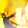
+++ richard with his sword is hot. plus, really good job on coloring and lights.
++ no reasons given
+ The saturated coloring works really well in this scene.
+ no reasons given
+ no reasons given
♥♥ _puchula_
08/02
+++ Gorgeous coloring!
+++ no reasons given
++ i love the background and the contrast on this
+ no reasons given
+ no reasons given absolutelybatty
10/00
+++ it's amazingly beautiful
++ I like the use of textures here to frame her.
++ no reasons given
♥
~ Pretty coloring, but it could have used a touch more contrast so that Kahlan stood out from the background a bit more. xbellaxdivax
07/01

++ Lovely work on the sky; love the clear, bright coloring as well.
++ no reasons given
+ Though I honestly find the Richard and Kahlan portion of the icon to be rather grainy, the sky is gorgeous.
+ Nice idea changing the sky background and apply a sky-texture... it gives more action to the image.
♥♥
~ I liked the cap but I feel it could use more coloring or textures bella_farfalla
04/02
++ no reasons given
+ no reasons given
sallyna_smile
03/00
++ no reasons given
+ no reasons given
♥
~ The duplicate at the bottom of the icon is rather distracting especially when the focus of the icon is clearly higher up (Kahlan's looking up and you've positioned the text high on the icon). So all the extra motion at the bottom of the icon muddies the focus. If you were looking for something to spice up your icon, try a texture (as opposed to simply white brushing) to create your negative space effect or add a little punch to your coloring by adding more tones to it!loversopolite
03/01
NO VOTES alorarose
00/00
+++ I really love the idea of darkening the silhouttes and enhance the background. And the white spots are great choice!
+++ I love how they are silhouetted .
+++ no reasons given
+++ no reasons given
+ no reasons given
+ lovely colors and composition
♥shamethebells
14/01
+++ no reasons given
++ no reasons given
++ love the blue coloring and the sharpening -it must have been difficult with such a difficult cap :P
♥♥♥♥ wildalyss
07/04
NO VOTES
~ Very nice choice of cap. However, all the light in the icon coupled with an indistinct Cara means that there's no clear focus in the icon. Where are we supposed to look? In this case, it might have been better to simplify your composition a little. Choosing something solid for the top (as opposed to more bright light) and/or toning down the brightness of the top so that it didn't conflict with the bottom right corner would have helped significantly. And a little more contrast plus some sharpening on Cara would have helped her stand out from the rest of the icon.
sourpony
00/00
+++ GORGEOUS. Love the clarity of the cap, and I love the weird texture. It all works together so well. Very, very well made.
+++ no reasons given
++ I love the warm colors used here; they really complement the chosen cap.
coffee_scented
08/00
Congratulations!
You can view the tally board here. Feel free to check it whenever you see fit.
CHALLENGE 10 IS GONNA BE POSTED TONIGHT. THIS IS THE LAST CHALLENGE. PLEASE ENTER!!
First
(5 pts) Second
(4 pts) Third (tie)
(3 pts)


shamethebells
w/ 14 votes absolutelybatty
w/ 10 votes _puchula_ coffee_scented
w/ 8 votes
Best Cap Choice
(2 pt) Mod's Choice
(2 pt)


wildalyss
w/ 4 votesbella_farfalla
TALLIES:
votes / special category
♥ = # of special category votes
~ = concrit
+++ richard with his sword is hot. plus, really good job on coloring and lights.
++ no reasons given
+ The saturated coloring works really well in this scene.
+ no reasons given
+ no reasons given
♥♥ _puchula_
08/02

+++ Gorgeous coloring!
+++ no reasons given
++ i love the background and the contrast on this
+ no reasons given
+ no reasons given absolutelybatty
10/00

+++ it's amazingly beautiful
++ I like the use of textures here to frame her.
++ no reasons given
♥
~ Pretty coloring, but it could have used a touch more contrast so that Kahlan stood out from the background a bit more. xbellaxdivax
07/01

++ Lovely work on the sky; love the clear, bright coloring as well.
++ no reasons given
+ Though I honestly find the Richard and Kahlan portion of the icon to be rather grainy, the sky is gorgeous.
+ Nice idea changing the sky background and apply a sky-texture... it gives more action to the image.
♥♥
~ I liked the cap but I feel it could use more coloring or textures bella_farfalla
04/02

++ no reasons given
+ no reasons given
sallyna_smile
03/00

++ no reasons given
+ no reasons given
♥
~ The duplicate at the bottom of the icon is rather distracting especially when the focus of the icon is clearly higher up (Kahlan's looking up and you've positioned the text high on the icon). So all the extra motion at the bottom of the icon muddies the focus. If you were looking for something to spice up your icon, try a texture (as opposed to simply white brushing) to create your negative space effect or add a little punch to your coloring by adding more tones to it!loversopolite
03/01

NO VOTES alorarose
00/00

+++ I really love the idea of darkening the silhouttes and enhance the background. And the white spots are great choice!
+++ I love how they are silhouetted .
+++ no reasons given
+++ no reasons given
+ no reasons given
+ lovely colors and composition
♥shamethebells
14/01

+++ no reasons given
++ no reasons given
++ love the blue coloring and the sharpening -it must have been difficult with such a difficult cap :P
♥♥♥♥ wildalyss
07/04

NO VOTES
~ Very nice choice of cap. However, all the light in the icon coupled with an indistinct Cara means that there's no clear focus in the icon. Where are we supposed to look? In this case, it might have been better to simplify your composition a little. Choosing something solid for the top (as opposed to more bright light) and/or toning down the brightness of the top so that it didn't conflict with the bottom right corner would have helped significantly. And a little more contrast plus some sharpening on Cara would have helped her stand out from the rest of the icon.
sourpony
00/00

+++ GORGEOUS. Love the clarity of the cap, and I love the weird texture. It all works together so well. Very, very well made.
+++ no reasons given
++ I love the warm colors used here; they really complement the chosen cap.
coffee_scented
08/00
Congratulations!
You can view the tally board here. Feel free to check it whenever you see fit.