Photoshop Tutorial: Icon Tutorial (Free Transform & Colour Adjustment) 1
It’s not that I’m an expert in photoshop. I’m just trying to share some photoshop tricks that I know. I’m not a pro, but hopefully it will be easy to understand for the beginners.
Wanna makes icons that no one else uses the same icons in LJ? Wanna create your own icon..? Let’s learn how to make icon..! It’s so easy..!
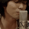
-->
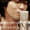
-->
-->
1. To Begin
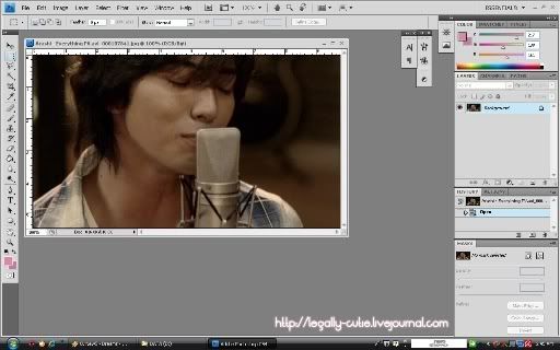
Open the image that you want to use as icon source. Here I use one of the screencaps from Arashi - Everything PV.
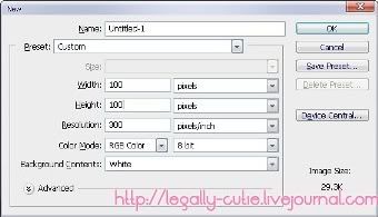
Create new document (ctrl+n) for icon. The icon size in LJ is 100x100 pixel.
2. Move & Transform Image
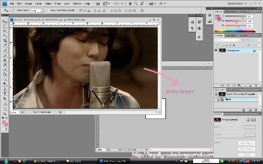
Drag the layer/image of the screencaps to the icon document window. It will automatically create new layer.
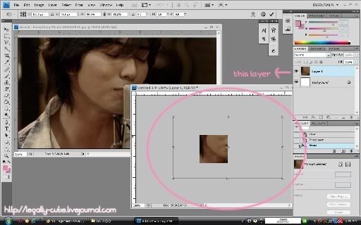
This image size is still too big for the icon. To make it smaller, use free transform by clicking image --> free transform (ctrl+t). To transform the object, click on the pointer and drag your mouse until the image is fit enough. By using free transform, you can transform, rotate and move the object. To keep the height and width of the object in balance, press shift while you transform it using the pointer in the corner.
3. Colour Adjustment
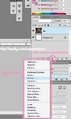
Click the adjustment tool in the layer tool as you can see in the screencaps. There will appear some adjustment choices that you can choose. For this icon, I use curve.
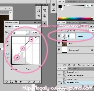
When you choose an adjustment, it will automatically create adjustment layer. For curve, you need to set the curve like the screencaps to get the same result.
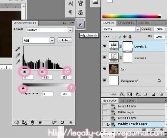
Everytime you add another adjustment, new layer will be created. The second adjustment I use in this icon is level. Try to move the pointer in the level until you get the desired image level.
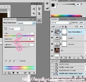
The third adjustment I use in this icon is Hue/Saturation. Change the number of Hue/Saturation until you get the desired result.
4. Result

Tada~ You get the image with sharper colour..!
You can also add more stuff in this icon by using brush like this

You can also add some text like this

Even with just one image source you can create many icons..^^
By the way I use Adobe Photoshop CS4 for this tutorial, but it's not really much a difference between other series. It's just the appeareance that's different. These features can be found also in previous series of photoshop.
Download PSD tutorial sample here
NO REPOST!
Stealing my tutorial and repost my screencaps is prohibited!
Questions are welcome..^^ I'll answer when I have time as far as I can.
Wanna makes icons that no one else uses the same icons in LJ? Wanna create your own icon..? Let’s learn how to make icon..! It’s so easy..!
-->
-->
-->
1. To Begin
Open the image that you want to use as icon source. Here I use one of the screencaps from Arashi - Everything PV.
Create new document (ctrl+n) for icon. The icon size in LJ is 100x100 pixel.
2. Move & Transform Image
Drag the layer/image of the screencaps to the icon document window. It will automatically create new layer.
This image size is still too big for the icon. To make it smaller, use free transform by clicking image --> free transform (ctrl+t). To transform the object, click on the pointer and drag your mouse until the image is fit enough. By using free transform, you can transform, rotate and move the object. To keep the height and width of the object in balance, press shift while you transform it using the pointer in the corner.
3. Colour Adjustment
Click the adjustment tool in the layer tool as you can see in the screencaps. There will appear some adjustment choices that you can choose. For this icon, I use curve.
When you choose an adjustment, it will automatically create adjustment layer. For curve, you need to set the curve like the screencaps to get the same result.
Everytime you add another adjustment, new layer will be created. The second adjustment I use in this icon is level. Try to move the pointer in the level until you get the desired image level.
The third adjustment I use in this icon is Hue/Saturation. Change the number of Hue/Saturation until you get the desired result.
4. Result
Tada~ You get the image with sharper colour..!
You can also add more stuff in this icon by using brush like this
You can also add some text like this
Even with just one image source you can create many icons..^^
By the way I use Adobe Photoshop CS4 for this tutorial, but it's not really much a difference between other series. It's just the appeareance that's different. These features can be found also in previous series of photoshop.
Download PSD tutorial sample here
NO REPOST!
Stealing my tutorial and repost my screencaps is prohibited!
Questions are welcome..^^ I'll answer when I have time as far as I can.