More color bar/icon thingies...
I don't know why everyone thinks I'm any good at these, *dismayed* but of course, between JJ mentioning that photoshop could do gradient transparencies and Schnick pointing out that lovely scene in TB where Seishirou knocks Subaru out and Rose being all encouraging... well, I had to try more! *embarrassed*
Initially, I wanted to attempt a full-fledged, all-6-colors-of-the-rainbow color bar, but I quickly realized I didn't have enough good layout ideas to keep the eye moving across it just yet. So I settled for shorter... ^^;
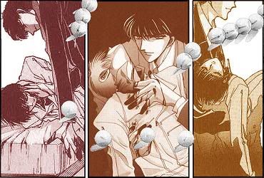
Playing around with Sei and Su and more color slides... (with broken prayer bead overlay)
And this time I made sure the icon 'is' 100x100! (though I feel bad that the black background on my profile is making it difficult to see the edges of the thing...)
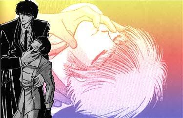
And then (as if the first one didn't take me hours by itself)! *horror or horrors* I finally discovered Photoshop's dual-color, gradient overlay with opacity settings ability for layers! *SQUEE* So as dorky as the next one is, I had to play around with the option and see what it could do... ^^; (I did a brighter one, but as my fiancee pointed out, it looked like some American hippies version from the 70s)
And it's icon... (The type is a little small on this one, but of course it reads "Soon we shall settle this, the two of us...")
Possibly easier to read version:
After a request to make it larger and the words clearer, I messed around yet again... (Note: cutting out all those glass shards took HOURS...)
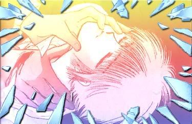
And it's icon... I thought it looked a lot clearer without the black overlay picture of Sei (because images just don't shrink that small and maintain their visibility), but now the words don't seem to make as much sense without him. As my mother would say, "You can't win for losing..." At least the words are clearer in this font (though I still had to go in and alter some pixels to make the individual letters more distinct). I can only fit so many letters in 100 pixels! @_@
Also, images from last time I never posted (or that I corrected but saw no point in posting). Probably because I didn't think they were good enough... Two Kamui images (one in blue and one in purple--I like the purple with him better), but again the small images are hard to see, particularly the middle one, which faded something horrible. Not to mention the way the too-large eyes picture on top makes the whole thing look lopsided. -_- Oh, and no, they're not 100x100 either. (Altogether, way too many things I don't like about these)


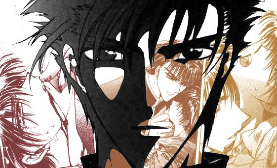
One last Fuuma image... this time with the 2-color fade, rather than 3. (I'm just never quite happy with this one... )
And now it's 1:30 AM, and it will be 2 AM by the time I get in bed again, and I have to sleeeeeep....! e_e
Initially, I wanted to attempt a full-fledged, all-6-colors-of-the-rainbow color bar, but I quickly realized I didn't have enough good layout ideas to keep the eye moving across it just yet. So I settled for shorter... ^^;
Playing around with Sei and Su and more color slides... (with broken prayer bead overlay)

And this time I made sure the icon 'is' 100x100! (though I feel bad that the black background on my profile is making it difficult to see the edges of the thing...)

And then (as if the first one didn't take me hours by itself)! *horror or horrors* I finally discovered Photoshop's dual-color, gradient overlay with opacity settings ability for layers! *SQUEE* So as dorky as the next one is, I had to play around with the option and see what it could do... ^^; (I did a brighter one, but as my fiancee pointed out, it looked like some American hippies version from the 70s)

And it's icon... (The type is a little small on this one, but of course it reads "Soon we shall settle this, the two of us...")

Possibly easier to read version:

After a request to make it larger and the words clearer, I messed around yet again... (Note: cutting out all those glass shards took HOURS...)

And it's icon... I thought it looked a lot clearer without the black overlay picture of Sei (because images just don't shrink that small and maintain their visibility), but now the words don't seem to make as much sense without him. As my mother would say, "You can't win for losing..." At least the words are clearer in this font (though I still had to go in and alter some pixels to make the individual letters more distinct). I can only fit so many letters in 100 pixels! @_@

Also, images from last time I never posted (or that I corrected but saw no point in posting). Probably because I didn't think they were good enough... Two Kamui images (one in blue and one in purple--I like the purple with him better), but again the small images are hard to see, particularly the middle one, which faded something horrible. Not to mention the way the too-large eyes picture on top makes the whole thing look lopsided. -_- Oh, and no, they're not 100x100 either. (Altogether, way too many things I don't like about these)
One last Fuuma image... this time with the 2-color fade, rather than 3. (I'm just never quite happy with this one... )

And now it's 1:30 AM, and it will be 2 AM by the time I get in bed again, and I have to sleeeeeep....! e_e