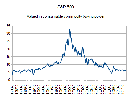
S&P 500, measured by real money!
I found some USDA prices for agricultural products stretching all the way back to 1986, so I was able to make spreadsheets that show how the S&P 500 performs against a real, fixed quality-of-life yardstick. Here's how our nation's economy has "grown" over the past two and a half decades:

I don't have a link to the USDA dietary guidelines I used, but the basket is an estimate I made on one person's consumption per month (these are all monthly average prices).
Wheat is sold in 60-pound bushels, and I estimated 15 pounds of wheat per month.
Corn is sold in 56-pound bushels, and I estimated 15 pounds of corn per month.
Beef and pork is sold by the hundredweight, and I estimated 7.5 pounds of each per month.
Milk is sold by the hundredweight, and I estimated 45 pounds of milk per month.
Crude is sold per barrel, and a google search sometime in the foggy past estimated two barrels of crude per person per month for transportation not just of ourselves, but the goods we buy, etc. I think this actually comes from crude purchased in the US per month, divided by the population of the US. Anyway, it's constant, so it works for my basket.
So if the columns in my spreadsheet were date in A, wheat in B, corn in C, beef in D, pork in E, milk in F, and crude in G, my calculated basket column reads like this:
=(B2*0.25)+(C2*0.267857)+(D2*0.075)+(E2*0.075)+(F2*0.45)+(G2*2)
Then, in another column, I just divided the S&P 500 value for each month by that calculated basket, and graphed that column.