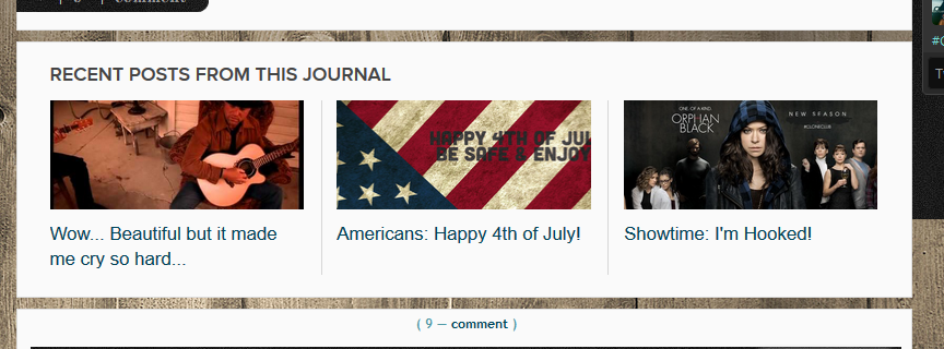
I really like the idea of this feature. Can definitely see the advantages of it. It sure comes in handy for fanfiction and the like. I really hope they're going to make it avaiable to communities some time; it would be awesome for icons and such.
I have yet to try this out though. But I was curious and - using Flexible Squares - it's just like you showed it for me. I did have an embarassing moment and wondered why the tags option was greyed out. I figured it out quickly, luckily. Enter tags first. Oopsie. :D
It really would. I think that would be rather neat. Plus it lets other see posts you've made that relate to why they've come to your journal. I love that.
I've starting using it and did make the same mistake you did. It is just a new thing to learn and no need to be embarrassed.
I got a bit curious when I started seeing it on your LJ. I'm not sure I'll be using it much, but I can see the use for it sure! It definitly have advantages and possibilities. :-)
So, question. Using two of your layouts. Will you recode your layouts so you can use it? Or do we have to add a fix to our layouts?
Yeah. And the beauty of it is you don't have to use it. I like that. I mean there are somethings I want it used on but somethings I likely won't. It is great.
So updated things like this you'd be adding. I mean if you were to need help... just ask me but in general I try not to go back a recode things I've done unless it is something major.
I realize this post is over a year old but I'll ask anyway.
No matter what custom theme I use, the related entries do not show up in line as shown unless I select yes to use the original stylesheet, which of course destroys your lovely themes. And when I say they don't show in line, I mean that the thumbnail is a TINY little square to the left of the header link and snippet of the entry. You can see what I mean here: http://bit.ly/2aEnZQG
I was able to modify it to look sort of correct but the link and excerpt will not move to the left. It doesn't look right in IE (looks like a regular bulleted list with no images or text) so who knows about Safari or other browsers I don't have access to... which really makes me not to want to keep it.
I don't understand why they wouldn't appear correctly when it certainly does for you. I reinstalled several themes multiples times, double checking the instructions just to be absolutely sure. Is there something I might not be considering?
Hmmm. Let me tinker with it a bit and see. I do know that when a journal is a smaller width they tend to be responsive and move into a list view but you are right about being able to control them to some extent. I'll tinker and like you know.
I have gone over this and over this and the only times I can recreate it is when I change the zoom of my page. So I do wonder if you need to reset your theme. When you go into the customization process there is a reset to default button next to the save changes button. I've had to do this before because I couldn't get something to work.
You just reset and then re-set up everything. It isn't a fun prospect but I can't seem to figure out what the deal is here.
This is what I have with a resolution of 1600x900 and the zoom in my browser at true to resolution.
Comments 11
I have yet to try this out though. But I was curious and - using Flexible Squares - it's just like you showed it for me. I did have an embarassing moment and wondered why the tags option was greyed out. I figured it out quickly, luckily. Enter tags first. Oopsie. :D
Reply
I've starting using it and did make the same mistake you did. It is just a new thing to learn and no need to be embarrassed.
Reply
So, question. Using two of your layouts. Will you recode your layouts so you can use it? Or do we have to add a fix to our layouts?
/KSena
Reply
So updated things like this you'd be adding. I mean if you were to need help... just ask me but in general I try not to go back a recode things I've done unless it is something major.
Reply
Mine are stacking on top of each other instead of being next to each other in a square shape like yours. Is do you have an idea what is causing that?
Reply
Reply
Thank you for looking!
Reply
Reply
No matter what custom theme I use, the related entries do not show up in line as shown unless I select yes to use the original stylesheet, which of course destroys your lovely themes. And when I say they don't show in line, I mean that the thumbnail is a TINY little square to the left of the header link and snippet of the entry. You can see what I mean here: http://bit.ly/2aEnZQG
I was able to modify it to look sort of correct but the link and excerpt will not move to the left. It doesn't look right in IE (looks like a regular bulleted list with no images or text) so who knows about Safari or other browsers I don't have access to... which really makes me not to want to keep it.
I don't understand why they wouldn't appear correctly when it certainly does for you. I reinstalled several themes multiples times, double checking the instructions just to be absolutely sure. Is there something I might not be considering?
Reply
Reply
You just reset and then re-set up everything. It isn't a fun prospect but I can't seem to figure out what the deal is here.
This is what I have with a resolution of 1600x900 and the zoom in my browser at true to resolution.
( ... )
Reply
Leave a comment