Icon Tutorial :)

Original Cap: here!

Original Icon: here!

Let me know if this helped!

FEEDBACK. Huzzah.

See USER INFO for more info.
I saved the original PSD file, but all the selective color layers are merged. I don't have specific numbers for them anyway, so I'm going to try and recreate the icon. Hopefully I'll come close. XD This is one of the rare occasions that I actually saved a PSD file. I only have it because my Adobe Photoshop went crazy in the middle of making it, and I had to save it quickly before the program closed. Hahaha.
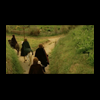
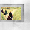
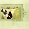
01. I took the cap and resized it to the way it appears above in the preview. I knew that I was going to be using the texture by sanami276 ( here!), so I know that I could make the image smaller. I then took the texture, cropped out the black part of the window, and positioned it over the base image like so:
Before/After
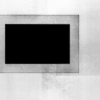
02. Now, the texture will basically stay on top for most of this process, and I'll work on the cap image underneath. That way if I were to alter the coloring or the base by using curves or something, the texture wouldn't be affected as well. So, after this I took the base image and duplicated it. I set this level to 'Screen' at 100%. Then I duplicated the Screen level and set that to 'Soft Light' at 100%. This should make it look like this:
Before/After


03. I merged the Screen layer into the base, and then the Soft Light layer into the base, but didn't touch the texture. After this I ventured into the Selective Coloring (Image --> Adjustments --> Selective Color). The automatic window that comes up is set to the reds by default, so I'll start there:
Reds:
-42 Cyan
+43 Yellow
Yellows:
-38 Cyan
+22 Yellow
Netrals:
+21 Cyan
-47 Yellow
This kind of tones down the yellows slightly. After that I duplicated the base and set that to 'Soft Light' at 23%, which makes it look like this:
Before/After


04. After this I merged the 'Soft Light' layer back onto the base image. The fact that I merge everything is what makes recreating hard, but it also keeps the layers neat, because at this point I am back down to only having 2 layers to worry about. Back into Selective Color we go:
Yellows:
-38 Yellow
Greens:
+94 Yellow
Then click 'OK'. After that I immediately go back into Selective color:
Yellows:
-16 Yellow
And after hitting 'OK', I duplicate the base and set the duplicated layer to 'Multiply' at 20%.
Before/After


05. All the changes look small, but they make a huge difference. Duplicate the base and set to screen at 15%. Now comes a slightly more grey area, because I use two curves layers on top of this. I don't really know how to describe exactly what I did for you; you just need to use your eye. After I make the small tweaks with curve, I create a new layer; then with the gradient tool, and black set in the color palette, I make this (Note: the white in that image is actually not there, just the black), which I set to 'Soft Light' at 100%.
Before/After

06. Now, I'm pretty much done with the base image, so it is time to move on to the texture. Create a new, blank layer above the texture. From the color pallate, I chose a dark olive green (hex code: #AAB46F) and and filled the new layer with the color. I delete the same hole that I deleted in the texture so the base image can be seen through, and set the color layer to 'Hard Light' at 100%. Then I duplicate the Hard Light layer and set it to "Linear Burn" at 11%.
Before/After

07. Now, for the final touches: I searched through my brush list and found this (I couldn't tell you who made it specifically, but it is someone on last5's resources list). After creating a a new layer, place the brush on it using a different dark olive green (hex code #9EA964). Position the brush so it falls over the end of the textured window and delete whatever is overlapping the image. Set it to 'Multiply' at 62%. Duplicate the brush layer and set to 'Normal' at 23% and then click back on the original layer that it was duplicated from. Right click on the layer in the Layer Menu and go to 'Blending Options'. Set it to 'Bevel and Emboss' and hit 'OK'.
Before/After

08. Last little thing. I want to add a bit of a shadow around the base image, so I create a new blank layer and fill it with the same color I used on the brush. I select only the area where the base image comes through the texture and delete the color from the rest of the layer. Next, blur it color layer slighly (Filter --> Blur --> Gaussian Blur --> 1 .4 pixels). Then, reselect the same box that the base comes through on the texture and delete it from the color layer so only the blurred edges remain. Duplicate that twice and set both layers to 'Soft Light' at 100%
Before/After


09. At this point I compared the icon to the original and realized the new version is a little darker, but it isn't a huge difference. I actually prefer the darker one to the original! See for yourself:
Original/New
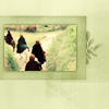

The differences are basically all due to the Selective Coloring and that the original icon didn't have the 'Soft Light' layer that I added at the end of Step 7. Otherwise, I think it was a success.
Note: This tutorial is not meant for you to go and create the same exact icon. Use any part of it you want and do something creative that you can actually call your own. :)

THADIUS WANTS YOU TO JOIN/WATCH last5.