icon guide
Since a couple of people asked, icon colouring guiiide. I'm using Photoshop CS3, though PSP should be the same way. I reference a lot of tools that are explained in Aviy's guide.
Do keep in mind that I have access to a tablet, which not. everyone has, but was a huge help in getting angles right for me. However, everything should be pretty simple with a mouse or laptop.
First of all, if you're using a colour even once in an icon KEEP IT. I can't stress this enough. Even if you think you're done with a colour, chances are that . . . you aren't. And if you do anything significant to any colour, you're probably going to want to save a copy. And always save a .psd copy of an icon/image. A-always.
Some shortcuts to remember!
[ will make your brush/eraser smaller.
] will make your brush/erase bigger.
Shift + [ makes the edges softer.
Shift + ] makes the edges harder.
You can change the keys as you'd like, but B is usually your brush tool, and E is usually your eraser. These can be changed or viewed under Edit > Keyboard Shortcuts.
Adding new patterns into photoshop actually makes some things, like fabric, really easy. Just open the image in photoshop, and select all. Then go to edit > define pattern, and name it. BOOM. You can use it with the paint bucket or with a pattern stamp. Making a pattern of ash from a picture on the Internet is how I put in Haineko.
CG Textures has a lot of patterns/textures available for free!
I don't mention using the magic wand in here, because with Bleach and KT's style, the lines are rarely closed enough for decent use of it. But you can always use it, and it really helps in some cases.
Soooo. I'm going to be demonstrating with one of Matsumoto's (old) deaged icons.
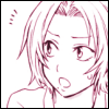
It's all up to you, but most of the time you're colouring an icon you're working from that icon.
What you want to do first is adjust the base image as you'd like. You do want to desaturate it by usng either CTRL+ALT+U or going to image > adjustments > desaturate. If the base image has lots of those gray marks, you can either use the dodge tool set to highlights/burn tool set to shadows trick, or adjust the levels.
Then, you want to set up your layers.
I have an action set up for this, but since there are two different methods I use in shading, I'm just going to do it manually.
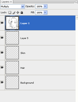
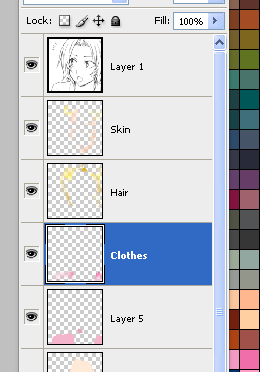
These are the base layers I use. As you can see, I try to keep everything on a different layer. You'll see why in a second, but your mileage may vary. In the screencap, I changed the base image's settings to multiply. Go ahead and leave everything else the way it is. You don't need to worry about the opacity yet. I only have four here, with the background, but depending on the icon, I can go up to eight, not including shading, since I make another one for Haineko and other people.
Now put down your colours.
Incidentally, this is why I use seperate layers on everything. I'm certainly not perfect when it comes to colouring within the lines, and it's much easier to go in and erase if I go over her hair colour with her skin than to choose the the hair colour again and go back, especially if I've already started shading.

Here's what it looks like when I've cleaned up. Also, I have an actual layer for my background, but you can also create a new colour fill layer. I just don't tend to.

Now if I'm happy with the colours, I start shading. Not everyone shades their icons though, which is fine. Most manga tends to look better without it/minimal shading. I'm just . . . weird. If you do shade, make sure that you have the colours as close to what you want as possible. Once you start putting in the highlights and shading, it's a pain in the ass to go back and do it again if you switch from say, pink to green.
Like I said, I have two different ways of doing.
One involves making two to four (or six) different layers -- two of them need to be set on linear burn, and the other two need to be set to screen. Keep in note that once you put colour on those layers you can mess around with the blending options to see which one you like better.
Now, with the same colours as the BASE COLOURS, put in highlights and shadows.

Here's what the icon looks like with the highlights and shadows. If your sense of shadowing sucks like mine, you can put in a minature sun or something in the corner to remind you, though sometimes the natural shading of the picture is uh, pretty weird itself.
It looks okay, but the pixels are kind of too noticeable. This is where I get the blur tool and go in, sometimes going back over my lines. If you do this, you may want to increase the canvas size another 50 pixels with the image in the center, because I've found it creates black lines on the edges sometimes.
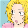
This is what it looks like when I've blurred everything. You can also go up and down the colour spectrum from your base colour if you find that the blur tool is erasing too much of the shadows or screens.
From here, you can put in backgrounds or patterns, put on a border if you want, and you're done!
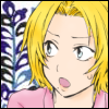
But wait! Remember how I said there's another method that I use? Y-yeah.
This one takes about three times as long, but I find that it looks a little prettier. I'm anal, what can I say.
From your base image, instead of creating the burn/screen layers, you want to create new normal layers. You can create either one, or one for each of your base layers, depending on if the colours touch. This is important.
For this method, you needto have a colour palette of the colours you use. I have skin palettes that I use, uploaded here. You can also load new palettes for your swatches in the preset manager, if you'd like. But you want to have two colours up and down from your base colours in your swatches. You can see some of mine (and my saved swatches).

Once you have your layers set up, go in with the different shades. Think of those pixel candybar dolls. If you're working from a 100 x 100 image, you might want to keep the brush as close to 1 pixel as possible. It tends to look better and cut down on any blurring you may have to do o/
Since I'm working with several different colours that may be right next to each other, I tend to keep it seperated by layer as much as possible.
Depending on how you like it, you can either leave it pixeled or blur the pixels to make them smoother. I tend to blur, especially with the highlights. Since blurring takes away the details and shadow, you'll probaby want to go back over again. Although it helps if you tap the blur tool instead of using it as a brush. Although even if you blur, you may want to go over edges or certain parts with the brush again. Since the image is so small, it won't matter. You CAN also use gaussian blur, but once again, since the image is so tiny, you don't want to set it to anything higher than 2.0 or 4.0 pixels MAXIMUM.
Here's what the icon looks like after I blur the shaded pixels.
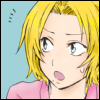
You can also create new layers for things like sweatdrops or speech bubbles if you'd like. I do that sometimes, and if there are any small things that I'm not going to be blending.
This takes a lot of experimenting and doing over to reach whatever you'd like. You can adjust opacity or the layer blending options, whatever. But if you do anything significant to a layer, it's always a good idea to create a duplicate or a new layer, so you can switch between the two as you like. And don't forget to save a psd copy.
Once again with this method, I put in a background if I want, make sure the border looks good, and save both the .psd and a .png copy. I use png because it tends to save the detail better, but that's just my opinion. Actually I'll probably go over this one with the blur tool again, because the highlighting on her cheek looks off to me. It's so much easier to load up the .psd file than try from a .png or .jpg
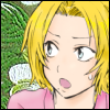
And that's all. With any kind of special effects, it's always a good idea to open a new layer and just mess around, and play around as you like. Any questions?
There's another tutorial here in my "writing" comm that is a little like this, but I use a FEW different things.
Do keep in mind that I have access to a tablet, which not. everyone has, but was a huge help in getting angles right for me. However, everything should be pretty simple with a mouse or laptop.
First of all, if you're using a colour even once in an icon KEEP IT. I can't stress this enough. Even if you think you're done with a colour, chances are that . . . you aren't. And if you do anything significant to any colour, you're probably going to want to save a copy. And always save a .psd copy of an icon/image. A-always.
Some shortcuts to remember!
[ will make your brush/eraser smaller.
] will make your brush/erase bigger.
Shift + [ makes the edges softer.
Shift + ] makes the edges harder.
You can change the keys as you'd like, but B is usually your brush tool, and E is usually your eraser. These can be changed or viewed under Edit > Keyboard Shortcuts.
Adding new patterns into photoshop actually makes some things, like fabric, really easy. Just open the image in photoshop, and select all. Then go to edit > define pattern, and name it. BOOM. You can use it with the paint bucket or with a pattern stamp. Making a pattern of ash from a picture on the Internet is how I put in Haineko.
CG Textures has a lot of patterns/textures available for free!
I don't mention using the magic wand in here, because with Bleach and KT's style, the lines are rarely closed enough for decent use of it. But you can always use it, and it really helps in some cases.
Soooo. I'm going to be demonstrating with one of Matsumoto's (old) deaged icons.

It's all up to you, but most of the time you're colouring an icon you're working from that icon.
What you want to do first is adjust the base image as you'd like. You do want to desaturate it by usng either CTRL+ALT+U or going to image > adjustments > desaturate. If the base image has lots of those gray marks, you can either use the dodge tool set to highlights/burn tool set to shadows trick, or adjust the levels.
Then, you want to set up your layers.
I have an action set up for this, but since there are two different methods I use in shading, I'm just going to do it manually.

These are the base layers I use. As you can see, I try to keep everything on a different layer. You'll see why in a second, but your mileage may vary. In the screencap, I changed the base image's settings to multiply. Go ahead and leave everything else the way it is. You don't need to worry about the opacity yet. I only have four here, with the background, but depending on the icon, I can go up to eight, not including shading, since I make another one for Haineko and other people.
Now put down your colours.
Incidentally, this is why I use seperate layers on everything. I'm certainly not perfect when it comes to colouring within the lines, and it's much easier to go in and erase if I go over her hair colour with her skin than to choose the the hair colour again and go back, especially if I've already started shading.

Here's what it looks like when I've cleaned up. Also, I have an actual layer for my background, but you can also create a new colour fill layer. I just don't tend to.

Now if I'm happy with the colours, I start shading. Not everyone shades their icons though, which is fine. Most manga tends to look better without it/minimal shading. I'm just . . . weird. If you do shade, make sure that you have the colours as close to what you want as possible. Once you start putting in the highlights and shading, it's a pain in the ass to go back and do it again if you switch from say, pink to green.
Like I said, I have two different ways of doing.
One involves making two to four (or six) different layers -- two of them need to be set on linear burn, and the other two need to be set to screen. Keep in note that once you put colour on those layers you can mess around with the blending options to see which one you like better.
Now, with the same colours as the BASE COLOURS, put in highlights and shadows.

Here's what the icon looks like with the highlights and shadows. If your sense of shadowing sucks like mine, you can put in a minature sun or something in the corner to remind you, though sometimes the natural shading of the picture is uh, pretty weird itself.
It looks okay, but the pixels are kind of too noticeable. This is where I get the blur tool and go in, sometimes going back over my lines. If you do this, you may want to increase the canvas size another 50 pixels with the image in the center, because I've found it creates black lines on the edges sometimes.

This is what it looks like when I've blurred everything. You can also go up and down the colour spectrum from your base colour if you find that the blur tool is erasing too much of the shadows or screens.
From here, you can put in backgrounds or patterns, put on a border if you want, and you're done!

But wait! Remember how I said there's another method that I use? Y-yeah.
This one takes about three times as long, but I find that it looks a little prettier. I'm anal, what can I say.
From your base image, instead of creating the burn/screen layers, you want to create new normal layers. You can create either one, or one for each of your base layers, depending on if the colours touch. This is important.
For this method, you needto have a colour palette of the colours you use. I have skin palettes that I use, uploaded here. You can also load new palettes for your swatches in the preset manager, if you'd like. But you want to have two colours up and down from your base colours in your swatches. You can see some of mine (and my saved swatches).

Once you have your layers set up, go in with the different shades. Think of those pixel candybar dolls. If you're working from a 100 x 100 image, you might want to keep the brush as close to 1 pixel as possible. It tends to look better and cut down on any blurring you may have to do o/
Since I'm working with several different colours that may be right next to each other, I tend to keep it seperated by layer as much as possible.

Depending on how you like it, you can either leave it pixeled or blur the pixels to make them smoother. I tend to blur, especially with the highlights. Since blurring takes away the details and shadow, you'll probaby want to go back over again. Although it helps if you tap the blur tool instead of using it as a brush. Although even if you blur, you may want to go over edges or certain parts with the brush again. Since the image is so small, it won't matter. You CAN also use gaussian blur, but once again, since the image is so tiny, you don't want to set it to anything higher than 2.0 or 4.0 pixels MAXIMUM.
Here's what the icon looks like after I blur the shaded pixels.

You can also create new layers for things like sweatdrops or speech bubbles if you'd like. I do that sometimes, and if there are any small things that I'm not going to be blending.
This takes a lot of experimenting and doing over to reach whatever you'd like. You can adjust opacity or the layer blending options, whatever. But if you do anything significant to a layer, it's always a good idea to create a duplicate or a new layer, so you can switch between the two as you like. And don't forget to save a psd copy.
Once again with this method, I put in a background if I want, make sure the border looks good, and save both the .psd and a .png copy. I use png because it tends to save the detail better, but that's just my opinion. Actually I'll probably go over this one with the blur tool again, because the highlighting on her cheek looks off to me. It's so much easier to load up the .psd file than try from a .png or .jpg

And that's all. With any kind of special effects, it's always a good idea to open a new layer and just mess around, and play around as you like. Any questions?
There's another tutorial here in my "writing" comm that is a little like this, but I use a FEW different things.