Icons 102- High Contrast Icon Tutorial
Yay for us, today we will be learning how to make a high contrast, professional looking Garden State Icon using Photoshop's levels. Which means to do this, you should have a copy of Photoshop (duh). I am using CS, but this tutorial works fine for 7 as well. This is a lower division course, but prerequisites do involve the ability to follow directions, and some slight knowledge about Photoshop. Now, of course, is the obligiatory before and after snapshot:

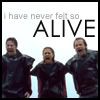
Right, now let's just go through the step by step. Make sure to follow all directions before asking me any questions about the technique, and pay attention! You will be tested on this after class...
1. I start of with a Garden State screen cap from teh_indy. Our goal is to create an image that has a white background, but that has no loss of quality for the foreground images. To achieve this effect, you are going to need to find an image where the background is clearly defined (meaning it's pretty much a solid color) and the background is a light-ish color. I have found an image that works well, and after croping and resizing, it looks a little bit like this:

2. Okay, now I think the word I'm searching for to describe the picture is, well, crap. A common problem of screencaps is that they come out much darker than they should be. Of course, we want things to be lighter! The easy way to fix this is by going to image> adjustments> levels. Locate the white arrow on the middle slider, and pull it closer to the middle. You should get something like this:
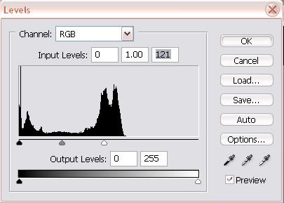
Levels can be a bit intimidating, but don't stress out about them. Pretty much, pulling the white more towards the middle makes it lighter, pulling the black makes it darker, and the gray changes the contrast. The bottom gradient deals with brightness and contrast. After messing around enough, my image turns out like so:

Notice how it looks like we both improved the quality of the image, and took out the background, all in one easy step. Now that's harnessing the powers of Photoshop!
3. Of course, we want the image to look better. Here, I've added a black border, then I added some text using the font 'century gothic' (it's a favorite of mine). I faded the opacity, and ended up with the final image:


Well, this has been my very first tutorial, I hope you liked it.


Right, now let's just go through the step by step. Make sure to follow all directions before asking me any questions about the technique, and pay attention! You will be tested on this after class...
1. I start of with a Garden State screen cap from teh_indy. Our goal is to create an image that has a white background, but that has no loss of quality for the foreground images. To achieve this effect, you are going to need to find an image where the background is clearly defined (meaning it's pretty much a solid color) and the background is a light-ish color. I have found an image that works well, and after croping and resizing, it looks a little bit like this:

2. Okay, now I think the word I'm searching for to describe the picture is, well, crap. A common problem of screencaps is that they come out much darker than they should be. Of course, we want things to be lighter! The easy way to fix this is by going to image> adjustments> levels. Locate the white arrow on the middle slider, and pull it closer to the middle. You should get something like this:

Levels can be a bit intimidating, but don't stress out about them. Pretty much, pulling the white more towards the middle makes it lighter, pulling the black makes it darker, and the gray changes the contrast. The bottom gradient deals with brightness and contrast. After messing around enough, my image turns out like so:

Notice how it looks like we both improved the quality of the image, and took out the background, all in one easy step. Now that's harnessing the powers of Photoshop!
3. Of course, we want the image to look better. Here, I've added a black border, then I added some text using the font 'century gothic' (it's a favorite of mine). I faded the opacity, and ended up with the final image:


Well, this has been my very first tutorial, I hope you liked it.