tut tut train!!
requested by empty_ambition and adiaaida. :)
Took me long enough. (ohyesithadtohaveatitle!) This is my first tutorial so if I am in any way unclear, feel free to ask me questions regarding the steps. Ignore my bad grammar for my sake. :p
How to make icons like these:
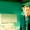
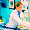
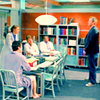
All made with Photoshop CS. I have no idea how to do this in other programs so if you have questions not related to CS, I won't be able to help. Previous versions of photoshop are applicable though.
Before I begin, I have to say right now that the coloring technique that I've been using and is going to be the point of the tutorial has been developed through riseoverrun's tutorial here. Don't want to be branded as a thief just because some of the steps were used in Phase One of this tutorial, as you'll see below. But other than those few steps, the other modifications are made by myself. :) I'm mentioning it now before people start pointing fingers and making accusations. I'd like to avoid that.
NOTES:
1/ This tutorial does not necessarily apply to ALL caps. It has worked very well on House caps for some reason though. They don't have to be hi-res either.
2/ It's VERY flexible too. You may change any aspect to make it work for the cap you're using.
3/ You don't have follow everything to the word. It's flexible after all so you change things as it suits you or the cap you're using.
4/ Please do not post this tutorial anywhere. Or claim it as yours. Linking or memming is totally fine of course.
5/ The icons here are not for the taking. Wait for them on my next update. :p
6/ Lastly, this tutorial serves merely as a guide. You shouldn't just copy the steps, try other things too. You'll be surprised how small changes make a huge difference. :)
PHASE ONE
Basically this is the preparation stage. Just some standard tweaking.
Pick your cap. (I usually use caps by spiffy_themes or those from HL.Net) You can resize it if you want but I usually keep the original size (800 or so px) until later. In this case I made is smaller as a representation.
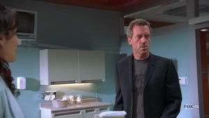
1. Duplicate the original layer twice. The topmost set to Screen and sharpened once. Or twice if it's really necessary. If you think it's too sharp, this can remedied by using Edit >> Fade. The middle layer is set to Linear Dodge. It's gonna be too bright now so lower the opacity depending on your preference. I would usually set the opacity to around 20-40%. Resize the cap to 600px.

2. Now that's done. This is the part I'll be using stuff from riseoverrun's tutorial. Again, the original's here. They will be marked with a *.
3. From here, I'll be using the following layers:
• Selective Color. Adjust the Reds as follows: Cyan -50; Magenta -17; Yellow +39; Black: 0. Then adjust the Neutrals: Cyan -9; Magenta -15; Yellow 0; Black -15.
Leave to Normal.
• *Color Balance. Adjust the following settings:
Midtones: Cyan-Red +70; Magenta-Green +2; Yellow-Blue +17.
Hightlights: Cyan-Red +21; Magenta-Green +4; Yellow-Blue +1.
Keep the Shadows untouched.
Leave to Normal.
• *Create a new layer and fill it with #000428. Set to Exclusion. Decrease opacity to 70%.
• Lastly, this part's modifiable once again depending on preference. *Create another layer and fill it with #46D4C5 (originally from riseoverrun's tutorial). Set to Color Burn. Lower the opacity to 70-80%. But I often change this to whatever I find more suitable for the cap. You don't want to be stuck with the same color all the time. :p
Here's what it should look like:
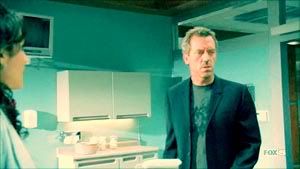
Other examples:
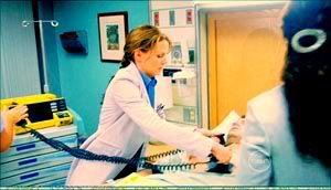
filled with #6DD7C4
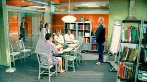
filled with #6DD7D6 (slight alteration from the previous one)
4. Cotrol+Shift+Alt E. Merged. Cropping time! Use the cropping tool with a fixed aspect ratio of 120px by 120px. Then create a new file that is 100px by 100px; lj standard. Sometimes when the cap is too big, I resize the image to 110px or less. I never go completely 100px for some reason though. One of my many quirks, I suppose. When you're satisfied with your cropping, move them to the new file where you'll adjust the placement on the empty canvas.
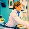
Phase One Completed. Still dodgy but presentable, at least. ;)
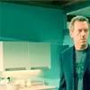

PHASE TWO
This shall be the color enhancing part. Whatever will be done next will depend on your results from before. You can use any layer. May it be Color Balance, Selective Color, Curves or fill it with whatever color you like. Be creative. Less is always more. So, as much as possible, don't overdo with the layers. It can get too "thick" if you know what mean.
In the following steps, I included what's the usual stuff I do with an almost finish product. The rest can be modified according to your preference. Just pick whatever other layer you'd like to use.
1. From the new file, duplicate the image. Sharpen once and use Edit >> Fade, as needed.
2. Create a Color Balance layer. I'll enhance the green because it's the central color of the icon I've used as an example.
Here's the settings:
Midtones Cyan-Red +20; Magenta-Green -2; Yellow-Blue +1
Hightlights: Cyan-Red -32; Magenta-Green 0; Yellow-Blue -8
Shadows: Cyan-Red +45; Magenta-Green +25; Yellow-Blue -8
Set to Color.
3. Next, use the Curves tool. This is standard in all my icons since it brings on the brightness. RGB & Red. Just set it to Normal and decrease opacity to 70%.
4. Finally, Hue/Saturation. Again, another standard layer used in all my icons. It brings the brilliance out especially in the background. Use a brush to tone down the excessive redness on faces if it occurs, however. The Saturation is set to +30.
... and voila!

For the other icons however, I did a few other things.
1.
2.
1. I gave it a blue tint using Color Balance, set to Color and has 90% opacity. This totally brought out the background, didn't it? And another, Color Balance layer set to Color with a 40% opacity. If you also noticed, a while ago the wall behind Cameron was a little pixellated. So, on a duplicate, I used the Magic Wand Tool to select the pixellated part and use Filter >> Blur >> Smart Blur with this setting: Radius 3.0; Threshold 25.0; Quality Low and Mode Normal.
2. I used the same blue tint and this other layer, set to Color with 100% opacity.
Phase Two Completed! That ends the tutorial for today. Fin.
I hope that was clear enough. At the end of it, I guess I got a little lazy and used printscreen insted of typing the settings up. :p I'm just sorry it's a little long. =/ I didn't want to forget anything. Once you get the hang of it though, it's not all that long really. :p
If you use this tutorial, I'd love to see the finish product! :)
Took me long enough. (ohyesithadtohaveatitle!) This is my first tutorial so if I am in any way unclear, feel free to ask me questions regarding the steps. Ignore my bad grammar for my sake. :p
How to make icons like these:


All made with Photoshop CS. I have no idea how to do this in other programs so if you have questions not related to CS, I won't be able to help. Previous versions of photoshop are applicable though.
Before I begin, I have to say right now that the coloring technique that I've been using and is going to be the point of the tutorial has been developed through riseoverrun's tutorial here. Don't want to be branded as a thief just because some of the steps were used in Phase One of this tutorial, as you'll see below. But other than those few steps, the other modifications are made by myself. :) I'm mentioning it now before people start pointing fingers and making accusations. I'd like to avoid that.
NOTES:
1/ This tutorial does not necessarily apply to ALL caps. It has worked very well on House caps for some reason though. They don't have to be hi-res either.
2/ It's VERY flexible too. You may change any aspect to make it work for the cap you're using.
3/ You don't have follow everything to the word. It's flexible after all so you change things as it suits you or the cap you're using.
4/ Please do not post this tutorial anywhere. Or claim it as yours. Linking or memming is totally fine of course.
5/ The icons here are not for the taking. Wait for them on my next update. :p
6/ Lastly, this tutorial serves merely as a guide. You shouldn't just copy the steps, try other things too. You'll be surprised how small changes make a huge difference. :)
PHASE ONE
Basically this is the preparation stage. Just some standard tweaking.
Pick your cap. (I usually use caps by spiffy_themes or those from HL.Net) You can resize it if you want but I usually keep the original size (800 or so px) until later. In this case I made is smaller as a representation.

1. Duplicate the original layer twice. The topmost set to Screen and sharpened once. Or twice if it's really necessary. If you think it's too sharp, this can remedied by using Edit >> Fade. The middle layer is set to Linear Dodge. It's gonna be too bright now so lower the opacity depending on your preference. I would usually set the opacity to around 20-40%. Resize the cap to 600px.

2. Now that's done. This is the part I'll be using stuff from riseoverrun's tutorial. Again, the original's here. They will be marked with a *.
3. From here, I'll be using the following layers:
• Selective Color. Adjust the Reds as follows: Cyan -50; Magenta -17; Yellow +39; Black: 0. Then adjust the Neutrals: Cyan -9; Magenta -15; Yellow 0; Black -15.
Leave to Normal.
• *Color Balance. Adjust the following settings:
Midtones: Cyan-Red +70; Magenta-Green +2; Yellow-Blue +17.
Hightlights: Cyan-Red +21; Magenta-Green +4; Yellow-Blue +1.
Keep the Shadows untouched.
Leave to Normal.
• *Create a new layer and fill it with #000428. Set to Exclusion. Decrease opacity to 70%.
• Lastly, this part's modifiable once again depending on preference. *Create another layer and fill it with #46D4C5 (originally from riseoverrun's tutorial). Set to Color Burn. Lower the opacity to 70-80%. But I often change this to whatever I find more suitable for the cap. You don't want to be stuck with the same color all the time. :p
Here's what it should look like:

Other examples:

filled with #6DD7C4

filled with #6DD7D6 (slight alteration from the previous one)
4. Cotrol+Shift+Alt E. Merged. Cropping time! Use the cropping tool with a fixed aspect ratio of 120px by 120px. Then create a new file that is 100px by 100px; lj standard. Sometimes when the cap is too big, I resize the image to 110px or less. I never go completely 100px for some reason though. One of my many quirks, I suppose. When you're satisfied with your cropping, move them to the new file where you'll adjust the placement on the empty canvas.
Phase One Completed. Still dodgy but presentable, at least. ;)


PHASE TWO
This shall be the color enhancing part. Whatever will be done next will depend on your results from before. You can use any layer. May it be Color Balance, Selective Color, Curves or fill it with whatever color you like. Be creative. Less is always more. So, as much as possible, don't overdo with the layers. It can get too "thick" if you know what mean.
In the following steps, I included what's the usual stuff I do with an almost finish product. The rest can be modified according to your preference. Just pick whatever other layer you'd like to use.
1. From the new file, duplicate the image. Sharpen once and use Edit >> Fade, as needed.
2. Create a Color Balance layer. I'll enhance the green because it's the central color of the icon I've used as an example.
Here's the settings:
Midtones Cyan-Red +20; Magenta-Green -2; Yellow-Blue +1
Hightlights: Cyan-Red -32; Magenta-Green 0; Yellow-Blue -8
Shadows: Cyan-Red +45; Magenta-Green +25; Yellow-Blue -8
Set to Color.
3. Next, use the Curves tool. This is standard in all my icons since it brings on the brightness. RGB & Red. Just set it to Normal and decrease opacity to 70%.
4. Finally, Hue/Saturation. Again, another standard layer used in all my icons. It brings the brilliance out especially in the background. Use a brush to tone down the excessive redness on faces if it occurs, however. The Saturation is set to +30.
... and voila!

For the other icons however, I did a few other things.
1.

2.

1. I gave it a blue tint using Color Balance, set to Color and has 90% opacity. This totally brought out the background, didn't it? And another, Color Balance layer set to Color with a 40% opacity. If you also noticed, a while ago the wall behind Cameron was a little pixellated. So, on a duplicate, I used the Magic Wand Tool to select the pixellated part and use Filter >> Blur >> Smart Blur with this setting: Radius 3.0; Threshold 25.0; Quality Low and Mode Normal.
2. I used the same blue tint and this other layer, set to Color with 100% opacity.
Phase Two Completed! That ends the tutorial for today. Fin.
I hope that was clear enough. At the end of it, I guess I got a little lazy and used printscreen insted of typing the settings up. :p I'm just sorry it's a little long. =/ I didn't want to forget anything. Once you get the hang of it though, it's not all that long really. :p
If you use this tutorial, I'd love to see the finish product! :)