(no subject)
Results Challenge 4

by
evening_road with -3

by
herportraitwith -7
Thankyou for particapating. All of your icon entries were beatuiful. Feel free to particapate next round.
Also, Someone complained about a particapant getting voted of with 3 votes last round. Yeah it is kinda, but we need to elimintate 2 particapants and they're the ones with the highest neg. votes.
Tally
1. +3
2.+3
3.-1,
4. -2
5. -4, +1
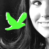
7. -7
Neg. votes
3. awkward cropping
4. the idea is nice, but the image is too dark.
4. The Icon's coloring is too off.
5. The icon is too blue making it not look as effective, great cropping though.
5.They're kind of unoriginal. A basic same crop, and have the same layout.
5. The coloring is overly blue.
5.coloring is too blue but the cripping is good.
7. I don't like the black and white result, plus the texture/brush doesn't fit well.
7. Bad contrast and the strong bird does not fit in. Awkward cropping aswell.
7. The brush is not ok.
7.They're kind of unoriginal. They're basically the same crop, and have the same layout.
7. great icon, just the green texture doesn't work though.
7. the green color is harsh and doesn't really fit
7. the neon green bird is doing nothing for the image.
Pos.
1. Perfect cropping and the texture is great!
1.fantastic cropping and good contrast
1. love the black and white, and the texture used
2. nice composition
2. Nice contrasting with b&w and yellow.
2.Nice use of texture and text. The yellow really stands out.
5. love the coloring used

by
evening_road with -3

by
herportraitwith -7
Thankyou for particapating. All of your icon entries were beatuiful. Feel free to particapate next round.
Also, Someone complained about a particapant getting voted of with 3 votes last round. Yeah it is kinda, but we need to elimintate 2 particapants and they're the ones with the highest neg. votes.
Tally
1. +3
2.+3
3.-1,
4. -2
5. -4, +1
7. -7
Neg. votes
3. awkward cropping
4. the idea is nice, but the image is too dark.
4. The Icon's coloring is too off.
5. The icon is too blue making it not look as effective, great cropping though.
5.They're kind of unoriginal. A basic same crop, and have the same layout.
5. The coloring is overly blue.
5.coloring is too blue but the cripping is good.
7. I don't like the black and white result, plus the texture/brush doesn't fit well.
7. Bad contrast and the strong bird does not fit in. Awkward cropping aswell.
7. The brush is not ok.
7.They're kind of unoriginal. They're basically the same crop, and have the same layout.
7. great icon, just the green texture doesn't work though.
7. the green color is harsh and doesn't really fit
7. the neon green bird is doing nothing for the image.
Pos.
1. Perfect cropping and the texture is great!
1.fantastic cropping and good contrast
1. love the black and white, and the texture used
2. nice composition
2. Nice contrasting with b&w and yellow.
2.Nice use of texture and text. The yellow really stands out.
5. love the coloring used