Challenge #1: Round #2 Results
Okay, i get not good amount of votes. Hope next time it'll be better. You can do that, right?
Thank you to people who voted, but sadly we have to say goodbye to some pearticipants.
Eliminated:
nialyind: -5

sjlnechnaia: -4

People's choice:
alice_trip: +2

Mod's choice:
swisp: really like the cropping..

If your icon number isn't listed here, you've recived no votes. Congrats :)
2.-2/+2=0
4.-1/+1=0
5.-2
6.-1
7.-2
8.+2
9.-5
10.+1
11.-1
12.-4
- = lesser quality vote(s)
+ = favorite icon vote(s)
Eliminate:
#02 - The icon is indistinct yet oversharpened.
2 - It seems icon is oversharpened
#04 - The image is blurry and unclear.
# 05 - the colors are too dark, which don't fit the icon at all
5 - colors are pale and icon is blurry
#6 -The colouring is too red. Kristen seems artificial and has too much brightness
#07 - Poor cropping that draws the focus off Kristen.
07 - cropping isn't effective and backgroung is a bit dirty
#9 - The image is oversharpened
# 09 - the light texture isn't good for the work, it darws away from Kristen's face
9 - The textures are overpowering, too much contrast
09 - texture is too contrasting and distracting
9 - kristens face is too bright and texture is too distracting..
11 - Icon is too blurry
#12 - The icon is too dark
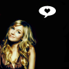
# 12 - the colors really dark colors doesn't fit the icon, there's no need in the form with the heart
12 - colouring is too dark
12 - coloring is too blue and icon is oversharped
To keep:
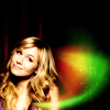
#02 - good colors and use of textures, really nice and pleasing icon
2 - nice colors and use of textures
04 - beautiful b&w colouring and cropping
#08 - Good coloring, contrast, and use of light textures.
#8 - original cropping and lovely texture
10 - Great coloring and crop. Really beautiful
Good luck to everyone in next round :)
Thank you to people who voted, but sadly we have to say goodbye to some pearticipants.
Eliminated:
nialyind: -5
sjlnechnaia: -4

People's choice:
alice_trip: +2

Mod's choice:
swisp: really like the cropping..

If your icon number isn't listed here, you've recived no votes. Congrats :)
2.-2/+2=0
4.-1/+1=0
5.-2
6.-1
7.-2
8.+2
9.-5
10.+1
11.-1
12.-4
- = lesser quality vote(s)
+ = favorite icon vote(s)
Eliminate:
#02 - The icon is indistinct yet oversharpened.
2 - It seems icon is oversharpened
#04 - The image is blurry and unclear.
# 05 - the colors are too dark, which don't fit the icon at all
5 - colors are pale and icon is blurry
#6 -The colouring is too red. Kristen seems artificial and has too much brightness
#07 - Poor cropping that draws the focus off Kristen.
07 - cropping isn't effective and backgroung is a bit dirty
#9 - The image is oversharpened
# 09 - the light texture isn't good for the work, it darws away from Kristen's face
9 - The textures are overpowering, too much contrast
09 - texture is too contrasting and distracting
9 - kristens face is too bright and texture is too distracting..
11 - Icon is too blurry
#12 - The icon is too dark
# 12 - the colors really dark colors doesn't fit the icon, there's no need in the form with the heart
12 - colouring is too dark
12 - coloring is too blue and icon is oversharped
To keep:
#02 - good colors and use of textures, really nice and pleasing icon
2 - nice colors and use of textures
04 - beautiful b&w colouring and cropping
#08 - Good coloring, contrast, and use of light textures.
#8 - original cropping and lovely texture
10 - Great coloring and crop. Really beautiful
Good luck to everyone in next round :)