First Tutorial - Chi
Go from 
to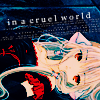
Requested by nocturnelorelei
Made in: Photoshop CS
Difficulty: Medium(I don't think it's very hard but beginners may have a hard time with it.)
Warning: Maybe image heavy.
STEP 1

Start off with your base and prep however you like. I don't remember what I did to this but I'm pretty sure I did the standard softlight on top of screen. You know, where you duplicate the base twice, set the bottom one to SCREEN and the top one to SOFTLIGHT. Adjust the opacity of the screen layer depending on how light your icon is. You may need additional screen layers if your base image is really dark.
STEP 2

>
Take this texture by unmasked_icons and set it to OVERLAY 60%
STEP 3

>
Create a new layer and fill it with #104468. Set that layer to EXCLUSION 100%.
STEP 4

>
Create a new layer and fill it with #c2e5fd. Set that layer to COLORBURN 100%.
STEP 5

>
Create a new layer and fill it with #fde6c2. Set that layer to MULTIPLY 100%. Yeah, I know, I'm killing you with the trendy coloring XD It'll get it better, I promise.
STEP 6

>
Duplicate your base and drag it up to the top. Set that layer to SOFTLIGHT 100%
STEP 7

Curves time! Create a Curves layer and play around with the settings till you get something you like. You can view my settings below.
RGB
RED
GREEN
Remember that the curves setting will vary with each image.
STEP 8

Use the rectangular marquee to select your whole icon. Then go to Edit>Copy Meged and paste the merged layer on top of your icon. Set that that layer to SCREEN 50%
STEP 9

>
Okay, so now it's time for textures. Take this texture by gender which I've modified by using the Hue/Saturation tool and set it to MULTIPLY 50%.
STEP 10

>
Take this texture, also by gender, and set it to COLORBURN 25%. I increased the lightness a bit by using the Hue/Saturation tool and smudged out the parts that were covering Chi's face by using the blur tool.
STEP 11

>
Okay, see that little eye beside each layer? Click the the ones by the two texture layers we just added. Then select the whole icon, go to Edit>Copy Merged, and paste the merged layer on top of your icon and set that layer to SOFLIGHT 100%. Click the blank spaces where the eyes were to turn those layers back on.
STEP 12

The colors are lookin' kinda fugly right now. Don't worry, we'll fix that by adding another curves layer. My settings are below.
RGB
RED
GREEN
BLUE
You remember what I said earlier about the curves settings so there's no need to repeat myself right? Good.
STEP 13

I'm still not satisfied with coloring so we'll add a color balance layer. My settings are below.
SHADOWS:
Cyan: -59
Make sure the Preserve Luminosity box is checked and just like curves, the settings will vary based upon the picture.
STEP 14

>
So now that I'm happy with the coloring on the icon, it's time for the text. I clicked the type tool and typed "in a cruel world" in Garamond size 9. I rotated it by going to Edit>Transform>Rotate.
STEP 15

>
Since the icon was still looking a lttle plain I decided to add some tiny text. I took this brush by ewanism and rotated it so that it was line with the text.
FINAL PRODUCT

And you're done. Now you can add borders, light textures, or more adjustment layers to create different variations like the ones below. Most of the light textures were modified using the Hue/Saturation tool.
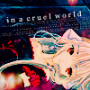
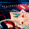
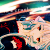
I hope that you find this tutorial helpful and easy to understand. Please comment and tell me what you think :D Try not to follow this tutorial exactly or your result will come out rather... ugly. Each image is different so the coloring and textures may have different effects.

to
Requested by nocturnelorelei
Made in: Photoshop CS
Difficulty: Medium(I don't think it's very hard but beginners may have a hard time with it.)
Warning: Maybe image heavy.
STEP 1

Start off with your base and prep however you like. I don't remember what I did to this but I'm pretty sure I did the standard softlight on top of screen. You know, where you duplicate the base twice, set the bottom one to SCREEN and the top one to SOFTLIGHT. Adjust the opacity of the screen layer depending on how light your icon is. You may need additional screen layers if your base image is really dark.
STEP 2

>

Take this texture by unmasked_icons and set it to OVERLAY 60%
STEP 3

>

Create a new layer and fill it with #104468. Set that layer to EXCLUSION 100%.
STEP 4

>

Create a new layer and fill it with #c2e5fd. Set that layer to COLORBURN 100%.
STEP 5

>

Create a new layer and fill it with #fde6c2. Set that layer to MULTIPLY 100%. Yeah, I know, I'm killing you with the trendy coloring XD It'll get it better, I promise.
STEP 6

>

Duplicate your base and drag it up to the top. Set that layer to SOFTLIGHT 100%
STEP 7

Curves time! Create a Curves layer and play around with the settings till you get something you like. You can view my settings below.
RGB
RED
GREEN
Remember that the curves setting will vary with each image.
STEP 8

Use the rectangular marquee to select your whole icon. Then go to Edit>Copy Meged and paste the merged layer on top of your icon. Set that that layer to SCREEN 50%
STEP 9

>

Okay, so now it's time for textures. Take this texture by gender which I've modified by using the Hue/Saturation tool and set it to MULTIPLY 50%.
STEP 10

>

Take this texture, also by gender, and set it to COLORBURN 25%. I increased the lightness a bit by using the Hue/Saturation tool and smudged out the parts that were covering Chi's face by using the blur tool.
STEP 11

>

Okay, see that little eye beside each layer? Click the the ones by the two texture layers we just added. Then select the whole icon, go to Edit>Copy Merged, and paste the merged layer on top of your icon and set that layer to SOFLIGHT 100%. Click the blank spaces where the eyes were to turn those layers back on.
STEP 12

The colors are lookin' kinda fugly right now. Don't worry, we'll fix that by adding another curves layer. My settings are below.
RGB
RED
GREEN
BLUE
You remember what I said earlier about the curves settings so there's no need to repeat myself right? Good.
STEP 13

I'm still not satisfied with coloring so we'll add a color balance layer. My settings are below.
SHADOWS:
Cyan: -59
Make sure the Preserve Luminosity box is checked and just like curves, the settings will vary based upon the picture.
STEP 14

>

So now that I'm happy with the coloring on the icon, it's time for the text. I clicked the type tool and typed "in a cruel world" in Garamond size 9. I rotated it by going to Edit>Transform>Rotate.
STEP 15

>

Since the icon was still looking a lttle plain I decided to add some tiny text. I took this brush by ewanism and rotated it so that it was line with the text.
FINAL PRODUCT
And you're done. Now you can add borders, light textures, or more adjustment layers to create different variations like the ones below. Most of the light textures were modified using the Hue/Saturation tool.
I hope that you find this tutorial helpful and easy to understand. Please comment and tell me what you think :D Try not to follow this tutorial exactly or your result will come out rather... ugly. Each image is different so the coloring and textures may have different effects.