Tutorial #4 and #5
come requested a coloring tutorial for this icon. I used PSP9, but there shouldn't be too big of a problem translating it to other programs. I'm also throwing in another coloring tutorial. I plan to delete some of my PSP files, but I like the coloring on the second one, and I'd like to have step by step instructions in case I forget. And if anyone else finds them useful, that's great too. If anything needs to be clarified, feel free to ask.

Hitsugaya Tutorial -
I started with this calendar scan of Hitsugaya that I downloaded from AnimePaper.
I cropped him out, and resized the image to 100 x 100:

I decided not to sharpen the image because it would have made the edges very pixelated. Instead, I duplicated my base twice. I set the first duplicated image to multiply with an opacity of 44%, and I set the second image to softlight with an opacity of 72% and ended up with this:

I created a new layer and filled it with #1b213a
and set it to exclusion:

I created a new layer and filled it with #efe1d5
and set it to burn at 100%. This is the layer that really controls the skin tone. If you want the skin tone to be lighter, you'd lower the opacity.

I created a new layer, and filled it with this
gradient, set it to lighten at 94%. It doesn't really affect the color of the icon at all. You don't even really notice it. What it does do is make the tip of the sword lighter. I wanted there to be a bit of variety rather than it being all black.

I then took the base image, copied it, (I treat it as a another icon), and greyscaled it. What I usually do is create a new layer and set that to color legacy, but you can go the easier route and just set it to greyscale.
Note: I usually duplicate the newly created black and white icon and set the duplicated layer to hard light. I lower the opacity to where to features have a nice contrast and are more defined but are not completely obliterated. I do this with almost every icon I make, but this part really depends on the image you are using. I couldn't do that with the Hitsugaya image because of how 'light' it was. It became pixelated very easily. I did use the technique with the other icon below though.
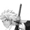
I then returned to my original icon. I took the new black and white image and set it as a new layer above the purple gradient. I set it to burn with an opacity of 62%:

I then took this texture
by sanami276 pasted it as a new layer and set it to softlight at 50% opacity:

I took this texture
by gender, pasted it as a new layer and set it to multipy at 54%. I then duplicated the layer but this time I set the duplicated layer to softlight at 100%. I ended up with this:

I again took the black and white image,
pasted it as a new layer, and set it to softlight with an opacity of 86%. I created a new layer and filled it with #202020
and set it to lighten at 100%. I added my text, merged all the layers, and was done:

Here is what the layer pallete should look like:
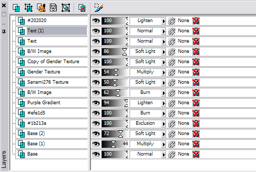
Note: dearest -----> gender
GrimmJow Tutorial -
I started with this cd cover scan of GrimmJow that I downloaded from AnimePaper.
I cropped him out, re-drew some missing body parts, and resized the image to 100 x 100. I duplicated the image, sharpened the new layer, and set the opacity to about 30%. I always lower the opacity because while I want the image to be defined, I don't want it over sharpened. When you start duplicating layers the image can become very harsh very quickly.
I then merged the two layers and got this:
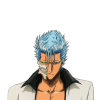
I duplicated the base twice. I set the first duplicated image to screen at 40% and the second duplicated image to softlight with an opacity of 86%:

I created a new layer and filled it with #0c3f62
and set it exclusion at 100%.

I add a new layer and filled it #f3ece1
and set it to color legacy at at 28%:

I copied the base, (again treating this like a new icon), and created a new layer and filled it with black. I'm basically greyscaling the image. I set this layer to color legacy and merged the two layers:
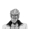
I then duplicated the new B/W icon and set the duplicated layer to hard light with an opacity of 50%. Notice how much more it pops. Then, I merged the two layers:
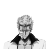
I went back to my original icon and pasted the new B/W image aboved the #f3ece1 layer and set it to burn with an opacity of 46% and got this:

I created a new layer and filled it with this gradient
and set it to lighten at 100%:

I took this texture
by ewanism pasted it as a new layer and set it to burn at 70%:
I took this texture
by gender pasted it as a new layer and set it to softlight at 100%:
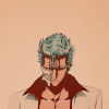
I took the B/W image, pasted it as a new layer, and set it to burn with an opacity of 24%:
I created a new layer and filled it with #202020
and set it to lighten at 100%. I merged all my layers and was done:
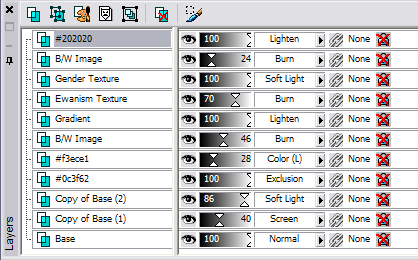
Here is what the color palette should look like:
Hitsugaya Tutorial -
I started with this calendar scan of Hitsugaya that I downloaded from AnimePaper.
I cropped him out, and resized the image to 100 x 100:
I decided not to sharpen the image because it would have made the edges very pixelated. Instead, I duplicated my base twice. I set the first duplicated image to multiply with an opacity of 44%, and I set the second image to softlight with an opacity of 72% and ended up with this:
I created a new layer and filled it with #1b213a
and set it to exclusion:
I created a new layer and filled it with #efe1d5
and set it to burn at 100%. This is the layer that really controls the skin tone. If you want the skin tone to be lighter, you'd lower the opacity.
I created a new layer, and filled it with this
gradient, set it to lighten at 94%. It doesn't really affect the color of the icon at all. You don't even really notice it. What it does do is make the tip of the sword lighter. I wanted there to be a bit of variety rather than it being all black.
I then took the base image, copied it, (I treat it as a another icon), and greyscaled it. What I usually do is create a new layer and set that to color legacy, but you can go the easier route and just set it to greyscale.
Note: I usually duplicate the newly created black and white icon and set the duplicated layer to hard light. I lower the opacity to where to features have a nice contrast and are more defined but are not completely obliterated. I do this with almost every icon I make, but this part really depends on the image you are using. I couldn't do that with the Hitsugaya image because of how 'light' it was. It became pixelated very easily. I did use the technique with the other icon below though.
I then returned to my original icon. I took the new black and white image and set it as a new layer above the purple gradient. I set it to burn with an opacity of 62%:
I then took this texture
by sanami276 pasted it as a new layer and set it to softlight at 50% opacity:
I took this texture
by gender, pasted it as a new layer and set it to multipy at 54%. I then duplicated the layer but this time I set the duplicated layer to softlight at 100%. I ended up with this:
I again took the black and white image,
pasted it as a new layer, and set it to softlight with an opacity of 86%. I created a new layer and filled it with #202020
and set it to lighten at 100%. I added my text, merged all the layers, and was done:
Here is what the layer pallete should look like:
Note: dearest -----> gender
GrimmJow Tutorial -
I started with this cd cover scan of GrimmJow that I downloaded from AnimePaper.
I cropped him out, re-drew some missing body parts, and resized the image to 100 x 100. I duplicated the image, sharpened the new layer, and set the opacity to about 30%. I always lower the opacity because while I want the image to be defined, I don't want it over sharpened. When you start duplicating layers the image can become very harsh very quickly.
I then merged the two layers and got this:
I duplicated the base twice. I set the first duplicated image to screen at 40% and the second duplicated image to softlight with an opacity of 86%:
I created a new layer and filled it with #0c3f62
and set it exclusion at 100%.
I add a new layer and filled it #f3ece1
and set it to color legacy at at 28%:
I copied the base, (again treating this like a new icon), and created a new layer and filled it with black. I'm basically greyscaling the image. I set this layer to color legacy and merged the two layers:
I then duplicated the new B/W icon and set the duplicated layer to hard light with an opacity of 50%. Notice how much more it pops. Then, I merged the two layers:
I went back to my original icon and pasted the new B/W image aboved the #f3ece1 layer and set it to burn with an opacity of 46% and got this:
I created a new layer and filled it with this gradient
and set it to lighten at 100%:
I took this texture
by ewanism pasted it as a new layer and set it to burn at 70%:
I took this texture
by gender pasted it as a new layer and set it to softlight at 100%:
I took the B/W image, pasted it as a new layer, and set it to burn with an opacity of 24%:
I created a new layer and filled it with #202020
and set it to lighten at 100%. I merged all my layers and was done:
Here is what the color palette should look like: