Tutorial #3
theshadowlover requested a tutorial for the coloring I used on these icons. They were basically made the same way, so I didn't really keep the PSP files. I won't be able to show examples after each layer, but it should be easy to follow nonetheless. I use PSP 9, so it should translate to PS without too many problems. I'll be using this icon as an example because it's the only one to have at least a partial PSP file. If anything needs to be clarified, feel free to ask.

I started with this manga scan of the Sand Nin. I cropped out Temari, and re-sized the image to 100 X 90:

Or you can wait to resize till after you have colored in the scan. It's sometimes easier to work on a larger canvas than on a 100x100 or in this case a 100x90 square.
I created a new layer, so I could begin to color in the the scan. When I do this type of coloring I usually use the same colors. I use #a50f00 (red), #edb303 (yellow), or #c1410f (orange) basically any really deep autumn colors. I'll create separate layers for each color, so I can change the opacity. Make some of the colors deeper and richer and others lighter. For the skin I just use any type of flesh color.
After I finish the colors, I set the layer(s) to Multiply.
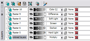
I created a new layer and filled it with #b9420d (an orange color). I then set the layer to Hard Light with an opacity of 28%.
I created a new layer and used this texture by inxsomniax. You can use any part of the texture depending on what type of definition you want the icon to have. I usually use the green part but really it's up to you. I set the layer to Darken with an opacity of 42%.
I created a new layer and used another texture by inxsomniax. Again, you can use any part of the texture. I set the layer to Screen with an opacity of 72%.
I created a new layer used another texture by inxsomniax that I grey scaled. I set this layer to Soft Light with an opacity of 74%.
I created another layer and filled it with #00093e (dark blue) and set it to Difference.
I created another layer and filled it with #efe1d5 (flesh colored) and set it to Color Legacy with an opacity of 22%.
I then merged all the layers. And ended up with this:

This is what the layer palette should look like:
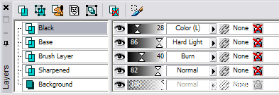
I then duplicated the image and sharpened it. I usually set the opacity to zero and then move it up till I find a number that doesn't make the icon too sharpened but gives it definition. In this case I set the opacity to 82%:

I created a new layer and used this brush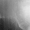
. I'm not sure who made it, so if anyone knows give me a heads up. I set the layer to Burn with an opacity of 40%:

I took the un-sharpened base image, duplicated it and then brought it to the top where I set it to Hard Light with an opacity of 86%:

Finally, I created a new layer and filled it with the #000000 (black). I set it to Color Legacy with an opacity of 28%:

The layer palette should look like this:
Or if you want the icon to be a little duller/not so bright in color you can lower the opacity of the Hard Light layer and raise the opacity of the Black Layer. This variation has the Hard Light layer at 54% and the Black layer at 44%:

Either way merge your layers, add your border if you want, and your done.

One caveat, I use Color Legacy, but I'm not sure that is a blend mode PS has. It's not much different than the Color blend mode though. The result isn't as dark as in Color which is why I like it, but there really shouldn't be too much of a difference.
I started with this manga scan of the Sand Nin. I cropped out Temari, and re-sized the image to 100 X 90:

Or you can wait to resize till after you have colored in the scan. It's sometimes easier to work on a larger canvas than on a 100x100 or in this case a 100x90 square.
I created a new layer, so I could begin to color in the the scan. When I do this type of coloring I usually use the same colors. I use #a50f00 (red), #edb303 (yellow), or #c1410f (orange) basically any really deep autumn colors. I'll create separate layers for each color, so I can change the opacity. Make some of the colors deeper and richer and others lighter. For the skin I just use any type of flesh color.
After I finish the colors, I set the layer(s) to Multiply.
I created a new layer and filled it with #b9420d (an orange color). I then set the layer to Hard Light with an opacity of 28%.
I created a new layer and used this texture by inxsomniax. You can use any part of the texture depending on what type of definition you want the icon to have. I usually use the green part but really it's up to you. I set the layer to Darken with an opacity of 42%.
I created a new layer and used another texture by inxsomniax. Again, you can use any part of the texture. I set the layer to Screen with an opacity of 72%.
I created a new layer used another texture by inxsomniax that I grey scaled. I set this layer to Soft Light with an opacity of 74%.
I created another layer and filled it with #00093e (dark blue) and set it to Difference.
I created another layer and filled it with #efe1d5 (flesh colored) and set it to Color Legacy with an opacity of 22%.
I then merged all the layers. And ended up with this:

This is what the layer palette should look like:

I then duplicated the image and sharpened it. I usually set the opacity to zero and then move it up till I find a number that doesn't make the icon too sharpened but gives it definition. In this case I set the opacity to 82%:

I created a new layer and used this brush

. I'm not sure who made it, so if anyone knows give me a heads up. I set the layer to Burn with an opacity of 40%:

I took the un-sharpened base image, duplicated it and then brought it to the top where I set it to Hard Light with an opacity of 86%:

Finally, I created a new layer and filled it with the #000000 (black). I set it to Color Legacy with an opacity of 28%:

The layer palette should look like this:

Or if you want the icon to be a little duller/not so bright in color you can lower the opacity of the Hard Light layer and raise the opacity of the Black Layer. This variation has the Hard Light layer at 54% and the Black layer at 44%:

Either way merge your layers, add your border if you want, and your done.
One caveat, I use Color Legacy, but I'm not sure that is a blend mode PS has. It's not much different than the Color blend mode though. The result isn't as dark as in Color which is why I like it, but there really shouldn't be too much of a difference.