(no subject)
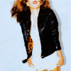
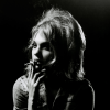
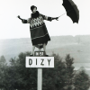
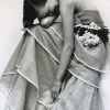
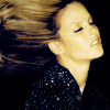
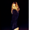
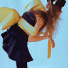
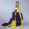
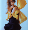
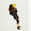
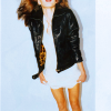
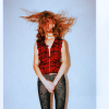
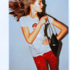
001-039: random models
Tutorial:
to: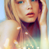
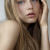
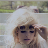
Teasers:

001
002
003
004
005
006
007
008
009
010
011
012
013
014
015
016
017
018

019
020
021

022
023
024
025
026
027

028
029
030
031
032
033

034
035
036
037
038
039
This is for Tina :* <3
From:
to:
Okay, this is different for every single icon I make, I usually don't make them exactly alike, so this probably won't work on all icons, but you can try, of course. (:
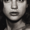
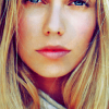
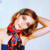
1. Let's start with the photo; http://i38.tinypic.com/5km35w.jpg . Now crop it so you're pleased. I usually take cropping by impulse, and the feel of it. But now I just cropped her pretty basically. No weird angles or anything - usually the simple is the best. Yeah, keep that in mind throughout the tutorial.
2. Now I do the coloring, which is usually the most important on my icons. The photo I've chosen is pretty plain, so we'll do a simple coloring on it, to make it a little bit more colorful. Start by making a new layer and filling it with #FFDE00, set it to soft light at 100%.
a) layer>>new adjustment layer>>selective color. Match my settings:
reds: -100, 0, +100, +100.
yellows: -30, 0, +20, 0.
whites: +100, 0, -100, 0.
neutrals: +50, 0, -60, +20.
b) Another selective color layer. Match my settings again:
reds: -40, 0, +20, +20.
yellows: -30, 0, -30, -30.
neutrals: +40, 0, -15, +10.
c) layer>>new adjustment layer>>color balance, match my settings:
midtones: +20, +11, -10.
highlights: 0, 0, +35.
shadows: +7, -2, -12.
d) And yet another selective color layer.
reds: -20, 0, +5, -10.
yellows: -30, 0, -30, -20.
whites: +100, 0, -100, 0.
neutrals: +20, 0, -15, 0.
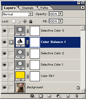
3. That wraps up the coloring, your layers should look something like this.
Now put all these layers in a folder on top of your main image.
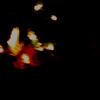
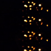
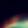
4. And then there's the textures. I don't put textures on all of my icons, because sometimes they just look better without it. On this icon though, I feel like we should have a few light textures. Here they are:
1
2
3
Now place them so you're happy. Your layers should look like
this now.
My result:
(:
Tutorial:
to:
Teasers:
001
002
003
004
005
006
007
008
009
010
011
012
013
014
015
016
017
018
019
020
021
022
023
024
025
026
027
028
029
030
031
032
033
034
035
036
037
038
039
This is for Tina :* <3
From:
to:
Okay, this is different for every single icon I make, I usually don't make them exactly alike, so this probably won't work on all icons, but you can try, of course. (:
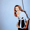
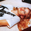
1. Let's start with the photo; http://i38.tinypic.com/5km35w.jpg . Now crop it so you're pleased. I usually take cropping by impulse, and the feel of it. But now I just cropped her pretty basically. No weird angles or anything - usually the simple is the best. Yeah, keep that in mind throughout the tutorial.
2. Now I do the coloring, which is usually the most important on my icons. The photo I've chosen is pretty plain, so we'll do a simple coloring on it, to make it a little bit more colorful. Start by making a new layer and filling it with #FFDE00, set it to soft light at 100%.
a) layer>>new adjustment layer>>selective color. Match my settings:
reds: -100, 0, +100, +100.
yellows: -30, 0, +20, 0.
whites: +100, 0, -100, 0.
neutrals: +50, 0, -60, +20.
b) Another selective color layer. Match my settings again:
reds: -40, 0, +20, +20.
yellows: -30, 0, -30, -30.
neutrals: +40, 0, -15, +10.
c) layer>>new adjustment layer>>color balance, match my settings:
midtones: +20, +11, -10.
highlights: 0, 0, +35.
shadows: +7, -2, -12.
d) And yet another selective color layer.
reds: -20, 0, +5, -10.
yellows: -30, 0, -30, -20.
whites: +100, 0, -100, 0.
neutrals: +20, 0, -15, 0.
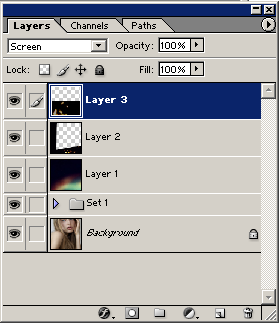
3. That wraps up the coloring, your layers should look something like this.
Now put all these layers in a folder on top of your main image.
4. And then there's the textures. I don't put textures on all of my icons, because sometimes they just look better without it. On this icon though, I feel like we should have a few light textures. Here they are:
1
2
3
Now place them so you're happy. Your layers should look like
this now.
My result:
(: