Two Graphic Tutorials
Alright, so these are the two tutorials I wrote for 2060, which I'm posting here for the sake of posterity for when they're taken down at the end of semester. Woo! Neither are image friendly, so click at your own risk.
to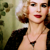

to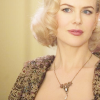
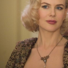
Find your base picture and do your basic preparations. I just cropped my picture, but you can also sharpen it if you find that your picture is too blurry. Duplicate your base and set its blending mode to 'Screen'. I got my base from Yahoo!Movies, from the film The Golden Compass.

to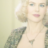
Flood fill a new layer with #c0ffff (a light blue-cyan) and set its blending mode to 'Soft Light'. This helps to balance out the yellows that are currently in my base. Blue and yellow are colour opposites, so if you're trying to get rid of yellow, add blue.

to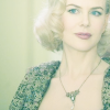
Duplicate the previous layer (the blue) and set its blending mode to 'Burn'. Again, this helps to balance out the overwhelming yellow in the base, and also adds some depth.

to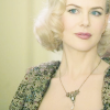
Now that we're overly blue, it's time to try and bring back some more natural skin tones into the picture. Add another flood fill layer, this time in #ffc0c0, a light pink. Set this layer to 'Burn' again, to add more depth to the picture.

to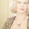
Duplicate the previous pink layer. Set this layer to 'Soft Light', which will help to bring out the pinks in Nicole Kidman's skin. Soft light layers usually bring out a colour in a picture.

to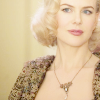
We're still really low on depth, so add a light gray layer (I used #c0c0c0) and set it to 'Burn'. This will help to bring out the shadows.

to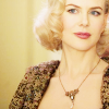
We still need more depth, and I don't want to completely overwhelm poor Nicole Kidman, so duplicate your base and bring it to the top of your layers. Set this layer to soft light.
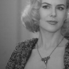
to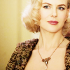
Since the base had so much yellow in it, the previous step added even more yellow. Duplicate the previous layer and change it's Hue/Saturation. I desaturated mine completely by going Adjust > Hue and Saturation > Hue/Saturation/Lightness and setting the Saturation to -100.

and
to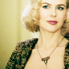
then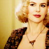
There's still too much yellow, so duplicate the blue burn layer and bring it to the top. To bring out the reds in the picture and add some depth, duplicate the pink burn layer and drag that one to the top as well.
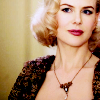
Now comes the technical stuff. Create a new Color Balance layer (Layers > New Adjustment Layer > Color Balance). Since there's so much yellow in the picture, you want to add some more blue to the picture. As well, I also added some cyan and magenta, to take away from the bright yellow feelings of the picture. The only settings I touched were Shadows and Midtones, and only the Blue/Yellow spectrum in Highlights. Make sure that 'Preserve Luminance' is checked.
My settings were as follows (click the setting for a preview):
Shadows: 1 | 12 | 40
Midtones: -30 | -13 | 21
Highlights: 0 | 0 | 17
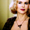
The picture still felt too yellow and too bright, so I added a Levels layer (Layers > New Adjustment Layer > Levels). I toyed a little with each of the channels, using the RGB channel to brighten things up and add depth to the shadows, the Red channel to add some more cyan, the Green channel to add a little magenta, and the Blue channel to add some more blue. The settings I used for this picture were:
RGB: 0 | 0.69 | 247
Red: 15 | 0.92 | 255
Green:0 | 1.06 | 255
Blue:0 | 0.93 | 238

to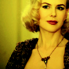
Since it was still too yellow, and I wanted to bring out the reds and magentas, I added a yellow layer (#ffff40) and set it to multiply. This seems rather contrary, but I find that I get the best results with the channel mixer while I'm removing colour.
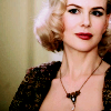
Add a new Channel Mixer layer (Layers > New Adjustment Layer > Channel Mixer). I went to the blue channel and removed all of the yellow, and then went back up to the red channel to add some red and cyan and the green channel to add some magenta. My settings were as follows:
Red: 100 | 0 | -12 | 0
Green: 1 | 98 | -21 | 0
Blue: 6 | 44 | 200 | -6
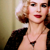
At this point, I'm fairly satisfied with my final product, but I decided to make some last few tweaks. Opening a new Color Balance layer, I used the following settings to add some depth and shadows. A good looking image is generally highly contrasted (though too much contrast can also be blinding - you've got to be careful and use everything in moderation). The settings I used were:
Shadows: -4 | -6 | 10
Midtones: 10 | 6 | -5
Highlights: 0 | 0 | 0
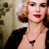
This step is purely optional. I added a texture by 'Gender', becuase I felt that my finished product was still a little too plain. Since Nicole Kidman's character in this photo, Mrs. Coulter, is a very high-class lady, I stuck with somethingthat was simple, some leaves. I pasted the texture over top and set it to 'Multiply'.

My final product is still too magenta, so I go and add some greens to it to tone things down a bit. I used another colour balance layer, with the settings:
Shadows: 0 | 4 | 0
Midtones: 0 | 13 | 0
Highlights: 0 | 2 | 0
Since I only touched the middle box, there was no reason to include images of my settings.
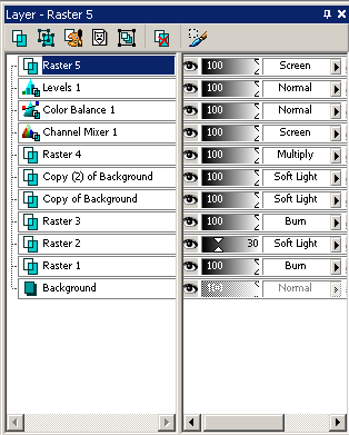
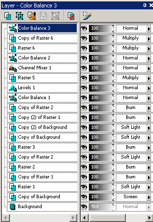
My layers palette appeared as follows:

to

to
Find your base and prepare it. I found a picture of a coffee cup from the stock.xchng, a free online stock photo exchange. All I did to my base was crop and resize it, but you could also sharpen your base if you find it to be too blurry. Duplicate your base and set it to 'Burn'.

to
Create a new flood fill layer with a soft pink (I used #ffc0c0) and set it to soft light to bring out the pinky tones in the picture. I found the effect a little too overwhelming, so I lowered the opacity of that layer down to 30%.

to
To bring back some contrast to the picture, I created a new flood fill layer with a light gray (in this case, #c0c0c0) and set it to 'Burn'. This brings out the shadows of a picture and makes it darker altogether.

to
I duplicated my base layer, dragged it to the top, and set it to 'Soft Light'. This added more contrast to the picture, and helped to redefine the edges in the picture better than another flood fill layer would have.

to
Duplicate the previous layer again, leaving the layer blend mode at soft light. Since the colours were too overwhelming at this point, I desaturated the picture by going Adjust > Hue and Saturation > Hue/Saturation/Lightness and dragging the saturation down to -100. As well, the image was too dark, so I dragged the Lightness slider up to +57. Preview. The image was also looking a little flat, so I upped the contrast by going Adjust > Brightness and Contrast > Brightness/Contrast (Or Shift+B) and raising the contrast to +31. Preview.

to
Next, I decided that it was time for another channel mixer layer and so, as preparation, I flood-filled a layer with a light purple (I used #ffc0ff) and set it to 'Multiply'. The fun thing about channel mixer layers is that you can get the most interesting results from things that seem to make no sense at all, so it's good for experimentation.

I added a new channel mixer layer (Layers > New Adjustment Layer > Channel Mixer) and fiddled around with the settings on all of the channels, taking out the purple by adding green, cyan, and blue to the mix. This layer was making the picture too dark and so once I was done changing my settings, I set the layer to 'Screen'. My settings were as follows (Click for previews):
Red: 76 | -17 | -10 | 0
Green: 0 | 76 | 0 | 0
Blue: -28 | 0 | 96 | 0

It's still really magenta-toned, so it's time for some colour balance! Go Layer > New Adjustment Layer > Color Balance. Here I focused heavily on the blues and greens in the midtones and shadows sections of the tool pallette, and made sure that 'Preserve Luminance' was checked. My settings were:
Shadows: -1 | 21 | 26
Midtones: -49 | 0 | 39
Highlights: -31 | 0 | 35
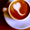
To add some more contrast and some more blue/cyan, I created a new levels layer (Layer > New Adjustment Layer > Levels). I played around with all of the channels - RGB to add shadows, red to add some cyan, green to add some green tones, and blues to add some blue tones. My settings were as follows:
RGB: 0 | 0.76 | 246
Red: 0 | 0.81 | 255
Green: 0 | 0.89 | 255
Blue: 0 | 0.96 | 255
to
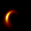
This step is completely optional. As a finishing touch for this picture, as I felt that my image needed it, I added a light texture that I made and set that layer to 'Screen', and then moved it around to my liking.
My layers palette appeared as follows:


to


to

Find your base picture and do your basic preparations. I just cropped my picture, but you can also sharpen it if you find that your picture is too blurry. Duplicate your base and set its blending mode to 'Screen'. I got my base from Yahoo!Movies, from the film The Golden Compass.

to

Flood fill a new layer with #c0ffff (a light blue-cyan) and set its blending mode to 'Soft Light'. This helps to balance out the yellows that are currently in my base. Blue and yellow are colour opposites, so if you're trying to get rid of yellow, add blue.

to

Duplicate the previous layer (the blue) and set its blending mode to 'Burn'. Again, this helps to balance out the overwhelming yellow in the base, and also adds some depth.

to

Now that we're overly blue, it's time to try and bring back some more natural skin tones into the picture. Add another flood fill layer, this time in #ffc0c0, a light pink. Set this layer to 'Burn' again, to add more depth to the picture.

to

Duplicate the previous pink layer. Set this layer to 'Soft Light', which will help to bring out the pinks in Nicole Kidman's skin. Soft light layers usually bring out a colour in a picture.

to

We're still really low on depth, so add a light gray layer (I used #c0c0c0) and set it to 'Burn'. This will help to bring out the shadows.

to

We still need more depth, and I don't want to completely overwhelm poor Nicole Kidman, so duplicate your base and bring it to the top of your layers. Set this layer to soft light.

to

Since the base had so much yellow in it, the previous step added even more yellow. Duplicate the previous layer and change it's Hue/Saturation. I desaturated mine completely by going Adjust > Hue and Saturation > Hue/Saturation/Lightness and setting the Saturation to -100.

and

to

then

There's still too much yellow, so duplicate the blue burn layer and bring it to the top. To bring out the reds in the picture and add some depth, duplicate the pink burn layer and drag that one to the top as well.

Now comes the technical stuff. Create a new Color Balance layer (Layers > New Adjustment Layer > Color Balance). Since there's so much yellow in the picture, you want to add some more blue to the picture. As well, I also added some cyan and magenta, to take away from the bright yellow feelings of the picture. The only settings I touched were Shadows and Midtones, and only the Blue/Yellow spectrum in Highlights. Make sure that 'Preserve Luminance' is checked.
My settings were as follows (click the setting for a preview):
Shadows: 1 | 12 | 40
Midtones: -30 | -13 | 21
Highlights: 0 | 0 | 17

The picture still felt too yellow and too bright, so I added a Levels layer (Layers > New Adjustment Layer > Levels). I toyed a little with each of the channels, using the RGB channel to brighten things up and add depth to the shadows, the Red channel to add some more cyan, the Green channel to add a little magenta, and the Blue channel to add some more blue. The settings I used for this picture were:
RGB: 0 | 0.69 | 247
Red: 15 | 0.92 | 255
Green:0 | 1.06 | 255
Blue:0 | 0.93 | 238

to

Since it was still too yellow, and I wanted to bring out the reds and magentas, I added a yellow layer (#ffff40) and set it to multiply. This seems rather contrary, but I find that I get the best results with the channel mixer while I'm removing colour.

Add a new Channel Mixer layer (Layers > New Adjustment Layer > Channel Mixer). I went to the blue channel and removed all of the yellow, and then went back up to the red channel to add some red and cyan and the green channel to add some magenta. My settings were as follows:
Red: 100 | 0 | -12 | 0
Green: 1 | 98 | -21 | 0
Blue: 6 | 44 | 200 | -6

At this point, I'm fairly satisfied with my final product, but I decided to make some last few tweaks. Opening a new Color Balance layer, I used the following settings to add some depth and shadows. A good looking image is generally highly contrasted (though too much contrast can also be blinding - you've got to be careful and use everything in moderation). The settings I used were:
Shadows: -4 | -6 | 10
Midtones: 10 | 6 | -5
Highlights: 0 | 0 | 0

This step is purely optional. I added a texture by 'Gender', becuase I felt that my finished product was still a little too plain. Since Nicole Kidman's character in this photo, Mrs. Coulter, is a very high-class lady, I stuck with somethingthat was simple, some leaves. I pasted the texture over top and set it to 'Multiply'.

My final product is still too magenta, so I go and add some greens to it to tone things down a bit. I used another colour balance layer, with the settings:
Shadows: 0 | 4 | 0
Midtones: 0 | 13 | 0
Highlights: 0 | 2 | 0
Since I only touched the middle box, there was no reason to include images of my settings.
My layers palette appeared as follows:


to


to

Find your base and prepare it. I found a picture of a coffee cup from the stock.xchng, a free online stock photo exchange. All I did to my base was crop and resize it, but you could also sharpen your base if you find it to be too blurry. Duplicate your base and set it to 'Burn'.

to

Create a new flood fill layer with a soft pink (I used #ffc0c0) and set it to soft light to bring out the pinky tones in the picture. I found the effect a little too overwhelming, so I lowered the opacity of that layer down to 30%.

to

To bring back some contrast to the picture, I created a new flood fill layer with a light gray (in this case, #c0c0c0) and set it to 'Burn'. This brings out the shadows of a picture and makes it darker altogether.

to

I duplicated my base layer, dragged it to the top, and set it to 'Soft Light'. This added more contrast to the picture, and helped to redefine the edges in the picture better than another flood fill layer would have.

to

Duplicate the previous layer again, leaving the layer blend mode at soft light. Since the colours were too overwhelming at this point, I desaturated the picture by going Adjust > Hue and Saturation > Hue/Saturation/Lightness and dragging the saturation down to -100. As well, the image was too dark, so I dragged the Lightness slider up to +57. Preview. The image was also looking a little flat, so I upped the contrast by going Adjust > Brightness and Contrast > Brightness/Contrast (Or Shift+B) and raising the contrast to +31. Preview.

to

Next, I decided that it was time for another channel mixer layer and so, as preparation, I flood-filled a layer with a light purple (I used #ffc0ff) and set it to 'Multiply'. The fun thing about channel mixer layers is that you can get the most interesting results from things that seem to make no sense at all, so it's good for experimentation.

I added a new channel mixer layer (Layers > New Adjustment Layer > Channel Mixer) and fiddled around with the settings on all of the channels, taking out the purple by adding green, cyan, and blue to the mix. This layer was making the picture too dark and so once I was done changing my settings, I set the layer to 'Screen'. My settings were as follows (Click for previews):
Red: 76 | -17 | -10 | 0
Green: 0 | 76 | 0 | 0
Blue: -28 | 0 | 96 | 0

It's still really magenta-toned, so it's time for some colour balance! Go Layer > New Adjustment Layer > Color Balance. Here I focused heavily on the blues and greens in the midtones and shadows sections of the tool pallette, and made sure that 'Preserve Luminance' was checked. My settings were:
Shadows: -1 | 21 | 26
Midtones: -49 | 0 | 39
Highlights: -31 | 0 | 35

To add some more contrast and some more blue/cyan, I created a new levels layer (Layer > New Adjustment Layer > Levels). I played around with all of the channels - RGB to add shadows, red to add some cyan, green to add some green tones, and blues to add some blue tones. My settings were as follows:
RGB: 0 | 0.76 | 246
Red: 0 | 0.81 | 255
Green: 0 | 0.89 | 255
Blue: 0 | 0.96 | 255

to

This step is completely optional. As a finishing touch for this picture, as I felt that my image needed it, I added a light texture that I made and set that layer to 'Screen', and then moved it around to my liking.
My layers palette appeared as follows:
