(no subject)
Results Post.
The person who came in 3rd place was.....
i_______loveyou with this icon
Well done on getting this far :D
Anonymous Criticisms
Now this are not meant in a spiteful way, it is just to let you see what people thought, and how you can improve. I have only included the criticisms that could help you.
Icon 1 -
- Washed out coloring especially around her chin and mouth. Pixelation around eyes. Border doesn't match the coloring of the icon.
Icon 2 -
- The coloring looks a bit drab and I don't like the symbol/brush used on the left.
- The colouring looks weird, making her look kind of green looking.
Icon 3 -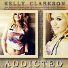
- it's not that i don't like it, it's just i love the other ones:) and the pics are tiny and it doesn't flatter kelly.
Voting Tally for Least Favourite
Icon 1 - 1
Icon 2 - 3
Icon 3 - 1
Final challenge will be up soon :D
Icon & Header mini-challenge
Round 2 Sign-ups