Digital Painting Tutorial
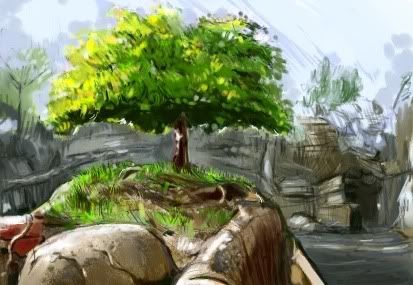
For some digital painting practice, I chose a reference photo of A Bug's Land at Disney's California Adventure, specifically the actual 'Ant Island' that's in the queue for It's Tough to Be a Bug.
Here's a walkthrough of the steps I took in Corel Painter 11.
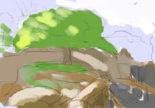
1. I start out using Digital Watercolor, doing a smooshy shapes and colors version, to figure out the basic composition. Actually, I started with an airbrush sketch underneath, which I forgot to screenshot.
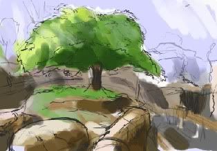
2. Next is another layer of loosey-goosey airbrush sketching over another round of Digital Watercolor. Some of these lines are pretty dark, but they're just meant to clarify my shapes. It looks very illustrationy at this point, but I always intended to have a traditional painting style for the finished version.
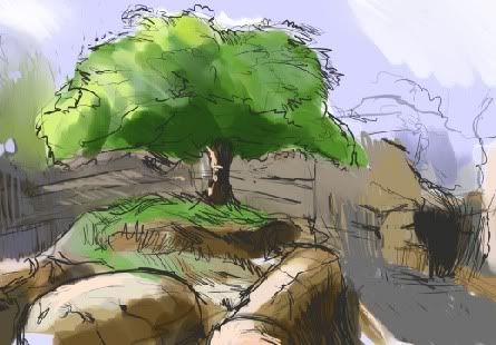
3. Some more sketching, and I start to color in the background here, mostly more airbrushing. I made two separate layers for the background and foreground, on top of the rough layers. (I later just started painting everything on the foreground layer. Oh, well.)
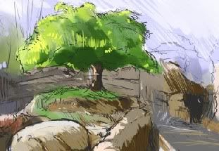
4. Did some basic colors for the foreground, more light and shadow definitions.
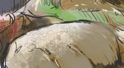
5. For stone texture I like to utilize the types of techniques I use when painting stone-walls or styrofoam rocks for theater sets, just the digital version. Over the basic colors I use the sponge tool to create a varied texture. Unfortunately, the digital sponge doesn't mimic the variations made by using a natural sponge on a real surface, so I improvise. I do several layers of light, midtone, and shadow colors, pulled from the colors already on the stone, or the surrounding colors.
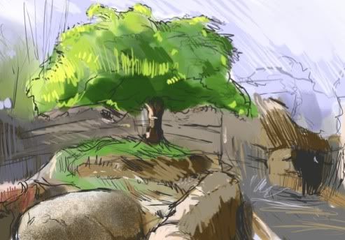
6. Here's a continuation of the rock sponging, while considering the shadows and form of the rock as I sponge on darker areas.

7. I went a step further and used the same technique on the surrounding rocks, island, and the tree, figuring the more texture the better. Our main bulbous rock got some more finessing with the Acrylic Dry Brush, and the details of the cracks.
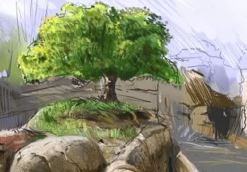
8. Now I'm really building up the details, and, channeling my inner Seurat, putting lots of crazy dots all over the tree to mimic the foliage. I'm using mostly Acrylic Dry Brushes from here on out.
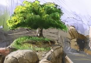
9. At this point, I went back to an earlier screenshot and realized I'd lost some of the tree's dimension. The under side of the foliage was darkened again, in an effort to restore that dimension. It's not true to the reference photo, but it adds to the weight of the form.
There was an initial problem with the composition in the reference photo- everything's naturally pointing to the entrance to the theater, that dark shape in the rock on the right. The tree seems to be reaching a leafy limb towards it, and even the rocks and pathways are leading your eye to it, besides being the darkest part of the image. I didn't decide what to do about that before hand, even though I wanted the tree to be the obvious focal point from the start. One word: drat. Or maybe, 'bother.'
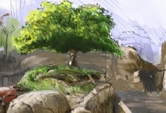
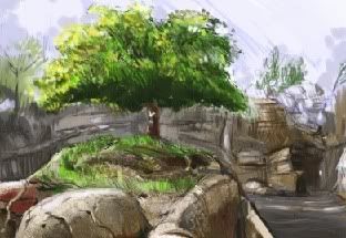
10. In these last few images I'm refining the canyon rock in the background, with shapes that define the forms in a basic way. Just went all out graphic-painterly here. The theater entrance on the right was also painted a lighter brown to down-play it.
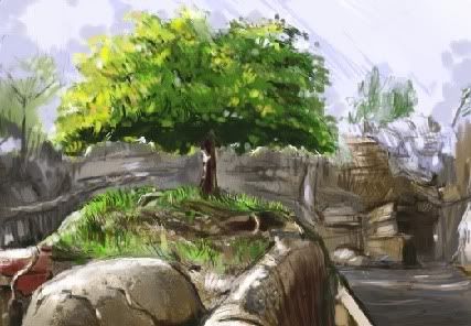
11. Also made the tree less leafy, and emphasized the part that was dark, the part that was green, and the part that was yellow.

12. Lastly, I messed around in Photoshop (Painter files can be saved directly into .psd files, to make the transition simpler). Made the background cooler (color wise, I mean), and upped the contrast and saturation. I'd already had these ideas in mind as I was painting, but using layers in Photoshop is less permanent.