[art wip] Designs 9 & 10
I'm feeling a trifle disheartened... So close to the end and my muses are running out of steam. Or perhaps we were rushing through it... :( Although I've managed to eke out designs that I have deemed acceptable, they seem to lack the buzz I have felt for the previous ones. ....sigh....
Anyway, I'll let you be the judge (and the critics, too!)

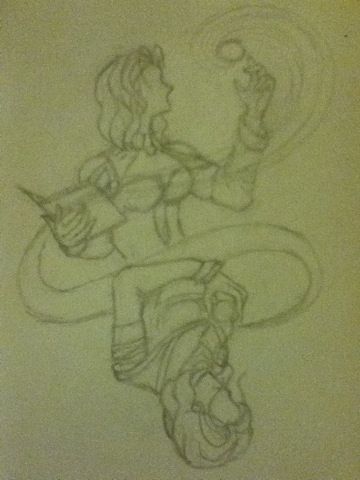
My plan is to have her sparkly magic be rainbow-like. I'm not sure I can fit all seven colours in so a rainbow effect will have to do. Even so, she seems lacklustre. ^^; I won't even tell you how many times I had to redraw her faces X(

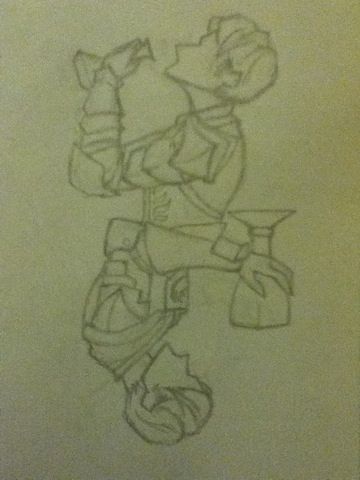
I like this better than the one above, but as I said he kinda lacks oomph! I like the aspects that I've chosen, but I'm just not sure I have represented them sufficiently.... The top is meant to depict his willingness to drink, whereas the bottom his reluctance/reservation in doing so. Yes, no? And on another semi-related note - armour = @_@
In any case, just two more to go! Dear muses, hold out a little longer!
Anyway, I'll let you be the judge (and the critics, too!)

My plan is to have her sparkly magic be rainbow-like. I'm not sure I can fit all seven colours in so a rainbow effect will have to do. Even so, she seems lacklustre. ^^; I won't even tell you how many times I had to redraw her faces X(

I like this better than the one above, but as I said he kinda lacks oomph! I like the aspects that I've chosen, but I'm just not sure I have represented them sufficiently.... The top is meant to depict his willingness to drink, whereas the bottom his reluctance/reservation in doing so. Yes, no? And on another semi-related note - armour = @_@
In any case, just two more to go! Dear muses, hold out a little longer!