my first tutorial!
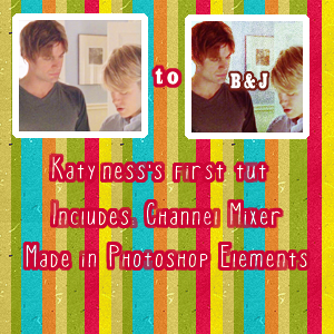
Squee! QAF has given me some inspiration so I have decided to make my first icon tutorial! Now, it was made in Photoshop Elements but I have used my Channel Mixer add-on, found here.
So here it is, featuring the amazing Brian and Justin from Queer as Folk!
NB. This tutorial only works on select images. I garuntee you that you will have to change the settings slightly to suit you.
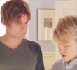
1. Start with your base image. I duplicated mine twice and set them on screen because I found it was too dark- but tweak this to your image. So I started with:
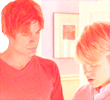
2. Next, pick a dark salmon colour from your palette. I used #EC2F31. Put this on a new layer and set it to Color Dodge. It may not look nice now, but later this will add a really gorgeous reddy undertone to the icon.
3.Then duplicate your base layer, drag it to the top and set it on Multiply. This is really to factor in more color and tone of the original image while keeping the pinky hue.
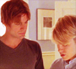
4. Duplicate your base layer again, and set this to soft light. This is mainly to add some contrast and more depth to the icon.
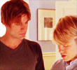
5. Still looks too salmon-y, huh? Well, add a Channel Mixer adjustment layer and use these settings:
Red Output: +72, 0, +10, +6
This 'washes' the image with a blue tone, but you can still see the red in the skin tones and dark bits of hair.
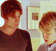
6. Next make a new color layer and fill it with a light blue hue, I picked #6FBAFF and set it on overlay 32%. This was a personal preference and it may not do much, but I felt it evened out the whole icon.
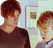
7. Then, I used this texture,
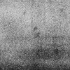
, by
sanami276 and set it on overlay. Then I erased the parts covering Brian, Justin and their clothes. I did this mainly to grunge up the background but also to add more contrast between the people and their setting.
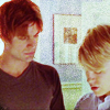
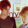
8. Last step! and this is optional. =D I added some text to the icon. I used Cairo 17pt in white, then simplified the layer and went to Edit-->Stroke and added a border of 2px with a dark colour from the image. In this case, I used the dark red from the middle of Justin's hair. Voila! Hope you liked it. =D
some other icons made using same technique:


(example 3 has a light yellow softlight layer because the original was too dark for my liking.)