Sun in the sky...
Ok, I've written this for Amy. :)
We'll be making an icon similar to the one I made for Faye, which is:
Yep, only I'll be making one of Tom this time.
First and foremost, this will be VERY image heavy, because the way I see it, if you're going to do something, do it right. So I'm going to be saving my progress every step and showing you what it looks like... Everything I'm going to cover I've learned from about six different tutorials, and I think smushing it into one will be way more effective than six or seven. Even if it ends up being a little long. *cough*
1. First, we find a picture. I'm going to be using this one. Copy paste it into Photoshop of course.
2. Select a band member ( I'm going with Tom ), and crop your picture so that you have him in the center. To crop, select

from the tool bar. Hold down the shift key, and click ont he picture. Drag out the little marquee box that comes out. Don't let go of the shift key until you've decided how big you want your square/how much of him you want. Holding down the shift key just makes it all proportioned so there isn't annoying guess work, or more cutting than you need. It saves loads of time. When you're done highlighting, double click in the center of what you've just highlighted. or right click and select Crop. It's all the same. You should now have the following.
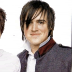
3. You're going to resize the picture now. At the top near file. Image > Image Size... A new pop up will appear.
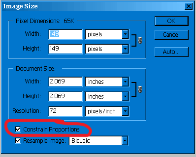
Click at the bottom where it says "Constrain proportions" ( this just proportions everything ) and then type 100 in Width. Height automatically changes so they're even. Here's what your first base looks like.
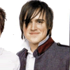
4. Now you need to actually prepare your base. This is when you sharpen, soften, brighten whatever. It looks a little dark to me, so I want to brighten it. Image > Adjustments > Variations ( all the way at the bottom of that menu, it took me ages to find it ). If you want it lighter, select where it says "Lighter" simple as that, then OK. At the top, select the Layer tab. You're going to go Layer > Duplicate Layer.
You'll get another pop up, hit enter. Layer > Layer Style > Blending Options. Once again you'll get a pop up. Select Soft Light from the Blend Mode menu.

Hit Enter. In the Layer window.
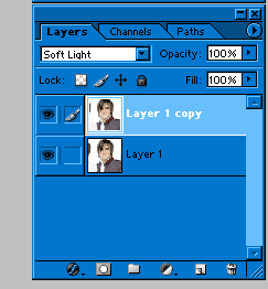
select the first original layer. Now to to ( at the top ) Filter > Sharpen. This is what you should have.

With the first layer still selected. Layer > Merge Visible ( all the way at the bottom of that tab ).
5. Layer > Duplicate ( yes again ). Layer > Layer Style > Blending options. Blending mode set to Screen and Opacity set to 25.
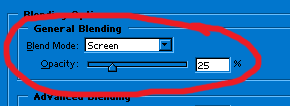
and it looks like this.
6. Select the first layer. Layer > Duplicate ( again ). Layer > Layer Style > Blending options. Blending mode set to Overly and opacity set to 40.
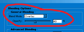
to look like
7. Create a new Layer. Layer > New > Layer. Flood fill that layer ( the paint bucket tool ) and at the bottom of your tools, make it color number BD915D. Then just click on the canvas and it'll flood fill. Now Layer > Layer Style > Blending options and set it to Multiply and opacity 14.
I've shown you how to change it, so I'm not going to keep print screening...
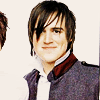
8. Go back to your first layer. You just want to have it selected.
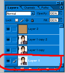
Layer > Duplicate Layer. It's going to come out on top of the layer you had selected so you need to click and drag it to the top.
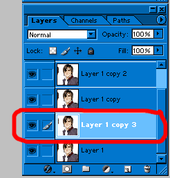
to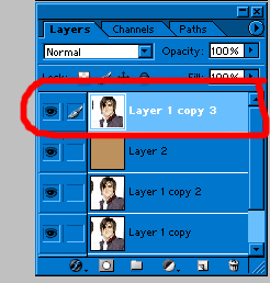
Keep that new layer selected and Layer > Layer Style > Blending options and set it to Overlay 74.

9. Take this texture: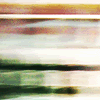
by _dysfunction and copy paste it over that last layer. Ctrl V or Edit > Paste.
10. We're going to do a mask now. At the bottom of your layers window, you'll see a little camera type looking thing. The circled one at the bottom. It'll create what the arrow is pointing at.
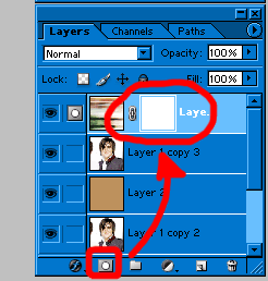
You'll notice that once you do that, your colors ( on the tools part ) go to black and white. One is to erase, the other is to repaint. You have to have the little white part of the layer selected ( just click on it if you're not sure which is selected ). Take your brush tool, a nice round one, in black as that's the erasing one, and brush over where you remember the face was. Don't worry about staying within the lines. Just do a rough outline, you can fix it.
You'll notice that on the layers window, the white part will start having some black in it. That's the part you're erasing off of the mask.
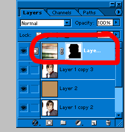
and your icon now looks like
11. Switch the black and white. The white fills in, you need to fill the edges around his face and shoulders ( although really the shoulders don't matter much unless you put a large part of him in the icon, and if you did, be careful because the background of that picture was white to begin with. The exact reason I'm using Tom as an example instead of anyone else ). Just change the size of your brush to a smaller one if you used a big one to erase, and go around him until you finish having what you want. If you make a mistake, switch to black to erase, then back to white.
It seems like a pain in the ass, but it's so much better than the actual eraser.
If you can't tell where the shoulders end and the background starts, make them up. Plain and simple.
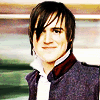
You might want to save your work, I reccomend doing it every so often, just in case. Save it as a PSD though, a photoshop file, just in case, that way you can go back and fix things in their individual layers.
12. Make a new layer. Layer > New > Layer. Take your paint bucket, and flood fill that layer in white. Layer > Layer Style > Blending Options. Set it to Lighten. You're going to take that

brush by sanamu267 and paste it into Photoshop. Not onto the layer you already have, a new image.
You're going to turn it into a brush by going Edit > Define Brush.
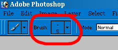
Click the arrow, and when the menu drops down, scroll all the way to the bottom where you'll see the newest addition to the brushes. Set the palate to black, the color in use anyway. Then just click where the face was and it'll clear out. You can do it once int he middle and get the ugly break, or one on each side.
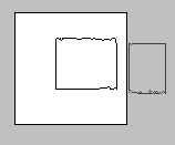
and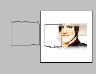
to get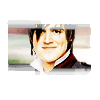
I'm going to add something on the corners witht hat same brush, cause i don't like it just in the middle, and I'll end up with.
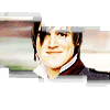
13. Because I want it to be a little more colorful, I'm going to add another texture.

by modernsecret
And put it below the white layer, then Layer > Layer Style > Blending options and set it to Lighten 67.

14. This is the hard part. You could put something on it, or not, it's up to you really. I'm going to go with a McFly lyric from "Ultraviolet" ( since that's what's playing right now ). First do one, then make another text layer and finish your text, or enter, however you like, and get...

15. Save as a PNG or a GIF and you're done.
The end. :D
Now let me see what you've made.
We'll be making an icon similar to the one I made for Faye, which is:
Yep, only I'll be making one of Tom this time.
First and foremost, this will be VERY image heavy, because the way I see it, if you're going to do something, do it right. So I'm going to be saving my progress every step and showing you what it looks like... Everything I'm going to cover I've learned from about six different tutorials, and I think smushing it into one will be way more effective than six or seven. Even if it ends up being a little long. *cough*
1. First, we find a picture. I'm going to be using this one. Copy paste it into Photoshop of course.
2. Select a band member ( I'm going with Tom ), and crop your picture so that you have him in the center. To crop, select

from the tool bar. Hold down the shift key, and click ont he picture. Drag out the little marquee box that comes out. Don't let go of the shift key until you've decided how big you want your square/how much of him you want. Holding down the shift key just makes it all proportioned so there isn't annoying guess work, or more cutting than you need. It saves loads of time. When you're done highlighting, double click in the center of what you've just highlighted. or right click and select Crop. It's all the same. You should now have the following.

3. You're going to resize the picture now. At the top near file. Image > Image Size... A new pop up will appear.

Click at the bottom where it says "Constrain proportions" ( this just proportions everything ) and then type 100 in Width. Height automatically changes so they're even. Here's what your first base looks like.

4. Now you need to actually prepare your base. This is when you sharpen, soften, brighten whatever. It looks a little dark to me, so I want to brighten it. Image > Adjustments > Variations ( all the way at the bottom of that menu, it took me ages to find it ). If you want it lighter, select where it says "Lighter" simple as that, then OK. At the top, select the Layer tab. You're going to go Layer > Duplicate Layer.
You'll get another pop up, hit enter. Layer > Layer Style > Blending Options. Once again you'll get a pop up. Select Soft Light from the Blend Mode menu.

Hit Enter. In the Layer window.

select the first original layer. Now to to ( at the top ) Filter > Sharpen. This is what you should have.

With the first layer still selected. Layer > Merge Visible ( all the way at the bottom of that tab ).
5. Layer > Duplicate ( yes again ). Layer > Layer Style > Blending options. Blending mode set to Screen and Opacity set to 25.

and it looks like this.

6. Select the first layer. Layer > Duplicate ( again ). Layer > Layer Style > Blending options. Blending mode set to Overly and opacity set to 40.

to look like

7. Create a new Layer. Layer > New > Layer. Flood fill that layer ( the paint bucket tool ) and at the bottom of your tools, make it color number BD915D. Then just click on the canvas and it'll flood fill. Now Layer > Layer Style > Blending options and set it to Multiply and opacity 14.
I've shown you how to change it, so I'm not going to keep print screening...

8. Go back to your first layer. You just want to have it selected.

Layer > Duplicate Layer. It's going to come out on top of the layer you had selected so you need to click and drag it to the top.

to

Keep that new layer selected and Layer > Layer Style > Blending options and set it to Overlay 74.

9. Take this texture:

by _dysfunction and copy paste it over that last layer. Ctrl V or Edit > Paste.
10. We're going to do a mask now. At the bottom of your layers window, you'll see a little camera type looking thing. The circled one at the bottom. It'll create what the arrow is pointing at.

You'll notice that once you do that, your colors ( on the tools part ) go to black and white. One is to erase, the other is to repaint. You have to have the little white part of the layer selected ( just click on it if you're not sure which is selected ). Take your brush tool, a nice round one, in black as that's the erasing one, and brush over where you remember the face was. Don't worry about staying within the lines. Just do a rough outline, you can fix it.
You'll notice that on the layers window, the white part will start having some black in it. That's the part you're erasing off of the mask.

and your icon now looks like

11. Switch the black and white. The white fills in, you need to fill the edges around his face and shoulders ( although really the shoulders don't matter much unless you put a large part of him in the icon, and if you did, be careful because the background of that picture was white to begin with. The exact reason I'm using Tom as an example instead of anyone else ). Just change the size of your brush to a smaller one if you used a big one to erase, and go around him until you finish having what you want. If you make a mistake, switch to black to erase, then back to white.
It seems like a pain in the ass, but it's so much better than the actual eraser.
If you can't tell where the shoulders end and the background starts, make them up. Plain and simple.

You might want to save your work, I reccomend doing it every so often, just in case. Save it as a PSD though, a photoshop file, just in case, that way you can go back and fix things in their individual layers.
12. Make a new layer. Layer > New > Layer. Take your paint bucket, and flood fill that layer in white. Layer > Layer Style > Blending Options. Set it to Lighten. You're going to take that

brush by sanamu267 and paste it into Photoshop. Not onto the layer you already have, a new image.
You're going to turn it into a brush by going Edit > Define Brush.

Click the arrow, and when the menu drops down, scroll all the way to the bottom where you'll see the newest addition to the brushes. Set the palate to black, the color in use anyway. Then just click where the face was and it'll clear out. You can do it once int he middle and get the ugly break, or one on each side.

and

to get

I'm going to add something on the corners witht hat same brush, cause i don't like it just in the middle, and I'll end up with.

13. Because I want it to be a little more colorful, I'm going to add another texture.

by modernsecret
And put it below the white layer, then Layer > Layer Style > Blending options and set it to Lighten 67.

14. This is the hard part. You could put something on it, or not, it's up to you really. I'm going to go with a McFly lyric from "Ultraviolet" ( since that's what's playing right now ). First do one, then make another text layer and finish your text, or enter, however you like, and get...

15. Save as a PNG or a GIF and you're done.
The end. :D
Now let me see what you've made.