Results Challenge # 2 Session Three
Hello everybody! Finally we have results challenge # 2. I'm really upset that it took us so long to get results...
Thanks for your votes!
This time we have one eliminated and one winner.
Eliminated:
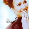
lihana
So sorry! Thanks for participation! Hope to see you next session!
People's choice:

loving_w
Congrats!!!
Banner
Mod's choice:

marinameira
I really love the composition, it's so unique. Colouring is soft and fits the icon.
Banner
Results:
1. + + +
2. - - - -
3. - - / + + + +
4. - / + + +
5. - - - - - / + +
6. - -
7. - - - / + +
8. - / + + +
9. +
Reasons:
negative:
# 2
- bad color and texture use.
- unnatural skin coloring, and the white splash is distracting
- the image is stretched which gives an awkward image. The light texture is overpowering
- This cropping doesn't work well, it makes her head look like a wrong shape. Colors are pretty though.
# 3
- washed-out colors and plain cropping
- dull colouring
# 4
- too bright and this J; + sky texture don't look very well
# 5
- overcontrasted, oversharpened, text looks no t so good and font doesn't fit
- Too beige coloring. The icon is overall too simple and boring.
- too sharpen and contrast
- White text on the background is very bright and blinding, almost impossible to tell what it is and the bright coloring is overwhelming with that background.
- too sharpened and oversaturated
# 6
- seems like nothing much is done with this icon, kind of boring.. needs texture use / text or brush..
- too simple
# 7
- too simple, icon need more contrast
- Icon is very simple. B&W color don't fit to the icon.
- It seems very plain, I can't tell that anything was done other than turning it black and white.
# 8
- Bad use of texture and coloring. The coloring is very beige and unattrcative and the texture chosen doesn't fit the picture, it also cuts right through her shoulder.
positive:
# 1
- nice crop and colour
- Nice coloring (just a tad to blue though) and crop.
- great cropping
# 3
- Dull coloring but nice texture use.
- I like the use of texture, it's interesting but not overwhelming.
- Colors are good and texture use is good too.
- nice coloring and use of textures
# 4
- Like texture use!
- nice soft colors
- The coloring is nice and crisp, and the "j;" thingy in the background is a unique idea.
# 5
- Great color!
- lovely composition and colouring
# 7
- really nice b/w colors and crop
- good cropping. and makes the icon b/w works really well.
# 8
- nice composition
- good use of texture(s)
- fantastic coloring, coloring and use of textures
# 9
- gorgeous colouring and cropping
Thanks for your votes!
This time we have one eliminated and one winner.
Eliminated:

lihana
So sorry! Thanks for participation! Hope to see you next session!
People's choice:

loving_w
Congrats!!!
Banner
Mod's choice:

marinameira
I really love the composition, it's so unique. Colouring is soft and fits the icon.
Banner
Results:
1. + + +
2. - - - -
3. - - / + + + +
4. - / + + +
5. - - - - - / + +
6. - -
7. - - - / + +
8. - / + + +
9. +
Reasons:
negative:
# 2
- bad color and texture use.
- unnatural skin coloring, and the white splash is distracting
- the image is stretched which gives an awkward image. The light texture is overpowering
- This cropping doesn't work well, it makes her head look like a wrong shape. Colors are pretty though.
# 3
- washed-out colors and plain cropping
- dull colouring
# 4
- too bright and this J; + sky texture don't look very well
# 5
- overcontrasted, oversharpened, text looks no t so good and font doesn't fit
- Too beige coloring. The icon is overall too simple and boring.
- too sharpen and contrast
- White text on the background is very bright and blinding, almost impossible to tell what it is and the bright coloring is overwhelming with that background.
- too sharpened and oversaturated
# 6
- seems like nothing much is done with this icon, kind of boring.. needs texture use / text or brush..
- too simple
# 7
- too simple, icon need more contrast
- Icon is very simple. B&W color don't fit to the icon.
- It seems very plain, I can't tell that anything was done other than turning it black and white.
# 8
- Bad use of texture and coloring. The coloring is very beige and unattrcative and the texture chosen doesn't fit the picture, it also cuts right through her shoulder.
positive:
# 1
- nice crop and colour
- Nice coloring (just a tad to blue though) and crop.
- great cropping
# 3
- Dull coloring but nice texture use.
- I like the use of texture, it's interesting but not overwhelming.
- Colors are good and texture use is good too.
- nice coloring and use of textures
# 4
- Like texture use!
- nice soft colors
- The coloring is nice and crisp, and the "j;" thingy in the background is a unique idea.
# 5
- Great color!
- lovely composition and colouring
# 7
- really nice b/w colors and crop
- good cropping. and makes the icon b/w works really well.
# 8
- nice composition
- good use of texture(s)
- fantastic coloring, coloring and use of textures
# 9
- gorgeous colouring and cropping