PS7 Tutorial 10: Ferris Wheels feat. Cordelia & Angel
I'm in an 
art_battle with the most fantabulous graphic maker,
moondancerjen and for our last volley, we're supposed to make an art piece with our favorite couple and write a tutorial on how to make it since we were following icon tutorials in the previous volleys by other artists to see if they translated well to bigger pieces. This is mine. Today, we will be making Ferris Wheels, as I like to call the piece, starring my favorite couple, Cordelia Chase & Angel of Angel and Buffy The Vampire Slayer.
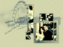
There are about 22 steps that I drafted out. I made the wallpaper before I wrote the tutorial, so if you see some things that I didn't cover - that's why. Okay, on with the tutorial:
Step One - Gray Background
Start off with your blank canvas - any size is good, but I would recommend anything above 800x600. I used a 1024x768 canvas and filled in it with a gray-ish color - #E3E3E7.
Step Two - Pattern
Create a new layer on top of that and fill it with a pattern. Any pattern is good, but don't fill it with something that looks too abstact, no light textures, stuff like that. Make it a bit more traditional. I used this one [link] and played around the hue and saturation of it, blending it into the background color.

Step Three - Polaroids
Add in your brushes now. I took these great polaroids from
sanami276 [ link] and put them all over and resized and repositioned them and such. In the example below, you'll see pictures alreadt in the smaller boxes - this is because I wrote the tutorial after I made the wallpaper.
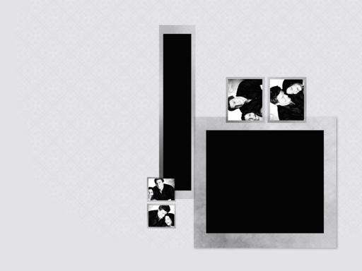
Step Four - Biggest Box
Now go ahead and add your pictures in. I created a manipulated picture of Cordelia and Angel from a Luke and Lorelai promotional image before I started the wallpaper and dragged it onto the wallpaper. Setting it in the largest box, I set it to lighten and cut away the excess of the picture. Once you did that, duplicate it, desaturate it and set it to hard light.
Step Five - Rectangular Box
Drag the same picture, or a different one - your choice - into the long rectangular box and repeat the same steps above.
Step Six*** - smaller boxes
For the smaller pictures, I chose the cute promo pictures of David and Charisma. Pay close attention now - Start off with only ONE SMALL BOX SET and set your pictures in them. You can repeat the steps above if you want. I simply desaturated both of them and set them to lighten, cut away the excess. Now, merge the polaroid and pictures together - for this set only. Duplicate, resize and reposition. This is what you should end up with, or something like it:
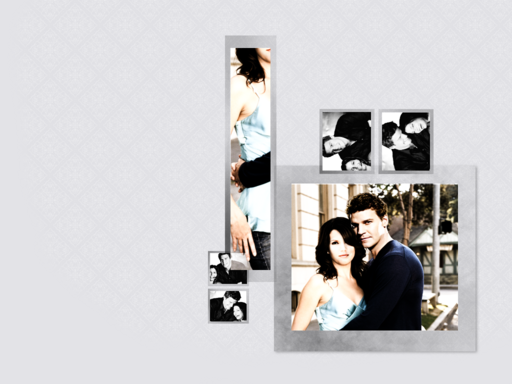
Go ahead and start brushing away some of the pattern, so that it looks blending into the gray color behind it.
Step Seven - Shadow Boxes pt1
Now, here comes the tricky part. Behind the polaroids, use the rectangular marquee tool and create a space behind the pictures. You can change this around so don't think that this is permanent. Once you have your area selected, right click on the area and select fill. Choose pattern - preferrably the one you used before for the background, but you can use another if you like. Deselect the area and adjust the color. I went with a blue-purple-ish color to offset the gray. Image - Adjustments - Hue/Saturation (Ctrl + U)
Step Eight - Shadow Boxes pt2
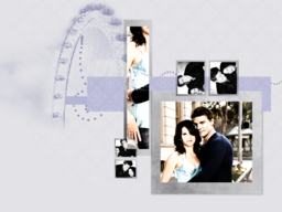
Right after that, add another empty space with the rectangular marquee and fill it with the offset color that you just picked out. here's what I have so far:

Step Nine - Fun Brushes
Now we get to the fun part - Brushes! Fun Ones! I got some from Orchidee [link] and I added in my own self made dots.
Step Ten - Color Layers
On top of it all - add in an exclusion layer - #02023C
Next - a color burn layer - #B9F5FA
One more - Overlay @ 40% - #F5AAF2
Step Eleven - Variations
Select - All
Edit - Copy Merged
Edit - Paste
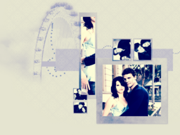
Next, go to Image - Adjustments - Variations. Add in some yellow, red, cyan, magenta or whatever color combination you like and any level. Tinker with it, get the look that you want. This is what I got:
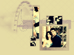
Step Twelve - More Variations
Duplicate your variation layer and desaturate it. Auto contrast this layer (Image - Adjustments - Auto Contrast). Set it to Soft Light @ 60%. Duplicate the desaturated layer again and set it to Multiply @ 60%.
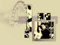
Step Thirteen - Text
Start adding in your text. Wherever you want.
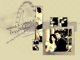
Step Fourteen - That Blue Layer Again
Remember that color burn layer? Find it, and drag it all the way on the top. And voila! - Moons & Junes & Ferris Wheels

Credits:
D-Boreanaz.com
Charisma Carpenter . net
Charisma Online
ask.com - Ferris Wheels
orchidee

sanami276

art_battle with the most fantabulous graphic maker,

moondancerjen and for our last volley, we're supposed to make an art piece with our favorite couple and write a tutorial on how to make it since we were following icon tutorials in the previous volleys by other artists to see if they translated well to bigger pieces. This is mine. Today, we will be making Ferris Wheels, as I like to call the piece, starring my favorite couple, Cordelia Chase & Angel of Angel and Buffy The Vampire Slayer.

There are about 22 steps that I drafted out. I made the wallpaper before I wrote the tutorial, so if you see some things that I didn't cover - that's why. Okay, on with the tutorial:
Step One - Gray Background
Start off with your blank canvas - any size is good, but I would recommend anything above 800x600. I used a 1024x768 canvas and filled in it with a gray-ish color - #E3E3E7.
Step Two - Pattern
Create a new layer on top of that and fill it with a pattern. Any pattern is good, but don't fill it with something that looks too abstact, no light textures, stuff like that. Make it a bit more traditional. I used this one [link] and played around the hue and saturation of it, blending it into the background color.

Step Three - Polaroids
Add in your brushes now. I took these great polaroids from

sanami276 [ link] and put them all over and resized and repositioned them and such. In the example below, you'll see pictures alreadt in the smaller boxes - this is because I wrote the tutorial after I made the wallpaper.

Step Four - Biggest Box
Now go ahead and add your pictures in. I created a manipulated picture of Cordelia and Angel from a Luke and Lorelai promotional image before I started the wallpaper and dragged it onto the wallpaper. Setting it in the largest box, I set it to lighten and cut away the excess of the picture. Once you did that, duplicate it, desaturate it and set it to hard light.
Step Five - Rectangular Box
Drag the same picture, or a different one - your choice - into the long rectangular box and repeat the same steps above.
Step Six*** - smaller boxes
For the smaller pictures, I chose the cute promo pictures of David and Charisma. Pay close attention now - Start off with only ONE SMALL BOX SET and set your pictures in them. You can repeat the steps above if you want. I simply desaturated both of them and set them to lighten, cut away the excess. Now, merge the polaroid and pictures together - for this set only. Duplicate, resize and reposition. This is what you should end up with, or something like it:

Go ahead and start brushing away some of the pattern, so that it looks blending into the gray color behind it.
Step Seven - Shadow Boxes pt1
Now, here comes the tricky part. Behind the polaroids, use the rectangular marquee tool and create a space behind the pictures. You can change this around so don't think that this is permanent. Once you have your area selected, right click on the area and select fill. Choose pattern - preferrably the one you used before for the background, but you can use another if you like. Deselect the area and adjust the color. I went with a blue-purple-ish color to offset the gray. Image - Adjustments - Hue/Saturation (Ctrl + U)
Step Eight - Shadow Boxes pt2
Right after that, add another empty space with the rectangular marquee and fill it with the offset color that you just picked out. here's what I have so far:

Step Nine - Fun Brushes
Now we get to the fun part - Brushes! Fun Ones! I got some from Orchidee [link] and I added in my own self made dots.

Step Ten - Color Layers
On top of it all - add in an exclusion layer - #02023C
Next - a color burn layer - #B9F5FA
One more - Overlay @ 40% - #F5AAF2
Step Eleven - Variations
Select - All
Edit - Copy Merged
Edit - Paste

Next, go to Image - Adjustments - Variations. Add in some yellow, red, cyan, magenta or whatever color combination you like and any level. Tinker with it, get the look that you want. This is what I got:

Step Twelve - More Variations
Duplicate your variation layer and desaturate it. Auto contrast this layer (Image - Adjustments - Auto Contrast). Set it to Soft Light @ 60%. Duplicate the desaturated layer again and set it to Multiply @ 60%.

Step Thirteen - Text
Start adding in your text. Wherever you want.

Step Fourteen - That Blue Layer Again
Remember that color burn layer? Find it, and drag it all the way on the top. And voila! - Moons & Junes & Ferris Wheels

Credits:
D-Boreanaz.com
Charisma Carpenter . net
Charisma Online
ask.com - Ferris Wheels
orchidee

sanami276