Me 'n' my GIMP made icons.
And I don't mean that in the politically incorrect way.
I have learned to use four whole tools on my GIMP (Graphical Something Manipulation Program or words to that effect--anyway, a freeware Photoshop relative). Or perhaps "learned to use" is glorifying things a bit--I now know where four tools are located and can fiddle with them and make them do things (unlike the other tools whose location I know but which I cannot for the life of me make work despite frantic clicking). So, obviously, these attempts at icons are madly amateurish, and still glitchy in ways that I don't understand. The text (and sometimes the pics) looks fine in my pictures folder but blurry when I upload them.
Nonetheless, I made 'em and by god I'm going to publish them (but in a place that very few people will see them until I get better at this. I'm not a complete idiot).
Eight for Heroes, one for Harry Potter (from the OotP movie):


I swear this ^ did not have a bright blue border when I uploaded it. (Borders are one of the 341,678,394,234,729.6 to the google-eth power things I don't know how to do.) See what I mean? This is also my biggest disappointment, since I struggled to cut out the roach and move it up front to make it bigger, only to realize that a bigger giant hissing cockroach on a 100x100 canvas still looks like a smudge.
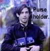



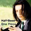
The whole reason I began this exercise was that this ^ was one of the funniest things I've seen on TV in months and I wanted an icon of it. I thought it would be so easy to just crop a screencap. Well. I have gone through about 7,003 versions, of which these two are the best. So you can see how awful most of them were.
If anyone out there has made or can make icons and would like to give me tips, I will bake cookies or something in return.
I have learned to use four whole tools on my GIMP (Graphical Something Manipulation Program or words to that effect--anyway, a freeware Photoshop relative). Or perhaps "learned to use" is glorifying things a bit--I now know where four tools are located and can fiddle with them and make them do things (unlike the other tools whose location I know but which I cannot for the life of me make work despite frantic clicking). So, obviously, these attempts at icons are madly amateurish, and still glitchy in ways that I don't understand. The text (and sometimes the pics) looks fine in my pictures folder but blurry when I upload them.
Nonetheless, I made 'em and by god I'm going to publish them (but in a place that very few people will see them until I get better at this. I'm not a complete idiot).
Eight for Heroes, one for Harry Potter (from the OotP movie):


I swear this ^ did not have a bright blue border when I uploaded it. (Borders are one of the 341,678,394,234,729.6 to the google-eth power things I don't know how to do.) See what I mean? This is also my biggest disappointment, since I struggled to cut out the roach and move it up front to make it bigger, only to realize that a bigger giant hissing cockroach on a 100x100 canvas still looks like a smudge.


The whole reason I began this exercise was that this ^ was one of the funniest things I've seen on TV in months and I wanted an icon of it. I thought it would be so easy to just crop a screencap. Well. I have gone through about 7,003 versions, of which these two are the best. So you can see how awful most of them were.

If anyone out there has made or can make icons and would like to give me tips, I will bake cookies or something in return.