Cover art
I found a forum thread comparing PAL, JPN and NTSC box art. Very interesting. North American covers tend not to be abstract; they usually feature one or more characters up front, making angry faces and waving their weapons, while sections of other people's faces float around the background. It's probably related to American Kirby is Hardcore.
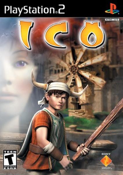
One of the most infamous is ICO. (Note: I have not played ICO. No Playstation 2, sorry. I'm currently watching an LP, though.) Almost everyone agrees that the original cover is nice while the NTSC version is a bucket of ugly. The original is a beautiful piece inspired by Giorgio de Chirico's The Nostalgia of the Infinite. It shares Nostalgia's long shadows and two small figures surrounded by architectural behemoths. This fits the game quite well, since you spend the game wandering around an enormous empty castle with only one other person for company. It also represents the game properly: artistic, atmospheric, and relying on thought rather than action. The shadows are one of my favourite things; I love the contrast and how tall it makes the buildings look. The NA version is extremely typical of NTSC covers. The castle is small and dull-looking, the figures don't look like the characters at all, and it makes it seem like the game is louder and more action-oriented than it actually is. Everything is blurred together and nothing about the layout is interesting.
Minimalism and contrast are great and make box art stand out. Compared to PAL and JPN versions, a lot of NTSC box art is overloaded with things that don't need to be there, and for some reason, seems really blurry.
Also, there isn't anything wrong with "artsier" covers. Art isn't supposed to be inaccessible to the general public. This includes abstract art; the artist will often think, "How do I make the viewers feel X," where X is a very common thing, like heat or sadness, and the viewers are anyone who happens across the work.
JPN cover art can go too far in the other direction. This article has several good examples. When a game features tanks and explosions, it's probably not represented well by a tree in a park. And not everything has to be cutesy and attractive and moe moe, which tends to happen with JPN covers. NA versions do sometimes improve upon a bland JPN cover by making it more dynamic.
PAL covers tend towards the abstract, which is nice but doesn't tell you a lot about the game. NTSC covers showing the characters has the advantage of informing you who you're going to spend the game with. You don't want to wait until after you get the game to find out that you can't stand the protagonists.
As for book covers... there is a trend among the girl-oriented, YA, possibly fantasy novels. They have a black background and some sort of smallish object providing the only colour (and it's usually only one colour), and sometimes there's a shadowy person whose face is never shown, interacting with the object. I think it's supposed to mimic Twilight's covers. This sort of design is not new; I've seen it used to market children's or fantasy books to adults, because it's more mature or respectable-looking or something. But the reason YA fantasy novels for girls picked this up is likely because of Twilight, and it's getting annoying because all of them look the same. You'd think they'd try to make the book seem unique, but apparently it pays to be like Twilight.
*****
I agreed with what this person said about the ICO cover, but what they said at the end bugged me a lot. I agree that it is nice to help a girl out for altruistic reasons, and not some bullshit like "she's a girl so if you save her you get her in the end." And I agree that the relationship between Ico and Yorda is mostly unromantic, that it's a very chaste relationship and he's helping her out of the goodness in his heart. I considered young both of them are; at that age, it's better to have fun and be happy instead of worrying about love and having a significant other.
However, the reviewer says that because Yorda is about a foot taller than Ico, the game somehow "instantly signal[s] to the player that this is not a romantic relationship." First of all, Ico is around ten. Yorda is maybe a few years older. Saying Ico is not tall enough to be Yorda's love interest is like picking on him for not being able to grow facial hair. At that age, guys can be pretty short. Girls tend to get growth spurts first. Second, why does it matter? Height is, in my opinion, such an irrelevant thing when it comes to falling in love. So what if the eHarmony newsletter mentioned in the article said that women prefer men who are taller than them? That study (if it was indeed a study) does not, cannot speak for all women. It certainly can't speak for a fictional princess. I bet that, even if when Yorda and Ico were older and Yorda was still taller than Ico, she could still fall in love with him.
Besides, some women are quite tall, and some men quite short. If they want to get together, the "wrong" person being taller should never be an obstacle. Height should not imply anything about a person's personality, compatibility, or the dynamics of a relationship. This is why I hate the One Head Taller trope with every fibre of my being.