Colouring Tutorial

Okay, so twinsfan33 nicely asked me would I do a tutorial on how I achieve my colouring; and rather than doing a tut on how to achieve a specific colouring I am going to make a post with tips on how I generally go about colouring and pictures/screencaps etc. Obviously you will have to experiment with the settings depending on the image you are using (if it is light/dark etc.)
STEP 1.
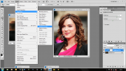
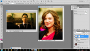
The first thing I do is choose my image; in this tutorial I am going to be working with an event picture of Danneel Ackles and also a screen cap from White Collar.
If the image is very large I will usually re-size it to about half the original size - I do not crop anything until I have done all my colouring.

[click for larger]
STEP 2.
The next step is adding a brightness adjustment layer. I usually set it to about 50-70 depending on how dark the image is - on screencaps I don't go too high as it can make the cap pixelated.

[click for larger]
I then go on and add a 'Layer Style' of 'Gradient Overlay' - I always choose the gradient that moves from black to a colour; such as white or in this case a pale yellow.


[click for larger]
As you can see this already has made a huge change to the colouring of the image.
STEP 3.
To make the colours stand out more I always add a 'Vibrance Adjustment Layer' - in this case I put it all the way up to 100, but as I said before, it depends on the image you are using so you will tell how far is enough when you are doing it yourself.

[click for larger]
This has enhanced the colours that are already in the image.
STEP 4.
The next step I make is to add a 'Selective Colour' layer. I usually only work with the 'Neutrals' colour and make adjustments to 'Yellow' and 'Magenta' - in this case I have only played around with 'Yellow', increasing it to +15.

[click for larger]
STEP 5.
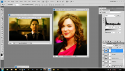
I then add a 'Curves' layer to add a little bit of brightness to the image. I stay in RGB and generally only move it slightly as it is only to enhance the brightness.

[click for larger]
STEP 6.
Sometimes, but not always (especially if the image is already dark) I add a 'Levels Layer' I only adjust the middle grey button slightly as too much will make the image far too dark.

[click for larger]
STEP 6.1.
Sometimes the image can be a little too dark, like the White Collar cap. So when this happens I usually 'Duplicate' the image and then set it to 'Screen' - once again adjusting the % depending on how it looks - for this I have set the screen percentage to 100% because it looked ok that way.

[click for larger]
STEP 7.
Once I have created the colouring that I want I then 'Sharpen' the image - sometimes the sharpness needs to be faded to stop the image becoming pixelated.


[click for larger]
STEP 8.
This is when I merge all the layers together [ Ctrl + Shift + E ] and then crop it and make icons XD
If you have any questions let me know and I will try and answer let as best as I can ;)