cakes in space: a peek at the illustration process
Some of my illustration in my new book with Philip Reeve, Cakes in Space, are quite complicated, so here's a breakdown of how I've made one of them. This scene shows a battle between a strange, black-spaghetti-like alien, astronaut Astra, Pilbeam the robot and a host of mutant killer cakes. (Such a traditional children's book scene, right? I love being able to dream up this stuff with Philip.)

Thumbnails: First I start by making rough 'thumbnail sketches' of possible scenes in the book. They're called thumbnails because they're tiny, just large enough to give our designer at Oxford University Press an idea of where things might go on the page, so she can figure out where the text could fit in. You can spot these two pages in the middle of the bottom row. (I drew lots of thumbnails all on one page together.)

'Who was your designer?', you may ask. Well, here she is, the lovely and talented Jo Cameron, on the left, in her wonderful colour-coordinated orange and black dress. The other two people are Liz Cross, our publisher (in the centre), and our editor, Clare Whitston, on the right (wearing the fascinators Jo made).

Back to work.... I added a bit of blackness on the stretched-out spaghetti alien to show Jo that I didn't want the text to go on its body. And she e-mailed it back like this, with text.

Pencil roughs: Then I made a more detailed version in pencil (called a 'pencil rough'). It's still scratchy and full of mistakes, but I have a much better idea of what's going to go on the page. (This is the version that a lot of reviewers saw, in the 'Uncorrected Proof Copy', a printed version of the book with only about half of my artwork completed.)

Going to INK: This is my favourite bit, the inking. I love it because I've already made the big stressful decisions about where everything will go, and I can have fun with the details and focus on making the line look nice. I dip an old-fashioned metal nib into India ink and trace over the pencil on a lightbox. I like doing it this way because I don't have to go back and erase the pencil, and risk smudging the ink.
A good tip, if you're drawing with a nib and India ink: the ink clogs the nib very quickly, so have a little jar of water nearby. Every few minutes, you can dip the nib into the water and wipe off the extra ink and water on a cloth or some kitchen roll. If you let the ink dry on the nib, you'll need to boil the kettle and swish the nib around in your teacup with a toothpick, until the ink comes off.

This is a different page, but it's a closeup of me inking some of the mutant cakes. They were super-fun to draw! I didn't use expensive paper, just cheap drawing cartridge. If the paper was too thick, I wouldn't have been able to see through it clearly enough to trace.

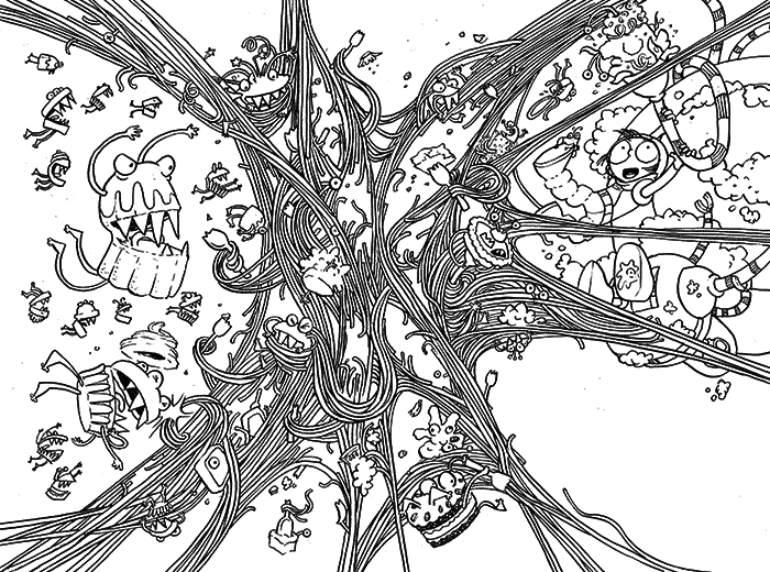
And here's what the page looks like, all inked up. (Feel free to try colouring it yourself, if you like.)
Next, I scanned the inked page into my computer.
Scanning breakdown: For this one, I scanned it in 'Bitmap', which is total black and white, no gray areas. That makes it very, very clean. And I think I scanned it at 1200 dots per inch, which is probably a higher resolution than I needed (600 dpi would have been fine), but I wanted to make sure I didn't lose any line quality. I then opened it in Photoshop, converted it to Grayscale and shrunk it down to 600 dpi, so it wouldn't be so big that it would crash my computer.
I don't have a photo of myself, working on exactly that page, but here I am with my laptop and the Wacom mouse pen that I use for colouring. (Note the scarf: it was the dead of winter and very cold!)

Here's a coloured-up version! When I coloured the previous book, Oliver and the Seawigs, I only let myself use blue and light blue. And in this book, I tried to stick to just orange, but I struggled with that; light orange isn't orange anymore, it's peach. I didn't want a whole book full of peach colour, it might look like some horrible old bathroom. So I also used gray in this book, and then added a few extra colours just for the human skin tones, so Astra's mum could have a rich chocolatey-colour skin, and Astra could be a little bit darker than peach.
Limited palette: Even though the book was printed using a full-colour technique (so I could have had ALL the colours of the rainbow!), I was still very strict with myself about keeping a very limited colour palette. I just like the look of limited colours, and that decision gives the artwork a slight retro feel, like space stories from the Sixties. Philip and I liked that era's positive spin on things, how people were still optimistic about building new worlds and new societies, and we wanted to capture that feeling.

Adding texture: I was looking at that coloured scene and I thought, Hmm, this is a big cakey, crumbly battle... it still looks too tidy. So I added texture. I had already scanned in a bit of texture for some of the cakes, but the splotchy background texture comes from a big piece of watercolour paper with stains all over it that I made with over-brewed tea. After the tea had dried, I scanned in the sheet (full colour, I think, so I could use it with other things), turned it gray in Photoshop, then added it to the digital image, as a layer all over everything.
That's the thing about digital artwork, I always have to make sure it doesn't look bland because everything's a bit too tidy and clean, so I'm constantly scanning in handmade textures. People ask me if I draw by hand or work digitally, and you can see that it's really a mixture of both.

Here's a little peek at the rest of the book, and I've included several How-to-draw Activity sheets on the Cakes in Space page on my website, so do go over and have a look!
Thumbnails: First I start by making rough 'thumbnail sketches' of possible scenes in the book. They're called thumbnails because they're tiny, just large enough to give our designer at Oxford University Press an idea of where things might go on the page, so she can figure out where the text could fit in. You can spot these two pages in the middle of the bottom row. (I drew lots of thumbnails all on one page together.)
'Who was your designer?', you may ask. Well, here she is, the lovely and talented Jo Cameron, on the left, in her wonderful colour-coordinated orange and black dress. The other two people are Liz Cross, our publisher (in the centre), and our editor, Clare Whitston, on the right (wearing the fascinators Jo made).
Back to work.... I added a bit of blackness on the stretched-out spaghetti alien to show Jo that I didn't want the text to go on its body. And she e-mailed it back like this, with text.
Pencil roughs: Then I made a more detailed version in pencil (called a 'pencil rough'). It's still scratchy and full of mistakes, but I have a much better idea of what's going to go on the page. (This is the version that a lot of reviewers saw, in the 'Uncorrected Proof Copy', a printed version of the book with only about half of my artwork completed.)
Going to INK: This is my favourite bit, the inking. I love it because I've already made the big stressful decisions about where everything will go, and I can have fun with the details and focus on making the line look nice. I dip an old-fashioned metal nib into India ink and trace over the pencil on a lightbox. I like doing it this way because I don't have to go back and erase the pencil, and risk smudging the ink.
A good tip, if you're drawing with a nib and India ink: the ink clogs the nib very quickly, so have a little jar of water nearby. Every few minutes, you can dip the nib into the water and wipe off the extra ink and water on a cloth or some kitchen roll. If you let the ink dry on the nib, you'll need to boil the kettle and swish the nib around in your teacup with a toothpick, until the ink comes off.
This is a different page, but it's a closeup of me inking some of the mutant cakes. They were super-fun to draw! I didn't use expensive paper, just cheap drawing cartridge. If the paper was too thick, I wouldn't have been able to see through it clearly enough to trace.
And here's what the page looks like, all inked up. (Feel free to try colouring it yourself, if you like.)
Next, I scanned the inked page into my computer.
Scanning breakdown: For this one, I scanned it in 'Bitmap', which is total black and white, no gray areas. That makes it very, very clean. And I think I scanned it at 1200 dots per inch, which is probably a higher resolution than I needed (600 dpi would have been fine), but I wanted to make sure I didn't lose any line quality. I then opened it in Photoshop, converted it to Grayscale and shrunk it down to 600 dpi, so it wouldn't be so big that it would crash my computer.
I don't have a photo of myself, working on exactly that page, but here I am with my laptop and the Wacom mouse pen that I use for colouring. (Note the scarf: it was the dead of winter and very cold!)
Here's a coloured-up version! When I coloured the previous book, Oliver and the Seawigs, I only let myself use blue and light blue. And in this book, I tried to stick to just orange, but I struggled with that; light orange isn't orange anymore, it's peach. I didn't want a whole book full of peach colour, it might look like some horrible old bathroom. So I also used gray in this book, and then added a few extra colours just for the human skin tones, so Astra's mum could have a rich chocolatey-colour skin, and Astra could be a little bit darker than peach.
Limited palette: Even though the book was printed using a full-colour technique (so I could have had ALL the colours of the rainbow!), I was still very strict with myself about keeping a very limited colour palette. I just like the look of limited colours, and that decision gives the artwork a slight retro feel, like space stories from the Sixties. Philip and I liked that era's positive spin on things, how people were still optimistic about building new worlds and new societies, and we wanted to capture that feeling.
Adding texture: I was looking at that coloured scene and I thought, Hmm, this is a big cakey, crumbly battle... it still looks too tidy. So I added texture. I had already scanned in a bit of texture for some of the cakes, but the splotchy background texture comes from a big piece of watercolour paper with stains all over it that I made with over-brewed tea. After the tea had dried, I scanned in the sheet (full colour, I think, so I could use it with other things), turned it gray in Photoshop, then added it to the digital image, as a layer all over everything.
That's the thing about digital artwork, I always have to make sure it doesn't look bland because everything's a bit too tidy and clean, so I'm constantly scanning in handmade textures. People ask me if I draw by hand or work digitally, and you can see that it's really a mixture of both.
Here's a little peek at the rest of the book, and I've included several How-to-draw Activity sheets on the Cakes in Space page on my website, so do go over and have a look!