Brighten and Color Icon Tutorial
I don't often do tutorials, but this icon came out so well, and I had to share.
In this tutorial, I'll show you how to go from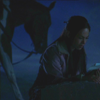
to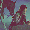
or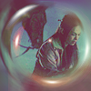
Also, I learned how to do the radial blur from this tutorial, so if you're gonna comment on this tut, it'd be nice to go comment hers, too.
This icon was made using Photoshop CS2, and would be translatable through other versions of Photoshop, but wont work in other programs like Paint Shop Pro because it uses Selective Coloring. Sorry guys! I used to be a PSP user, and it would drive me absolutely crazy when I wanted to do a tut but it was non-translatable thanks to stupid selective coloring. But! There is hope! The selective coloring layer is really just to get rid of the crazy blue tones, so if you're starting out with a kinda normal colored picture, you could skip that step and get away with it. That also goes for any Photoshop users who are starting with an image which isn't ridiculously blue.
Anyway, here's what you came here for:
1. Choose your image. I picked this screencap of Lana from Smallville, capped by Oxoniensis.
2. Crop, sharpen, resize and all that jazz. And, a note; while I love that creative cropping where the subject is half out of the frame, in this tutorial it's best to keep the subject centered, as you can see by the end result.
3. Duplicate the base three or four times, depending on how dark your image is. If it's looking un-contrasty, duplicate again, drag to the top and set to soft light, and play with the opacity.
4. Merge all.
5. New layer. Fill with a pale pinky-peach color. Nope, I'm not gonna give the specific color codes. Play with it and see what you get! Set this layer to soft light.
6. New layer. Fill with a dark red. Set to Lighten.
7. New layer. Fill with light blue. Set to Color Burn.
8. And that good ole' dark blue exclusion layer we all know and love.
9. Now go to Layer > New Adjustment Layer > Brightness/Contrast and put the brightness at 17 and the contrast at 18.
10. Layer > New Adjustment Layer > Selective Color. This is where the magic happens! As I said earlier though, if your image isn't a weird dark blue to begin with, you should just skip this step or you'll probably get a really weird outcome. Or, try it anyway! And show me what you get! Anyway, the settings:
Reds: -100, 0, 0, 0
Greens: 100, -100, 0, 0
Cyans: -20, -17, 19, 0
Blues: -100, -39, 100, 20
Magentas: -100, 100, 0, 0
Neutrals: 2, -2, 9, 8
Method: Relative. Set it to 47% opacity.
11. Phew. I hate selective color. It does a great job, but it takes so. damn. long. Especially when you're copying it from a tutorial, huh? And, I guess this isn't really a step, just an opinion I wanted to make known. So yeah, step 11 is to listen to me complaining.
12. Once you've done that, go to Layer > New Adjustment Layer > Curves. This is where it gets tricky on my part! I hope I'm translating this to you right, but I've seen it done in other tutorials and I think I know how to put it. (I = Input, O = Output) The settings are:
RGB:
First point: I 88 O 87
Second point: I 170 O 179
Third Point: I 228 O 193
Green:
First Point: I 47 O 36
Blue:
First point: I 67 O 29
Second Point: I 137 O 118
Third Point: I 234 O 188
13. Duplicate the base and drag to the top. Set to soft light.
14. Duplicate the base again and drag to the top. Keep on Normal blend mode, but lower the opacity to 14%. Depends on your icon, but I think it makes a difference.
15. New layer. Fill with a light tan color and set to multiply.
16. If you only wanted to get the first icon effect, then you're finished! You should have something that looks like this:
But! If you wanted the second icon effect, read on -- you're not done yet.
17. Merge all! Yes! All that work and you were just gonna end up merging it. Make sure you're happy with the way your icon looks before you do this... I always get nervous merging so many layers.
18. Duplicate your new base, and apply a Radial Blur (Filter > Blur > Radial Blur) to the DUPLICATE with these settings:
Amount: 18
Blur method: Spin
Quality: Best
Or, as always, feel free to disregard my directions and play around with different settings.
19. Now, it's all weird and spinny, right? That's okay! That's what you want. Now find a lensflare light texture or two (I used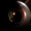
and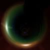
by ssaya and move them around until they form a good bubble-looking thing around where you
remember your subject to be (because now it all just looks like a bowl of runny porridge). Set the
textures to either screen or lighten, whichever
finds your Nemo.
20. Select your eraser tool, and make the brush about the size of the bubble you've created. Select your porridgey
blurred duplicate and click right in the middle of the bubble to clear out the center. If you did it right, you should now be
able to see your subject in the middle of the 'bubble'.
And you're done! Your end result should look something like this --
If you liked this tutorial, please leave me a comment. It took way longer than I thought it would, so It'd be great to
hear if it helped anyone. Also, I'd really, really love to see your end results!
Johnny 'Onions' -- out.