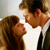
049. TUTORIAL # 3: Pushing Daisies.
requested by ingenu0us.

to
For PS & PSP users.
*** Optional selective coloring.
I'm going to make this simple.
01. Base & Duplicate twice.

and set duplicates to SCREEN.
02. Color Balance.
Midtones: -20, 9, 4
Shadows: 6, 10, 11
*** UNCHECK "Preserve Luminosity."
03. Levels.
RBG: 12, 1.44, 255
Red: 12, 1.20, 255
Blue: 1, 1.11, 255
04. Curves.
RBG: 1st point: 128, 149 ; 2nd point 64, 71
Red: 128, 131
Green: 128, 132
Blue: 128, 141
05. Selective Color (optional; see below).

Red: -11, -7, 3,-6
Yellow: 0, 0, -5, -3
Green: -38, 19, 42, 53
White: 0, 0, -7, -5
Neutral: 2, -3, -6, -6
Black: -13, 0, 0, 5
*** CHECK "Absolute."
06. Color Fill.

#160202 and set to EXCLUSION.
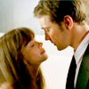
07. Merge.
08. Duplicate.
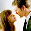
09. Unsharpen Mask.
Amount: 11%
Radius: 29px
Threshold: 0 Levels.
*** The original is a little darker and has more white. There may have been a Auto Levels after the merge.
*** For those of you without PS, don't fret.
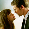
PSP result:
.
After the merge, I used unsharpen mask twice. You may just need to up the curves or levels a little bit afterwards. This one is actually closer to the original, so there you have it.
I don't make tutorials often, mostly because I don't know which icon people would like to see. What is the point to make a tutorial nobody wants? So if you'd like to see a tutorial just ask, and I'll see what I can do, I really don't mind the questions.
Also, I know the new thing is to post the .psd, I'm not going to do that. There is no reason to mass produce a technique, m'kay? Every picture is different and the coloring should be too.
Last Post: 048. pushing daisies
to
For PS & PSP users.
*** Optional selective coloring.
I'm going to make this simple.
01. Base & Duplicate twice.
and set duplicates to SCREEN.
02. Color Balance.
Midtones: -20, 9, 4
Shadows: 6, 10, 11
*** UNCHECK "Preserve Luminosity."
03. Levels.
RBG: 12, 1.44, 255
Red: 12, 1.20, 255
Blue: 1, 1.11, 255
04. Curves.
RBG: 1st point: 128, 149 ; 2nd point 64, 71
Red: 128, 131
Green: 128, 132
Blue: 128, 141
05. Selective Color (optional; see below).
Red: -11, -7, 3,-6
Yellow: 0, 0, -5, -3
Green: -38, 19, 42, 53
White: 0, 0, -7, -5
Neutral: 2, -3, -6, -6
Black: -13, 0, 0, 5
*** CHECK "Absolute."
06. Color Fill.
#160202 and set to EXCLUSION.
07. Merge.
08. Duplicate.
09. Unsharpen Mask.
Amount: 11%
Radius: 29px
Threshold: 0 Levels.
*** The original is a little darker and has more white. There may have been a Auto Levels after the merge.
*** For those of you without PS, don't fret.
PSP result:
.
After the merge, I used unsharpen mask twice. You may just need to up the curves or levels a little bit afterwards. This one is actually closer to the original, so there you have it.
I don't make tutorials often, mostly because I don't know which icon people would like to see. What is the point to make a tutorial nobody wants? So if you'd like to see a tutorial just ask, and I'll see what I can do, I really don't mind the questions.
Also, I know the new thing is to post the .psd, I'm not going to do that. There is no reason to mass produce a technique, m'kay? Every picture is different and the coloring should be too.
Last Post: 048. pushing daisies