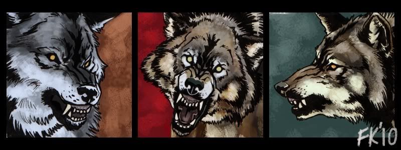
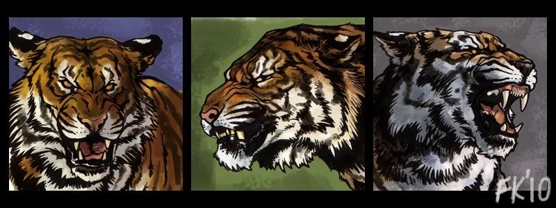
[art]Style tests, part one
Cropped properly now, the ink is the main part of these, just wanted to see how I should go about adding colours or tones underneath the lineart without overrunning the inks. What do you think?


Also a test to see how quickly I can punch them out for small avatar/headshot/icon commissions, if anyone's interested. Posted an ad over at teenycom, $10 each, check it out there eh.
Human faces next!


Also a test to see how quickly I can punch them out for small avatar/headshot/icon commissions, if anyone's interested. Posted an ad over at teenycom, $10 each, check it out there eh.
Human faces next!