Phuck Up the Oldies
So I am doing this icon meme thing from phuck @ last5 where you remake old icons. I have taken a very old post and re-made the icons.
Old Icon Post: Here
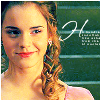
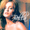
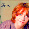
New Icon Previews:

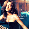
Old:

New:

Right, so with these two, I corrected the half-crappy coloring and did a better crop, and added a texture. And took away the text, because...really. Why was it there to start with?
Old:

New:

With these, I didn't like the crop (again). Did a bit better coloring. And then, I took her name out of it, and added a scratchy text brush thingy. Et, voila. C'est ça.
Old:
New:
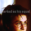
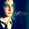
Okay, first of all? I really dislike both of these. Second of all? LMFAO at the first one. WTF was I thinking??? Harry looks like some kind of DEMON with these freaky neon colored eyes!!! HA. Plus, it was a crappy crop. Oh and then there's that craptastic text I decided to add. WTF? So I went for more subtle coloring, but I still didn't really get it right and the text is...eh. Probably unneeded I dunno. I don't really like these two.
Old:
New:

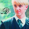
I didn't really like either of these icons either. The image I started with blew to start with, and I never really got the improvement I wanted. I liked the subtle coloring and I really wanted some texture but...eh. Okay, moving on.
Old:

New:

HA! WHAT A CRAPPY FIRST ICON UP THERE. The coloring doesn't have enough contrast and it looks like she has no nose. And why add the scratchy texture? And the text brush? So I colored it differently, and cropped it better and added a light texture. (I don't know why I made a Cho icon. I don't even like Cho.)
Old:

New:

Wow, oversaturation much? YIKES. His eyes look all demonized, too. And what did I have with this text brush letter trend? I think I was trying to make a matching set. ..............
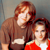
....riiiiiight. Anyway, I zoomed the crop out to include Emma because it looks bleh with just him. And I colored them both differently. (i.e., better.) Nothing too special about this icon, but it doesn't suck as much.
Okay! Thanks for the opportunity to phuck up my stuff!
Old Icon Post: Here
New Icon Previews:
Old:
New:
Right, so with these two, I corrected the half-crappy coloring and did a better crop, and added a texture. And took away the text, because...really. Why was it there to start with?
Old:
New:
With these, I didn't like the crop (again). Did a bit better coloring. And then, I took her name out of it, and added a scratchy text brush thingy. Et, voila. C'est ça.
Old:
New:
Okay, first of all? I really dislike both of these. Second of all? LMFAO at the first one. WTF was I thinking??? Harry looks like some kind of DEMON with these freaky neon colored eyes!!! HA. Plus, it was a crappy crop. Oh and then there's that craptastic text I decided to add. WTF? So I went for more subtle coloring, but I still didn't really get it right and the text is...eh. Probably unneeded I dunno. I don't really like these two.
Old:
New:
I didn't really like either of these icons either. The image I started with blew to start with, and I never really got the improvement I wanted. I liked the subtle coloring and I really wanted some texture but...eh. Okay, moving on.
Old:
New:
HA! WHAT A CRAPPY FIRST ICON UP THERE. The coloring doesn't have enough contrast and it looks like she has no nose. And why add the scratchy texture? And the text brush? So I colored it differently, and cropped it better and added a light texture. (I don't know why I made a Cho icon. I don't even like Cho.)
Old:
New:
Wow, oversaturation much? YIKES. His eyes look all demonized, too. And what did I have with this text brush letter trend? I think I was trying to make a matching set. ..............
....riiiiiight. Anyway, I zoomed the crop out to include Emma because it looks bleh with just him. And I colored them both differently. (i.e., better.) Nothing too special about this icon, but it doesn't suck as much.
Okay! Thanks for the opportunity to phuck up my stuff!