o7: Harry/Parvati Icon Tutorial
Go from 
to
Start with this screencap:
by krissinator
Now, seeing as how these caps weren't superior quality, I made larger sized crops out of most of them, because the bigger a picture you resize, the better it's going to look, obviously. So I cropped the picture, and included part of the black bar at the bottom, because I liked it there. So crop and resize to 100x100, and get this: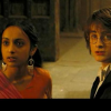
Now you want to duplicate your base layer. Sharpen once, and set to screen, opacity 100%: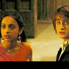
Pretty disgusting, right? But leave it, because you'll need it this bright later.
Duplicate this layer, but change the setting to Soft Light. Leave the opacity at 100%. Desature to -100 and get this: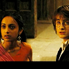
Starting to look a little better. Duplicate your soft light layer once. Leave at 100%: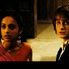
Now it's time for the coloring. I used only one color on this:
(#0c1266)
Take that color, put it on a new raster layer. Set the layer to Exclusion, 52%.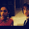
Duplicate your exclusion layer. Change the layer setting to Difference, but leave the opacity at 52%.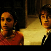
Here's where I saved my base. Now it's time to add text. I chose a yellow from the floor behind Harry and Parvati, #91843a. I used Times New Roman, italicized, size 5, kerning 292. I wrote "simpler times" because I couldn't think of anything better and positioned it on the black space I had at the bottom.
And there you have it. Now, the coloring I did on this didn't make a huge difference, but this is the exact process I used for all the icons in [this] set, so as you can tell, depending on the lighting of your picture, you'll get different results.
Let me know if you have any questions. Or you just want to show me what you made from this.