Tutorial #19 [Michael Jackson]
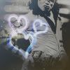
Go from: 
To:
Made in PS7. Somewhat translatable if you don't mind not having vibrant colour or use it on a black and white photo. Uses curves, selective colour, levels and textures. Works best on images with a good bit of blue in the background, or black and white photos.
Other examples:


Get your base and do whatever preparation you need to it. Then make yourself a new curves adjustment layer. Your settings will vary from mine depending on your photo, but here are mine:
RGB:
Point one
Input: 197
Output: 199
Point two
Input: 62
Output: 105
Now duplicate your base and drag it to the top. Set it to soft light, 100% opacity.
Make a new colour fill layer.
Exclusion - #202020 - 100% opacity
Note: If you are making a black and white icon as you read this, go ahead and keep the exclusion layer, but skip the next step.
This next step is skippable and could probably be somewhat replicated with colour balance, channel mixer or levels, but here is the selective colour layer.
Reds:
-100, +100, +100, +100
Yellows:
0, 0, 0, +100
(Do not modify the yellow at all if you find it makes the picture look too terrible, I only did because of Michael's shirt. Remember, this tut is not meant to be followed to a tee.)
Blues:
+100, -46, -100, +100
Whites:
0, 0, 0, -20
Neutrals:
-10, -5, +15, +20
Now, paste this texture by azuremonkey to the icon and set it to hard light, 100%. Looks a little bit off, yeah? No problem, just take the elliptical marquee tool set to 5-10 feather and feather out what you don't want covering your subject. You could also use an eraser set to a soft round brush, or a layer mask for this.
If you don't like the colour scheme of this one, or are working with different colours but trying this out anyway, many of the other textures from the Affection set will also do nicely.
For the black and white icon, make a new gradient map adjustment layer and use the standard black and white on normal, 100%, this will keep the neat effect of the texture you just used, but take the colour away and give the icon a slight bit more contrast as opposed to simply desaturating the texture itself.
Adjustment layer time!
Levels
RGB:
50, 1.35, 255
0, 200
Take this texture by bambinainnero and set it to multiply, 100%. This serves to darken the icon a fair bit, however, depending on the lighting of your photo, you may not need the same opacity, or the texture at all, but likewise, you may find you need two or three duplicates of it! Mine looks just fine, so I don't need to make any duplicates.
Next, take this texture by (I honestly don't remember where I got it. If anyone knows, please tell me so I can credit.) and set it to screen, 100%. The same applies to this texture as the first one we applied. It probably doesn't look good covering your subject! So rotate as you see fit and take your preferred method to clear it up a bit. This texture is also completely optional, you may find you like different textures as opposed to this one. Play around, that's the fun of making icons!
Take this gradient (I also am not sure where this came from, argh!) and set it to lighten, 100%. It is best to rotate this texture so that the blue light section is NOT on top of the subject. This is the step that may make or break the icon depending on how dark you've got it by now. If it's too light, you're not going to notice much difference at all. If it's too dark, it's going to look really bad. If I find too many problems using this texture on full opacity, I just reduce it until it looks alright. :)
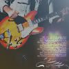
You could leave it just like this, or you could add more to it. I added a text and light texture to it, which I found compliment each other well, but really the possibilities are endless!
I hope this tut helps and I would love to see what others come up with.
Notes:
- Apologies about the texture credits. Some of these textures I've had since I first got my old laptop and had not had the chance to get the credits onto my journal before I lost a bunch of my stuff when it died.
- Sorry, I don't make PSD files available upon request.
- For more tutorials by me, check out my tutorial list!

To:
Made in PS7. Somewhat translatable if you don't mind not having vibrant colour or use it on a black and white photo. Uses curves, selective colour, levels and textures. Works best on images with a good bit of blue in the background, or black and white photos.
Other examples:

Get your base and do whatever preparation you need to it. Then make yourself a new curves adjustment layer. Your settings will vary from mine depending on your photo, but here are mine:
RGB:
Point one
Input: 197
Output: 199
Point two
Input: 62
Output: 105
Now duplicate your base and drag it to the top. Set it to soft light, 100% opacity.
Make a new colour fill layer.
Exclusion - #202020 - 100% opacity
Note: If you are making a black and white icon as you read this, go ahead and keep the exclusion layer, but skip the next step.
This next step is skippable and could probably be somewhat replicated with colour balance, channel mixer or levels, but here is the selective colour layer.
Reds:
-100, +100, +100, +100
Yellows:
0, 0, 0, +100
(Do not modify the yellow at all if you find it makes the picture look too terrible, I only did because of Michael's shirt. Remember, this tut is not meant to be followed to a tee.)
Blues:
+100, -46, -100, +100
Whites:
0, 0, 0, -20
Neutrals:
-10, -5, +15, +20
Now, paste this texture by azuremonkey to the icon and set it to hard light, 100%. Looks a little bit off, yeah? No problem, just take the elliptical marquee tool set to 5-10 feather and feather out what you don't want covering your subject. You could also use an eraser set to a soft round brush, or a layer mask for this.
If you don't like the colour scheme of this one, or are working with different colours but trying this out anyway, many of the other textures from the Affection set will also do nicely.
For the black and white icon, make a new gradient map adjustment layer and use the standard black and white on normal, 100%, this will keep the neat effect of the texture you just used, but take the colour away and give the icon a slight bit more contrast as opposed to simply desaturating the texture itself.
Adjustment layer time!
Levels
RGB:
50, 1.35, 255
0, 200
Take this texture by bambinainnero and set it to multiply, 100%. This serves to darken the icon a fair bit, however, depending on the lighting of your photo, you may not need the same opacity, or the texture at all, but likewise, you may find you need two or three duplicates of it! Mine looks just fine, so I don't need to make any duplicates.
Next, take this texture by (I honestly don't remember where I got it. If anyone knows, please tell me so I can credit.) and set it to screen, 100%. The same applies to this texture as the first one we applied. It probably doesn't look good covering your subject! So rotate as you see fit and take your preferred method to clear it up a bit. This texture is also completely optional, you may find you like different textures as opposed to this one. Play around, that's the fun of making icons!
Take this gradient (I also am not sure where this came from, argh!) and set it to lighten, 100%. It is best to rotate this texture so that the blue light section is NOT on top of the subject. This is the step that may make or break the icon depending on how dark you've got it by now. If it's too light, you're not going to notice much difference at all. If it's too dark, it's going to look really bad. If I find too many problems using this texture on full opacity, I just reduce it until it looks alright. :)
You could leave it just like this, or you could add more to it. I added a text and light texture to it, which I found compliment each other well, but really the possibilities are endless!
I hope this tut helps and I would love to see what others come up with.
Notes:
- Apologies about the texture credits. Some of these textures I've had since I first got my old laptop and had not had the chance to get the credits onto my journal before I lost a bunch of my stuff when it died.
- Sorry, I don't make PSD files available upon request.
- For more tutorials by me, check out my tutorial list!