Icon tutorial #1
I'm doing this backwards and reposting my first tut from my lj here as well. It's quite a few months old already :)
I had to make this tut as a requirement for winning at severalplums, so I figured why not post it here as well (even if it's just so I can keep up with any tuts I post). It took a lot longer than those 4 steps look like because it was a lot of trial and error for the cropping part but it didn't take as long as writing this tut :)
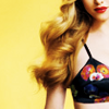
From
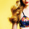
to
Icon made with Gimp 2.6
Step 1: Crop
I usually open a new 100x100 image, copy the picture into a new layer and move it around until I find a good crop. If that doesn't help, I resize a bit and do the whole thing over again until I find my base. I wasn't entirely sure how to crop this one at first because I liked her face as a whole but then the cut off for the top looked weird to me. So in the end I decided to keep the top and as much hair as possible and go for a colorful icon and a bit more contrast.

Step 2: Colouring
I duplicated my layer and set it to hard light to get more contrast and darker shadows as well as more vibrant colours in the lighter areas (specifically the yellow and the red lips). Since 100% was a bit too bright, I set the opacity to 60%.

The only thing I didn't like now was that the top had gotten a bit too black, so I wanted to get the blue back, maybe even a tad lighter than before. For that I duplicated my hard light layer and desaturated it, choosing "shades of gray based on lightness" ("average" would have done the trick as well, just not "luminosity" because that would have been too much contrast again). Then set the layer to 'division'. That usually brightens an image and makes for an overexposed look on the darker areas - in this case the dark blue top turned a lighter blue. Since it was a bit too bright for my taste I lowered the opacity until I liked the blue - at about 30% I stopped.

Unfortunately I had pretty much undone my whole hard light layer effect and the hair looked too yellow for my liking so I took a brush and erased everything but the top on the division layer to get the old look back.

Step 3: Adding the brush
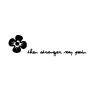
I personally thought the icon looked too empty on the left now - the negative space was too small to keep so I went and looked for a tiny text brush to fill the void and found this:

by iiokua
The flower fit the whole gardening theme. I didn't use the brush but rather the img from the image pack because the brushes tend to come up blurry for me in GIMP. Using it as a brush is a lot easier of course. I had to invert the colours because I thought that the white would fit the icon better / would be less overpowering than black. Then I rotated it, set the layer to screen and moved it to the left so it would fill out the empty space. That's it.

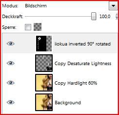
My layers palette - I tried to rename everything I could in English:

I had to make this tut as a requirement for winning at severalplums, so I figured why not post it here as well (even if it's just so I can keep up with any tuts I post). It took a lot longer than those 4 steps look like because it was a lot of trial and error for the cropping part but it didn't take as long as writing this tut :)
From
to
Icon made with Gimp 2.6
Step 1: Crop
I usually open a new 100x100 image, copy the picture into a new layer and move it around until I find a good crop. If that doesn't help, I resize a bit and do the whole thing over again until I find my base. I wasn't entirely sure how to crop this one at first because I liked her face as a whole but then the cut off for the top looked weird to me. So in the end I decided to keep the top and as much hair as possible and go for a colorful icon and a bit more contrast.
Step 2: Colouring
I duplicated my layer and set it to hard light to get more contrast and darker shadows as well as more vibrant colours in the lighter areas (specifically the yellow and the red lips). Since 100% was a bit too bright, I set the opacity to 60%.
The only thing I didn't like now was that the top had gotten a bit too black, so I wanted to get the blue back, maybe even a tad lighter than before. For that I duplicated my hard light layer and desaturated it, choosing "shades of gray based on lightness" ("average" would have done the trick as well, just not "luminosity" because that would have been too much contrast again). Then set the layer to 'division'. That usually brightens an image and makes for an overexposed look on the darker areas - in this case the dark blue top turned a lighter blue. Since it was a bit too bright for my taste I lowered the opacity until I liked the blue - at about 30% I stopped.
Unfortunately I had pretty much undone my whole hard light layer effect and the hair looked too yellow for my liking so I took a brush and erased everything but the top on the division layer to get the old look back.
Step 3: Adding the brush
I personally thought the icon looked too empty on the left now - the negative space was too small to keep so I went and looked for a tiny text brush to fill the void and found this:
by iiokua
The flower fit the whole gardening theme. I didn't use the brush but rather the img from the image pack because the brushes tend to come up blurry for me in GIMP. Using it as a brush is a lot easier of course. I had to invert the colours because I thought that the white would fit the icon better / would be less overpowering than black. Then I rotated it, set the layer to screen and moved it to the left so it would fill out the empty space. That's it.
My layers palette - I tried to rename everything I could in English: