Icon Tutorial #5
This is made for and at the request of tiah15 who without her participation in this community, it'd probably be dead. :)
This icon was made with Paint Shop Pro X2 on a PC (Vista). I know it's translatable to Photoshop but not sure of other programs. It uses Color Balance and Hue/Saturation/Lightness layers plus flood fill layers. This coloring was used on most of the larger pictures in my latest picspam.

to

VERY IMAGE HEAVY!
I am going to assume you know a lot about your program.
So I cropped my base from THIS picture. I encourage you to use your own and don't copy this to a T. Mess around because I don't know how this will work on all images.
1. Do your usually fixing up of your base. I never sharpen my base to the very end because sometimes the glow works better for me. What I did to fix up my base was duplicated 3 times. Set the first to screen at 100% opacity. Set the layer above that to screen also but take the the opacity to 45%. And set the top layer to Soft Light at 35%. Again all pictures are different so you may not need to screen or you may need to add extra screen. Also if you have a better way of doing this then by all means. It is just my way of lightening up the picture and giving it some contrast without over doing it.

>>>

2. Now create a new raster layer and flood it with #0D1739 and set it to Exclusion -100% opacity

>>>
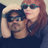
3. Create another raster layer and flood with #596471 set to Burn at 10% opacity. Mess around with this but keep it below 20%.

>>>

4. Duplicate your soft light layer of your base and bring it to the top. Change opacity to 50%. Again use judgement you may have to take it down or take it way up depending on your pic.

>>>
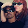
5. Create a Color Balance layer (do not use color balance on the top picture, make it it's own layer if you can do this. In psp and ps it's a new adjustment layer)
Use these settings
Shadows: +13, +10, +38 (on the cyan/red 13 toward red. On the magenta/green 10 toward green. On yellow/blue 38 toward blue.)
Midtones: -72, -20, +67 (on the cyan/red -72 toward cyan. magenta/green -20 toward magenta. yellow/blue 67 toward blue)
Highlights: +69, +62, +14 (cyan/red 69 toward red. magenta/green 62 toward green. yellow blue 14 toward blue.)
Make sure to UNCHECK preserve luminance
ETA: Tiah, I hope that helped! I don't know how gimp's color balance is but by seeing which colors I leaned toward hopefully helps.

>>>

Looks all contrasty now doesn't. Don't worry we will calm it down a notch.
6. Create another new raster layer and flood with #C7B299 set to Multiply at 20%

>>>
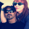
I know it doesn't look like there's a difference but trust me it's there.
7. Copy Merge everything now and paste it as a new layer. You can merge all layers(flatten) or whatever. I never do this in case I ever want to figure out what I did in the first place. :) You can set this as soft light at any opacity under 50% or mess with it. Make sure you desaturate if you do set it to Soft Light.
Another option and the option I used in this icon is I copy merged all and pasted as new layer. Then I went to Adjust>One Step Noise Remover and just took the opacity to 30%. I don't know how you would do this in other programs but here's what it should look like at 100% opacity.
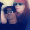
Anyway this is what it does

>>>

See how that mutes down the contrast a bit.
8. And finally last step. Created a new adjustment layer of Hue/Saturation/Lightness and up the Saturation as follows...
Reds: +15
Magentas: +20
Again mess around with this because with different pictures comes different colors.

>>>
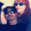
It's very subtle in this picture as you can see.
After this I'm not sure if I went to the bottom layer base and sharpened it or not. I think I might have but I don't remember. If you think it needs it, try it. You can always undo. :)
The last is up to you. Add textures and text or whatever looks good but you never want to overdo icons. I added these textures
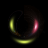
and
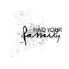
For the first one I did several motion blurs in different directions till I came to get this
then set it to screen or lighten. I don't remember which but it's one of those.
For the text texture, I inverted the colors to negative image and set it screen. then moved it to the bottom of the icon.

>>>
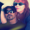
>>>

And thats all there is too it. It's not hard at all.
And as for textures used in this tutorial, if they are yours, please claim them and I will give you proper credit. I have forgotten where I got them since I've had them for so long.
Other examples: