Post #15: Tutorial 1
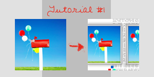
In PS7, without masking brushes ♥
Requested by gabbiegirlz
My first tutorial, hope I explained everything clearly, but I'd be glad to answer any questions :)
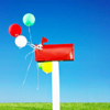
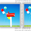
Choose an image, adjust colors and
contrast to your liking. Bright and clear works
better for this kind of icon than muted, though.
I often use THIS tutorial by raptureicons, it works well with most pics and it's very simple.

Crop your image, it should be around 66x73 px, but anything that's not square works. Create a new document (100x100, white background) and then paste your image on it.
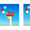
Duplicate your image and move it to the right untill only a small part of it is showing. There should be at least 15 px between the base image and the copy.
Open a tiny text brush, I used BABYTEXT by Sanami276, but any tiny brush will do. Create a new layer, drag it under both you image layers and stamp the brush on it.
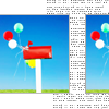
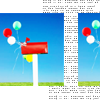
Create a new layer (layer 3), drag it on top of the layer palette. Go back to the original picture layer and select its content (ctrl+right click on layer name in ps7), then, making sure you are working onthe new layer, click the selection tool, right click on the selction and run stroke (settings 1px, inside) in a light grey, like #BEBEBE.
Repeat the process for the 2 image, always working on layer 3, so that you get the 2 frames on the same layer. Lower its opacity at about 59%.
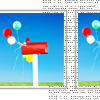
Create another layer. Go back to the original picture layer and select its content, then go to Select>>Modify>>Expand 3px, run stroke with the same settings but a darker grey, like #AFAEAE. Repeat, always working on layer 4, for the 2 pic.
Select the tiny brush layer, erase anything that's visible under the frames.
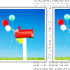
To make the frame stand out a bit more go to Layer>>Layer Style>>Drop Shadow, and apply with these settings: Multiply, 76% opacity, distance 0, spread 6, size 6.
Then run filter>>blur>>blur on the layer itself once or twice, to your tastes.
With larger frames you can add a wrinkled paper texture for a more realistic look: just paste it in a new layer, set it on darken or multiply and erase anything that's not in the frame.
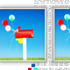
To add a bit of color in the background use a square brush at 4px and stamp two or 3 squares on a new background, using colors from your pic.
All done.
I hope I explained everything clearly, but HERE'S the .psd file, just in case. Hope it helps :)