maps
Just last night I was saying I was eager to see the purple map for this election -- remember that? It was a US map that showed election returns on a county level, coloring each county a shade between red and blue depending on how republican or democratic its vote total was. Well, here it is.
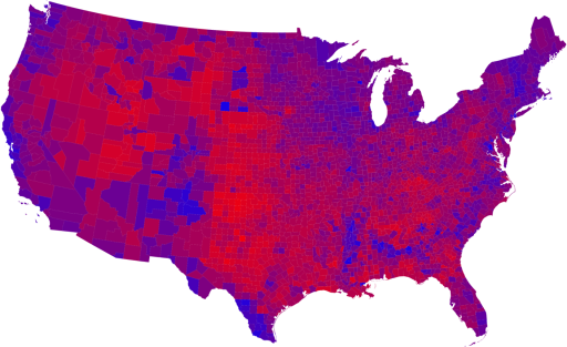
Isn't it beautiful? I guess we are one nation after all.
Okay, there are still some states that are as solid red as ever. But it sure looks better.
If you look closely, you can see the tiny blue mote that represents Austin. The conspicuously bright blue patch in the southwest is, as best I can tell, a region of New Mexico that includes Santa Fe, Taos, and Los Alamos.
Then they created a cartogram that resizes each state in proportion to its electoral votes (which, for example, makes the importance of those tiny New England states a lot clearer).
PS - the guy who invented this method lived down the hall from me at the time
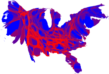
Those who are melodramatic might say it looks like a phoenix.
More maps and larger images here
Isn't it beautiful? I guess we are one nation after all.
Okay, there are still some states that are as solid red as ever. But it sure looks better.
If you look closely, you can see the tiny blue mote that represents Austin. The conspicuously bright blue patch in the southwest is, as best I can tell, a region of New Mexico that includes Santa Fe, Taos, and Los Alamos.
Then they created a cartogram that resizes each state in proportion to its electoral votes (which, for example, makes the importance of those tiny New England states a lot clearer).
PS - the guy who invented this method lived down the hall from me at the time
Those who are melodramatic might say it looks like a phoenix.
More maps and larger images here