arbuus
in
indie_lims
ROUND #3 CHALLENGE #5 RESULTS
ELIMINATED-
jann_ness with -8 votes
sorry and i hope you'll join us in the next round!
PEOPLE'S CHOICE-
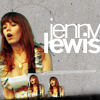
spiffydaze with +4 votes
MOD'S CHOICE-
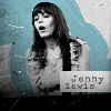
neuroticalx
i like the idea a lot, even though the icon is a bit fuzzy.
RESULTS-
1: -5
2: -4
3: -5
4: +4
5: -8
6: -1 +1
7: -4 +2
8: -1 +1
9: -2 +2
ICONS-
#1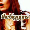
#2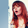
#3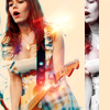
#4
#5
#6
#7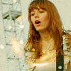
#8
#9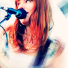
VOTES-
#1-
- Font doesn't fit the icon, crop is too close
- It kind of looks like the text says "The Bigguns" instead of "The Big Guns".
- interesting crop but not too fond of the font choice
- the image is really dark; too much contrast
- Cutting is not so bad, but it's hard to tell it's Jenny. The text is bothering me because it's too big and it's distracting
#2-
- The cropping is really weird and the bar on the left doesn't mesh at all
- the blue bar seems insignificant
- Too simple. I don't see a point for that blue part on the left
- I find it too simple. The block of color on the side makes it look unfinished
#3-
- Too many effects used, looks too busy and random
- The burst of light and the b&w strip don't really seem to go together
- The black&white part in there makes the composition look awkward
- The light flashes on it look a bit wird and the black an white stripe doesn't fit with the icon
- just cut on the right seems a bit random
#4-
+ soooo pretty. I like the miniatures, it's unique
+ very creative, love it!
+ The most original one
+ no reason given
#5-
- too dark, and actually doesn't look like there's been done anything besides the crop (it's a good crop though^^)
- nice cropping but the icon is a little too dark drawing attention to the white space
- The coloring is too dark and much too red
- very plain, the colouring is too reddish
- Interesting crop, but too dark
- The image is really dark and the crop looks awkward
- the icon is quite plain, and the colouring doesn't make it stand out
- Coloring seems too simple and the icon looks rather dark, too
#6-
- I like the idea but the black bar and white text is a little too stark compared to the muted blue tones of the icon
+ no reason given
#7-
- Effects seem random, icon feels unfinished
- The light texture takes the attention away from Jenny
- too yellow, rather unexciting crop
- Other than a light texture, it doesn't look like there's much going on here
+ no reason given
+ Very pretty coloring and even the light textures blend with the picture, I think she did an amazing work
#8-
- I really like the idea but the contrast is a little too high on the face and it seems a little pixelated where the icon maker has cut out Jenny
+ no reason given
#9-
- looks a little oversharp, and the blur at the bottom is a bit distracting
- The image looks blurry
+ Good picture, good colours, I like the blurry edges
+ I like the colouring!
(let me know if i made any mistakes!)

jann_ness with -8 votes
sorry and i hope you'll join us in the next round!
PEOPLE'S CHOICE-

spiffydaze with +4 votes
MOD'S CHOICE-

neuroticalx
i like the idea a lot, even though the icon is a bit fuzzy.
RESULTS-
1: -5
2: -4
3: -5
4: +4
5: -8
6: -1 +1
7: -4 +2
8: -1 +1
9: -2 +2
ICONS-
#1

#2

#3

#4

#5

#6

#7

#8

#9

VOTES-
#1-
- Font doesn't fit the icon, crop is too close
- It kind of looks like the text says "The Bigguns" instead of "The Big Guns".
- interesting crop but not too fond of the font choice
- the image is really dark; too much contrast
- Cutting is not so bad, but it's hard to tell it's Jenny. The text is bothering me because it's too big and it's distracting
#2-
- The cropping is really weird and the bar on the left doesn't mesh at all
- the blue bar seems insignificant
- Too simple. I don't see a point for that blue part on the left
- I find it too simple. The block of color on the side makes it look unfinished
#3-
- Too many effects used, looks too busy and random
- The burst of light and the b&w strip don't really seem to go together
- The black&white part in there makes the composition look awkward
- The light flashes on it look a bit wird and the black an white stripe doesn't fit with the icon
- just cut on the right seems a bit random
#4-
+ soooo pretty. I like the miniatures, it's unique
+ very creative, love it!
+ The most original one
+ no reason given
#5-
- too dark, and actually doesn't look like there's been done anything besides the crop (it's a good crop though^^)
- nice cropping but the icon is a little too dark drawing attention to the white space
- The coloring is too dark and much too red
- very plain, the colouring is too reddish
- Interesting crop, but too dark
- The image is really dark and the crop looks awkward
- the icon is quite plain, and the colouring doesn't make it stand out
- Coloring seems too simple and the icon looks rather dark, too
#6-
- I like the idea but the black bar and white text is a little too stark compared to the muted blue tones of the icon
+ no reason given
#7-
- Effects seem random, icon feels unfinished
- The light texture takes the attention away from Jenny
- too yellow, rather unexciting crop
- Other than a light texture, it doesn't look like there's much going on here
+ no reason given
+ Very pretty coloring and even the light textures blend with the picture, I think she did an amazing work
#8-
- I really like the idea but the contrast is a little too high on the face and it seems a little pixelated where the icon maker has cut out Jenny
+ no reason given
#9-
- looks a little oversharp, and the blur at the bottom is a bit distracting
- The image looks blurry
+ Good picture, good colours, I like the blurry edges
+ I like the colouring!
(let me know if i made any mistakes!)