arbuus
in
indie_lims
ROUND #3 CHALLENGE #4 RESULTS
ELIMINATED-
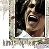
marienkefa with -4 votes
sorry and i hope you'll join us in the next round!
PEOPLE'S CHOICE-
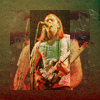
thatgirlsoph with +3 votes
MOD'S CHOICE-
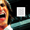
shizukuchan
though it got a lot of bad votes, i think it's cute. his fac eis a tad bit too red, but otherwise it's a very smooth icon and the colouring and cropping works great.
RESULTS-
1: -1 +1
2: -2
3: -4
4: -2 +1
5: -1
6: -1
7: -1
8: -1
9: -1
10: -1
11: +3
ICONS-
#1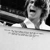
#2
#3
#4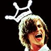
#5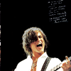
#6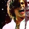
#7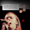
#8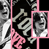
#9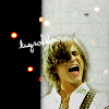
#10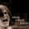
#11
VOTES-
#1-
- The blank space in the bottom half of the icon makes it look unfinished; the grey dots along the top left make the icon look like it was saved poorly
+ I love the cropping!!
#2-
- Looks like very little to no effort was put into the icon - just a crop and a slap on of a random "trendy" brush
- too saturated, and the cropping's a bit awkward
#3-
- the texture/border is too much, it distracts from the overall icon
- a bit dark, and the texture doesn't fit
- A bit too messy/grungy looking. The whole idea for the design doesn't work well with this type of picture
- it looks oversharpened, his face looks a bit like it's made of rubber
#4-
- It strikes me as the least quality icon in the bunch. Picture looks a bit too crispy, while the 'crown' brush is blurry
- the cropping makes it look like his head's cut off, a bit of shoulders would have looked better
+ Simple and clever! I love it
#5-
- unexciting crop and seems a bit blurry
#6-
- Too dark and crispy. Also, the duplicated part on the right adds to the awkwardness of the composition
#7-
- the whole icon looks too blurry, and the coloring is quite bland
#8-
- the icon is too busy, you're not entirely sure what should be the focus
#9-
- Seems like a random blend of the current "trendy" effects
#10-
- I like the idea, but the under-saturation doesn't really work with the icon and the font choice is a bad match
#11-
+ I like that effect :)
+ The most original one of all
+ unique, and great cropping
(let me know if i made any mistakes!)

marienkefa with -4 votes
sorry and i hope you'll join us in the next round!
PEOPLE'S CHOICE-

thatgirlsoph with +3 votes
MOD'S CHOICE-

shizukuchan
though it got a lot of bad votes, i think it's cute. his fac eis a tad bit too red, but otherwise it's a very smooth icon and the colouring and cropping works great.
RESULTS-
1: -1 +1
2: -2
3: -4
4: -2 +1
5: -1
6: -1
7: -1
8: -1
9: -1
10: -1
11: +3
ICONS-
#1

#2

#3

#4

#5

#6

#7

#8

#9

#10

#11

VOTES-
#1-
- The blank space in the bottom half of the icon makes it look unfinished; the grey dots along the top left make the icon look like it was saved poorly
+ I love the cropping!!
#2-
- Looks like very little to no effort was put into the icon - just a crop and a slap on of a random "trendy" brush
- too saturated, and the cropping's a bit awkward
#3-
- the texture/border is too much, it distracts from the overall icon
- a bit dark, and the texture doesn't fit
- A bit too messy/grungy looking. The whole idea for the design doesn't work well with this type of picture
- it looks oversharpened, his face looks a bit like it's made of rubber
#4-
- It strikes me as the least quality icon in the bunch. Picture looks a bit too crispy, while the 'crown' brush is blurry
- the cropping makes it look like his head's cut off, a bit of shoulders would have looked better
+ Simple and clever! I love it
#5-
- unexciting crop and seems a bit blurry
#6-
- Too dark and crispy. Also, the duplicated part on the right adds to the awkwardness of the composition
#7-
- the whole icon looks too blurry, and the coloring is quite bland
#8-
- the icon is too busy, you're not entirely sure what should be the focus
#9-
- Seems like a random blend of the current "trendy" effects
#10-
- I like the idea, but the under-saturation doesn't really work with the icon and the font choice is a bad match
#11-
+ I like that effect :)
+ The most original one of all
+ unique, and great cropping
(let me know if i made any mistakes!)