arbuus
in
indie_lims
ROUND #3 CHALLENGE #3 RESULTS
we had some very versatile votes this time and some people loved some icons as much as other people disliked it. so here are the final results
ELIMINATED-
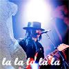
juiceb0xx with -10 votes
sorry and i hope you'll join us in the next round!
PEOPLE'S CHOICE-
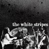
thatgirlsoph with +3 votes
MOD'S CHOICE-
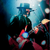
neuroticalx
and this is not because of last night!! i really do love it and the way you've managed to turn the picture into something mystical with the subtle blue glow around jack and the light texture just enhances everything.
RESULTS-
1: -6 +3
2: -1 +4
3: -1 +3
4: -1 +1
5: -3 +3
6: -10 +1
7: -7 +1
8: -3
ICONS-
#1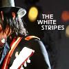
#2
#3
#4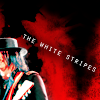
#5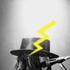
#6
#7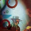
#8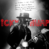
VOTES-
#1-
- The cropping looks awkward. You cannot see the face...
- Unflattering crop, and 'Jack White' would be more suitable text since not even half of him can be seen, let alone Meg.
- weird cropping
- The cropping isn't very appealing
- I don't like the way that you can't see the subject's face and the text is too simple.
- terrible cropping, the text is distracting also
+ very original cropping. I normally dislike white text in icons but this mixes well with the icon coloring
+ The cropping, text placement, and coloring are all great.
+ no reason given
#2-
- The pic's very small, its hard to tell what it is...
+ no reason given
+ I looooove the cropping!
+ Lovely composition, neat texture, and the text is very well done
+ good use of black and white and text works really well
#3-
- Too dark and messy. Nothing special was done to it, sorry.
+ nice colouring and textures
+ I love the coloring
+ I really like the colouring and use of textures on this icon
#4-
- the cropping is unflattering and the text is overly pixelated
+ Nice use of texture, interesting cropping and good text placement
#5-
- The yellow is a little distracting at first and it's a little bit hard to know who is in the icon because of the cropping
- The flash is a funny idea but the placement isn't very good
- Entire icon seems random - bright yellow lightning brush doesn't fit, and due to the cropping, most of the icon is blank
+ Very interesting
+ no reason given
+ very creative!
#6-
- It would have looked a lot better without the text, it really lowers the quality of the icon
- it just doesn't look like the icon flows. The texture/text don't go together
- Texture added doesn't fit the icon, text isn't easy to read and the font clashes
- The texture and text don't fit the picture, and the coloring is too blue
- There is way too much going on here and the 'la's on the bottom don't really suit the icon
- crop and text placement are unexciting, the texture doesn't add anything either
- text doesn't work with the icon
- The text is badly-placed and the colouring is too blueish
- Text placement is hard to read in spots and the bright white light with the texture on the side makes the whole thing just overwhelming
- seems nothing was done to the colouring, the icon shows me lack of creativity
+ no reason given
#7-
- the image could be a bit sharper and the arrangement of the circles looks very random
- The texture is very distracting. It's hard to focus on Jack
- The circular texture sort of over powers the icon
- The textures, while being popular, distracts from the overall image
- the texture is overpowering
- icon is too blurry
- the icon is too busy and the colouring washed out
+ Creative use of brushes, it really stands out form the rest
#8-
- The red text isn't readable and the scribbles above the head look akward.
- The text looks kind of oversharp
- The font isn't really working, its getting lost. Maybe a solid font would work better
and there was one more comment-
kudos for 04 and 08, they are very good too. :)
(let me know if i made any mistakes!)
ELIMINATED-

juiceb0xx with -10 votes
sorry and i hope you'll join us in the next round!
PEOPLE'S CHOICE-

thatgirlsoph with +3 votes
MOD'S CHOICE-

neuroticalx
and this is not because of last night!! i really do love it and the way you've managed to turn the picture into something mystical with the subtle blue glow around jack and the light texture just enhances everything.
RESULTS-
1: -6 +3
2: -1 +4
3: -1 +3
4: -1 +1
5: -3 +3
6: -10 +1
7: -7 +1
8: -3
ICONS-
#1

#2

#3

#4

#5

#6

#7

#8

VOTES-
#1-
- The cropping looks awkward. You cannot see the face...
- Unflattering crop, and 'Jack White' would be more suitable text since not even half of him can be seen, let alone Meg.
- weird cropping
- The cropping isn't very appealing
- I don't like the way that you can't see the subject's face and the text is too simple.
- terrible cropping, the text is distracting also
+ very original cropping. I normally dislike white text in icons but this mixes well with the icon coloring
+ The cropping, text placement, and coloring are all great.
+ no reason given
#2-
- The pic's very small, its hard to tell what it is...
+ no reason given
+ I looooove the cropping!
+ Lovely composition, neat texture, and the text is very well done
+ good use of black and white and text works really well
#3-
- Too dark and messy. Nothing special was done to it, sorry.
+ nice colouring and textures
+ I love the coloring
+ I really like the colouring and use of textures on this icon
#4-
- the cropping is unflattering and the text is overly pixelated
+ Nice use of texture, interesting cropping and good text placement
#5-
- The yellow is a little distracting at first and it's a little bit hard to know who is in the icon because of the cropping
- The flash is a funny idea but the placement isn't very good
- Entire icon seems random - bright yellow lightning brush doesn't fit, and due to the cropping, most of the icon is blank
+ Very interesting
+ no reason given
+ very creative!
#6-
- It would have looked a lot better without the text, it really lowers the quality of the icon
- it just doesn't look like the icon flows. The texture/text don't go together
- Texture added doesn't fit the icon, text isn't easy to read and the font clashes
- The texture and text don't fit the picture, and the coloring is too blue
- There is way too much going on here and the 'la's on the bottom don't really suit the icon
- crop and text placement are unexciting, the texture doesn't add anything either
- text doesn't work with the icon
- The text is badly-placed and the colouring is too blueish
- Text placement is hard to read in spots and the bright white light with the texture on the side makes the whole thing just overwhelming
- seems nothing was done to the colouring, the icon shows me lack of creativity
+ no reason given
#7-
- the image could be a bit sharper and the arrangement of the circles looks very random
- The texture is very distracting. It's hard to focus on Jack
- The circular texture sort of over powers the icon
- The textures, while being popular, distracts from the overall image
- the texture is overpowering
- icon is too blurry
- the icon is too busy and the colouring washed out
+ Creative use of brushes, it really stands out form the rest
#8-
- The red text isn't readable and the scribbles above the head look akward.
- The text looks kind of oversharp
- The font isn't really working, its getting lost. Maybe a solid font would work better
and there was one more comment-
kudos for 04 and 08, they are very good too. :)
(let me know if i made any mistakes!)