arbuus
in
indie_lims
ROUND #3 CHALLENGE #2 RESULTS
ELIMINATED-
kurren with -7 votes
sorry and i hope you'll join us in the next round!
PEOPLE'S CHOICE-
thatgirlsoph with +3 votes
MOD'S CHOICE-
whatifmaybe
i know the picture sucked so you chose the road i would have taken- go b&w! and it looks amazing =)
RESULTS-
1: -4 +1
2: -7
3: -1 +5
4: +3
5: -3
6: -4 +1
7: -2
8: -6
9: -6 +1
10: -1
11: -2 +1
ICONS-
#1
#2
#3
#4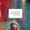
#5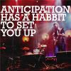
#6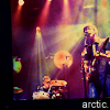
#7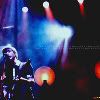
#8
#9
#10
#11
VOTES-
#1-
- The texture is overpowering and doesn't fit the icon
- the dashed line distracts from the picture itself
- the purple/green bit just looks very random, as does the dashed line
- I don't like the texture or brush used; it looks a bit basic
+ The brush and the splash of color work really well with the picture
#2-
- the text looks distrorted..
- The image is to sharp and the diplication looks like a ghost
- The text is the worst part on this one. It's not very clear and the crossing over of the lines makes it look really slopping. The icon would have been more successful sans the text at all
- the font is a little hard to read and the duplication is unnecessary
- it's too pixelated
- the text is hard to read, it looks kinda oversharpened
- The text is too small, making it a bit hard to read
#3-
- a bit too dark, could need more contrast
+ fantastic compostitioning and colours chosen!
+ no reason given
+ great mix of colours and unique style!
+ Fucking perfect
+ i like the repetition of the pic and the colours work well together. ^__^
#4-
+ no reason given
+ I'm a fan of the deep muted colors and the addition of putting the text in a small white box above Alex's head is a good choice as opposed to leaving the text alone
+ the cropping is amazing!
#5-
- the text is a bit too big, and the picture's too blurred
- The picture itself is really small and hard to focus in on Alex and the text takes up so much space that it becomes distracting. Besides, habit is spelled wrong
- I actually really like the icon, you've just spelt 'habit' wrong
#6-
- The text is very small and the position could be better (the colouring is great, though!)
- the text is distracting and looks our of place
- Looks very messy. Coloring doesn't work at all
- alex disappears in the cloud of yellow
+ really nice colouring and simple text use
#7-
- too dark
- Because of the composition of the picture itself, this was not a good choice of a crop 'cause it came out too dark
#8-
- The text along with the cropping of the picture make it very hard to see what's going on at first. There's just too much there
- The text doesn't fit and the cropping is akward, because you can only see half of the face
- I don't think the cropping is that successful, or it might just be that the contrast is upped so heavily that the subject becomes a little distorted. The text that reads 'Arctic Monkeys' is okay, but the text underneath that is a little odd. The coloring is a little poor too
- there's too much going on in the icon - the focus divides between image placement and heavy text and they don't mesh
- Looks too crowded. Texture, two types of fonts, etc. doesn't go with the pic that's not simple-looking either. Too much going on
- the cropping seems to have cut off Alex's head, and i don't think the two different fonts work together
#9-
- too dark and pixelated
- the picture doesn't look too good in black and white, and it kind of looks like Alex is in a middle of a sandstorm, so it looks distorted
- It's very dark, and there's way too much negative space
- The icon is a bit blurry
- It's too dark
- There is too little contrast and the picture looks very grainy
+ i love it! it's like you're at a show and he's far away and you're in a dark corner watching him through all the smoke
#10-
- The color bars don't work with the picture or text, and the picture is pretty dark
#11-
- It kinda looks like too much selective colouring was used, Alex's chin looks too red
- i love the colouring, but the font is a bit too much
+ I like the bright colours and the font used
(let me know if i made any mistakes!)