arbuus
in
indie_lims
ROUND #3 CHALLENGE #1 RESULTS
ELIMINATED-
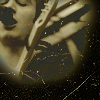
capturean with -11 votes
and

partofatale with -8 votes
sorry and i hope you'll join us in the next round!
PEOPLE'S CHOICE-
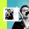
spiffydaze with +6 votes
MOD'S CHOICE-
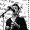
juiceb0xx
i like the texture used and it's simple, yet nice
RESULTS-
1: -7
2: +1
3:
4: -11
5: -8
6: -7
7: -1 +1
8: +6
9: -7 +2
10: -3
11: -2 +1
12: -2 +1
13: -2
14: -2
15: -3 +1
16: -1 +1
ICONS-
#1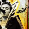
#2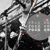
#3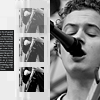
#4
#5
#6
#7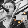
#8
#9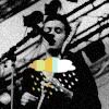
#10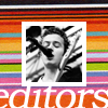
#11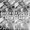
#12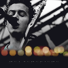
#13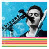
#14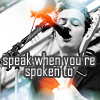
#15
#16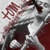
VOTES-
#1-
- You can't read the text very easily and the colours are too "patchy".
- The text is hard to read
- very confused, it's hard to focus on one thing
- The text is hard to read and the style doesn't suit the icon
- The texture takes away al the attention from the icon. The text is also very hard to read
- the text is hard too read and the colored parts on his neck/face are a bit distracting - I think the yellow would've worked better if he'd remained black&white
- it's too crowded and the texture is pixelated
#2-
+ no reason given
#4-
- The colours look odd and are washed out, and you wouldn't be able to tell who it was because of the way it's been cropped
- the sepia-ish colouring doesn't work
- It's too dark and the black texture and scratches are overpowering
- I love the cropping and texture use, the sepia tone is a nice colour, there's just not enough contrast in the cion - it's hard to make out the subject
- The grungy effect on the picture doesn't match the black around it. Looks very sloppily done
- It's kind of dark and the scratchy texture used overwhelms the icon
- The icon is really dark and the texture is overpowering
- too dark, too much empty space (or rather: too much space that looks just like a scratch texture)
- the scratch textures look a bit oversharpened
- The icon is a bit blurred
- it's too dark
#5-
- In my opinion, the icon is too simple and looks like not much has been done to the image
- It looks too plain
- a little too simple
- The most plain one of all
- the cropping is a bit awkward and the font is horribly plain
- the image looks a little blurred. it could be sharper reckon
- There's too little tension in the icon, because of the cropping and the writing exactly in the middle
- the font doesn't suit the icon
#6-
- The colours on this icon are very washed out and the image looks a bit too bright
- the text is hard to make out, and there's not enough contrast in the icon
- I dig the creativeness of this icon, but the crop, then coloring and texture used in this way make it look unflattering
- The text is rather hard to read and the image is rather blurry
- The texture s really overpowering the icon
- nice icon, but you can barely read the writing on it
- it's washed out and the cropping makes it hard to understand, what's on the icon
#7-
- The light blobs are kinda distracting, they look out of place
+ no reason given
#8-
+ it's cool, very original. the coloured background vs b/w is very effectively done
+ I'm warning this person. If you see me making something like this, don't say I didn't warn you. The composition, colors used, the whole thing... SUBLIME!
+ no reason given
+ the black and white contrast with colour works well. & i like the placement. =]
+ just perfect
+ no reason given
#9-
- The coloring is muddy and the rain cloud is distracting
- I find the icon too dark, which (in my opinion) lowers the quality of the graphic
- nice positioning and subtle texture use, but the brush or overlay is out of place and takes away from the icon
- too dark, the placement of the rain cloud doesn't work for me
- the idea is nice, but it doesn't work with this picture
- the contrast on the icon is very dark, it's hard to see the original image
- the picture is a bit fuzzy
+ I like the texture of this icon, and really like the cloud brush
+ I like the rain cloud thing!
#10-
- the coloured texture on the back is a little too much, the font choice could have been better
- The picture itself is blurry and the background doesn't really fit
- there is just too much going on with the texture
#11-
- It's washed out and the repeating of the picture plus the text make the icon too busy
- The text and lightness of the icon distract from the focal point that is supposed to be person in the picture
+ Duplicating the image adds something new to the picture. The text also fits really well and isn't overpowering.
#12-
- It looks too dark
- too dark, but I like the line of light dots^^
+ The whole arrangement is great, the crop, the light effects,...
#13-
- The different use of colours makes a rather bad clash
- The background doesn't seem to fit the icon. Also you forgot to erase some parts of the background
#14-
- Same reason as above, though it's not so obvious in this one. The maker could have picked a softer text to bring attention to the picture instead of distracting the eyes. Hope that makes sense haha
- the light textures used kind of take over the icon. it goes over his face too much
#15-
- The background looks a little out of place. If the person had added a border around the body, to sort of separate the background it would have look completely different
- it might look better if the cutting edges weren't so blurry
- Texture overpowers the pic. They don't blend in. In this type of icons, I always suggest doing something over the layers after being merged. At least a texture over it or any other effect, to... I'll put it this way... To GLUE those two layers together
+ Really simple but brilliant. I love the background used
#16-
- the smaller writing (under 'Tom') distracts from the overall icon
+ no reason given
(let me know if i made any mistakes!)

capturean with -11 votes
and

partofatale with -8 votes
sorry and i hope you'll join us in the next round!
PEOPLE'S CHOICE-

spiffydaze with +6 votes
MOD'S CHOICE-

juiceb0xx
i like the texture used and it's simple, yet nice
RESULTS-
1: -7
2: +1
3:
4: -11
5: -8
6: -7
7: -1 +1
8: +6
9: -7 +2
10: -3
11: -2 +1
12: -2 +1
13: -2
14: -2
15: -3 +1
16: -1 +1
ICONS-
#1

#2

#3

#4

#5

#6

#7

#8

#9

#10

#11

#12

#13

#14

#15

#16

VOTES-
#1-
- You can't read the text very easily and the colours are too "patchy".
- The text is hard to read
- very confused, it's hard to focus on one thing
- The text is hard to read and the style doesn't suit the icon
- The texture takes away al the attention from the icon. The text is also very hard to read
- the text is hard too read and the colored parts on his neck/face are a bit distracting - I think the yellow would've worked better if he'd remained black&white
- it's too crowded and the texture is pixelated
#2-
+ no reason given
#4-
- The colours look odd and are washed out, and you wouldn't be able to tell who it was because of the way it's been cropped
- the sepia-ish colouring doesn't work
- It's too dark and the black texture and scratches are overpowering
- I love the cropping and texture use, the sepia tone is a nice colour, there's just not enough contrast in the cion - it's hard to make out the subject
- The grungy effect on the picture doesn't match the black around it. Looks very sloppily done
- It's kind of dark and the scratchy texture used overwhelms the icon
- The icon is really dark and the texture is overpowering
- too dark, too much empty space (or rather: too much space that looks just like a scratch texture)
- the scratch textures look a bit oversharpened
- The icon is a bit blurred
- it's too dark
#5-
- In my opinion, the icon is too simple and looks like not much has been done to the image
- It looks too plain
- a little too simple
- The most plain one of all
- the cropping is a bit awkward and the font is horribly plain
- the image looks a little blurred. it could be sharper reckon
- There's too little tension in the icon, because of the cropping and the writing exactly in the middle
- the font doesn't suit the icon
#6-
- The colours on this icon are very washed out and the image looks a bit too bright
- the text is hard to make out, and there's not enough contrast in the icon
- I dig the creativeness of this icon, but the crop, then coloring and texture used in this way make it look unflattering
- The text is rather hard to read and the image is rather blurry
- The texture s really overpowering the icon
- nice icon, but you can barely read the writing on it
- it's washed out and the cropping makes it hard to understand, what's on the icon
#7-
- The light blobs are kinda distracting, they look out of place
+ no reason given
#8-
+ it's cool, very original. the coloured background vs b/w is very effectively done
+ I'm warning this person. If you see me making something like this, don't say I didn't warn you. The composition, colors used, the whole thing... SUBLIME!
+ no reason given
+ the black and white contrast with colour works well. & i like the placement. =]
+ just perfect
+ no reason given
#9-
- The coloring is muddy and the rain cloud is distracting
- I find the icon too dark, which (in my opinion) lowers the quality of the graphic
- nice positioning and subtle texture use, but the brush or overlay is out of place and takes away from the icon
- too dark, the placement of the rain cloud doesn't work for me
- the idea is nice, but it doesn't work with this picture
- the contrast on the icon is very dark, it's hard to see the original image
- the picture is a bit fuzzy
+ I like the texture of this icon, and really like the cloud brush
+ I like the rain cloud thing!
#10-
- the coloured texture on the back is a little too much, the font choice could have been better
- The picture itself is blurry and the background doesn't really fit
- there is just too much going on with the texture
#11-
- It's washed out and the repeating of the picture plus the text make the icon too busy
- The text and lightness of the icon distract from the focal point that is supposed to be person in the picture
+ Duplicating the image adds something new to the picture. The text also fits really well and isn't overpowering.
#12-
- It looks too dark
- too dark, but I like the line of light dots^^
+ The whole arrangement is great, the crop, the light effects,...
#13-
- The different use of colours makes a rather bad clash
- The background doesn't seem to fit the icon. Also you forgot to erase some parts of the background
#14-
- Same reason as above, though it's not so obvious in this one. The maker could have picked a softer text to bring attention to the picture instead of distracting the eyes. Hope that makes sense haha
- the light textures used kind of take over the icon. it goes over his face too much
#15-
- The background looks a little out of place. If the person had added a border around the body, to sort of separate the background it would have look completely different
- it might look better if the cutting edges weren't so blurry
- Texture overpowers the pic. They don't blend in. In this type of icons, I always suggest doing something over the layers after being merged. At least a texture over it or any other effect, to... I'll put it this way... To GLUE those two layers together
+ Really simple but brilliant. I love the background used
#16-
- the smaller writing (under 'Tom') distracts from the overall icon
+ no reason given
(let me know if i made any mistakes!)