Hello
I have 8 icons that I'd love your opinions on. It's just like the other two or so posts I've done. Be brutal, if need be ;)
1.
2.
3.
4.
5.
6.
7.
8.
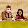
#1-Does a background like this work well? Coloring, the likes.
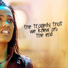
#2-I'm getting into these kind of croppings, way off or close up or whatever, does it work? And the text, would love feedback on that as I loathe text, but sometimes feel the need for it.
#3-Extended black backgrounds, what do y'all think? And the light texture, I'm loving using these, but I'd like some opinions.
#4-Similar to #3, the light texture, does it work like this?
#5-Saw an icon that inspired this, does it work? I'm so on the fence about it.
#6-I felt my Office icons were way to bland, and thought some would work with textures/backgrounds like this. Yes/No? I have other examples if interested.
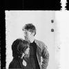
#7-How well does this work for you? Would be better without the two people, or better matched caps?
#8-How do y'all feel about the split icon? Is it too rough with the obvious blend in the middle, or no? Curious.
Overall, is the coloring okay?
Thank you all so much!
1.

2.

3.

4.

5.

6.

7.

8.

#1-Does a background like this work well? Coloring, the likes.
#2-I'm getting into these kind of croppings, way off or close up or whatever, does it work? And the text, would love feedback on that as I loathe text, but sometimes feel the need for it.
#3-Extended black backgrounds, what do y'all think? And the light texture, I'm loving using these, but I'd like some opinions.
#4-Similar to #3, the light texture, does it work like this?
#5-Saw an icon that inspired this, does it work? I'm so on the fence about it.
#6-I felt my Office icons were way to bland, and thought some would work with textures/backgrounds like this. Yes/No? I have other examples if interested.
#7-How well does this work for you? Would be better without the two people, or better matched caps?
#8-How do y'all feel about the split icon? Is it too rough with the obvious blend in the middle, or no? Curious.
Overall, is the coloring okay?
Thank you all so much!