Q&As and Tutorials
This is going to be my Q/A + Tutorial post. Ask questions + tutorial requests here, and I'll come back and edit this with my responses.
T U T O R I A L S
1. I did one very long ago for this icon:
. It can be found here.
Q U E S T I O N S / A N S W E R S
From celestial_m00n
Q: Okay, I want to ask you how did you get the simple lights/colors that fit with the image so much:
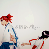


A: If you're asking about selecting colors in general, I guess I tend to use a lot of color adjustment layers (e.g. curves, selective coloring). >____> I usually pile seven or so adjustment layers on top of my icons before I'm happy with it, so it's mostly a matter of experimenting.
But if you mean the round blobs of highlights at the outlines of the image, then I do have a strategy for how to use them. They work best on light backgrounds because they give the sense of light shining from behind the character. I basically make a new layer set to screen, and use a blurred round brush (decently large size like 65 or 100) with either turquoise blue or red-orange and just click once along the edges. Then I adjust the opacity or go in with a layer mask and erase some of the highlight if it's too much. I also like to use the smudge tool to smudge the light if it looks too round.
Q: Do you prefer any type of textures?
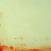
A: I do! I really love textures that give the icon a sense of multiple layers of color or give it a vignetting effect.
Examples:
1.
(I don't remember who it's by anymore. >___<)
2.
(by soaked)
3.
(by soaked)
I use these textures a lot, because they give an otherwise empty background a sense of atmosphere and because of the subtle gradient effects. I usually like to set these on a lower opacity to "multiply" and then just smudge and crop the texture until it looks good with my icon.
Q: How did you deal with the background, if you have a colorful manga colorization? (my userpic is my own coloring, and yes, I don't know how should I do with the backgrounds)

A: Haha, this is actually related to the last question. I love white backgrounds, because they work well with the aforementioned textures. With an icon like this, I would probably put a light peach/tan colored texture on a new layer and set it to "multiply." Then I'd play with the opacity. And then I might use a layer mask to get rid of parts of the texture that might be covering the character. Finally, I'd use the round blobs of highlights to make everything a bit more shiny.
T U T O R I A L S
1. I did one very long ago for this icon:

. It can be found here.
Q U E S T I O N S / A N S W E R S
From celestial_m00n
Q: Okay, I want to ask you how did you get the simple lights/colors that fit with the image so much:


A: If you're asking about selecting colors in general, I guess I tend to use a lot of color adjustment layers (e.g. curves, selective coloring). >____> I usually pile seven or so adjustment layers on top of my icons before I'm happy with it, so it's mostly a matter of experimenting.
But if you mean the round blobs of highlights at the outlines of the image, then I do have a strategy for how to use them. They work best on light backgrounds because they give the sense of light shining from behind the character. I basically make a new layer set to screen, and use a blurred round brush (decently large size like 65 or 100) with either turquoise blue or red-orange and just click once along the edges. Then I adjust the opacity or go in with a layer mask and erase some of the highlight if it's too much. I also like to use the smudge tool to smudge the light if it looks too round.
Q: Do you prefer any type of textures?
A: I do! I really love textures that give the icon a sense of multiple layers of color or give it a vignetting effect.
Examples:
1.

(I don't remember who it's by anymore. >___<)
2.

(by soaked)
3.

(by soaked)
I use these textures a lot, because they give an otherwise empty background a sense of atmosphere and because of the subtle gradient effects. I usually like to set these on a lower opacity to "multiply" and then just smudge and crop the texture until it looks good with my icon.
Q: How did you deal with the background, if you have a colorful manga colorization? (my userpic is my own coloring, and yes, I don't know how should I do with the backgrounds)

A: Haha, this is actually related to the last question. I love white backgrounds, because they work well with the aforementioned textures. With an icon like this, I would probably put a light peach/tan colored texture on a new layer and set it to "multiply." Then I'd play with the opacity. And then I might use a layer mask to get rid of parts of the texture that might be covering the character. Finally, I'd use the round blobs of highlights to make everything a bit more shiny.