Graph Fun!
With any luck I'll be graduating after this semester, so I've recently been hectically running around checking that all my enrollments are in order. This meant a lot of pouring over marks from previous units, and because I like graphs, I decided to graph them.
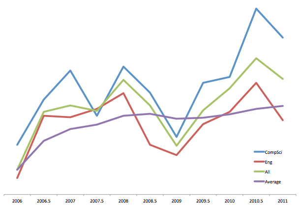
I know it doesn't mean much without a scale, so I'll just say that there is a difference of about 40% between the highest and lowest points.
I keep being told that weighted average is dependent on level of the unit (i.e. the higher level the unit, the more it is worth), but I've never officially seen that written anywhere. My difference in average between level 3 & 1 units is 14%, so I certainly hope it is.
The end is finally in sight!