tutorials!
WELCOME NEW WATCHERS! Thank you all so much for joining/watching idkreeg. It means so very much to me and lintwhite :DD
I have a very large batch of icons in the works, but a lot of people on Plurk talked me into making a tutorial. This is long, but it's not complicated. If you can color icons, you can do this. In fact, I'm kind of embarrassed that it looks like I'm thinking everyone is new to this. But yeah, tutorial!! Enjoy. ♥
MANGA COLOR TUTORIAL
this to
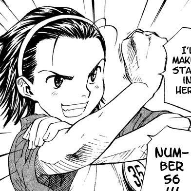
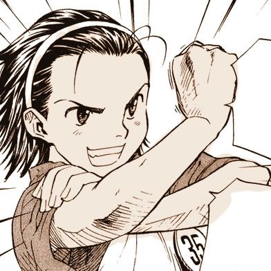
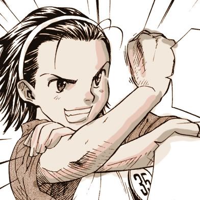
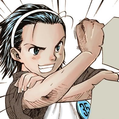
01. I start with this cute panel from Yakitate Japan, which I happened to be reading at the time. I make icons while I read constantly.
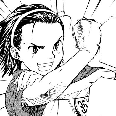
02. Clean off any text or anything you don't want in the coloring. I don't mind leaving in panels. Sometimes it's rly impossible to crop them out.
03. These scans are pretty clean, but if you're DLing anything off One Manga to make icons, don't fret, it's possible to clean. (I prefer not to, however.) You can find how-to in my old tutorial here.
(A)
(B)
(C)
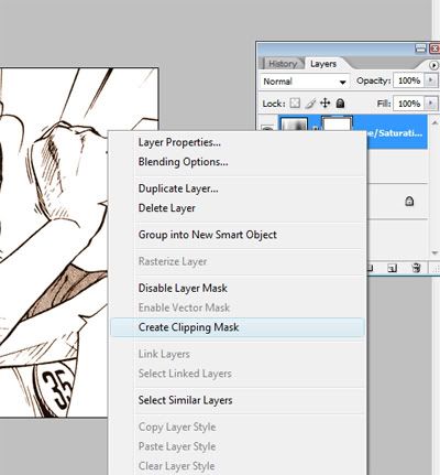
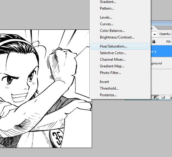
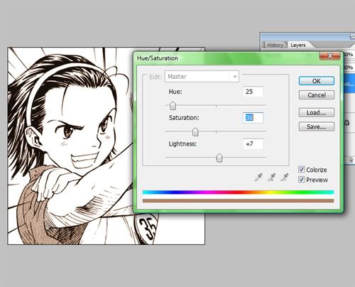
04. Time to prepare the lineart! I make a new Hue/Saturation Layer (A) then set it to something like this (B) and then create clipping mask (C). In Photoshop CS, not 2 or 3, the command for clipping masks is ctrl+g. Ta-da!
05. Make the lineart to Multiply and make a new layer beneath it. We want to take a slightly neutral tan color for the base skin tone and fill it in. It's okay to be messy, the point is to fill in all the white. If you're like me, you're always gonna be messy.
06. SHADING PART. I don't shade with anything but a round brush set to regular settings. To start, I pick a brownish color that's in the range of the base skin. I chose #c0af9b.

07. Somewhat (okay very) haphazardly block in the darkest part of the shading. It look like poo, I know.
08. So I pick a peachier color. #e9c7b8 seems good. With this, I add a second bit of shading. I do this to brighten the colors, so when I blend them it won't be muddy. I like to fill in the entire nose at this point, because I'll shape it up later.

09. I get an even PEACHIER color, almost an orange (#f8bfa5) and add some more color.
10. Now here's where it gets tricky. Pick a color halfway between the shading and the base color. Any part of the shading. An easy way to get this color is a little color mixing. Turn down your brush opacity and swipe the darker color over the lighter one. Use your eyedropper to pick up the new color :D
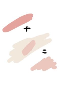
mixin' colahs
Okay, with our new color (#f3d7cb), we turn down the opacity to about 32% and we'll color a little. Just basic blending. It's okay to use the blur tool a little on this. (GASP) it's going to be shrunken, so it doesn't matter.
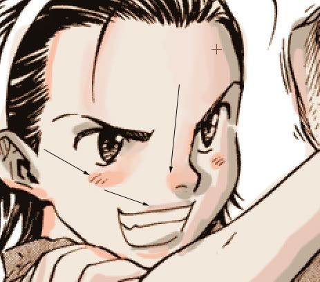
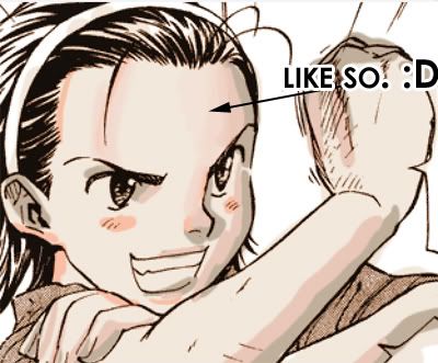
11. Now, to blend more, keep picking up colors with your eyedropper with the blended shadows. I've indicated with arrows good places to pick up colors. Just blend them together.
12. I keep blending all over the areas I've colored.
after adding the gradient ... and blending a bit more D|

gradient tab
13. NOW IT'S CHEATIN' TIME. Two good things? I lock my layer. (The small transparency button by "Lock" in the layers window, but I'm sure you knew that.) Then get a very light peach from the skin and pick the gradient tool and set that to fade to transparent. I also set it to Multiply and Opacity 30-45%. Drag it from the opposite of the light source (shadow source?). Voila! YOU CAN ALSO duplicate your skin color. Set the duplicate to Multiply at 25% opacity. :)
14. Clean up/detail time. Pretty easy to see I just erased all the skin, filled in the gray for the shirt and added some soft shading to the apron/hightlights to hair. Usually I just soft shade clothes with an airbrush. Attention isn't paid much to them unless it's the focal point of the icon. I might add a little hightlights with the dodge tool (the only time you'll ever hear me justifying the existence of this tool) because it's easy and clean in moderation on icons
:D
15. Now just crop (if you haven't already -- sometimes I do multiple ones from one color) and shrink. At this point I paste it into a pre-made PSD that I fixed up earlier (I have literally like 30 of them hanging around my computer) and it adds some brightness and ... glam to it. LOL
16. At this point, sometimes I do a little editing in the PSD -- I may brighten the cheeks with the saturate tool (found with burn/dodge) or brightness/contrast it a little to my tastes. Or you can add textures. But for the most part, this thing is done.
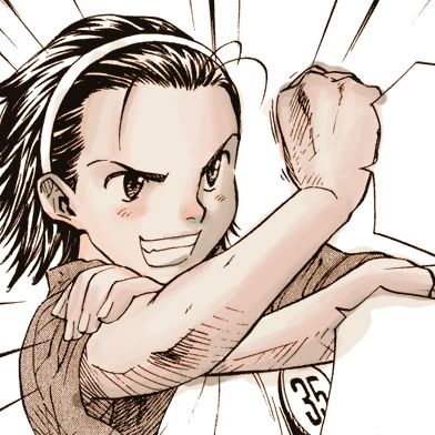
FINISHED ICON
The last thing I did to this was desaturated the clothing (it was a tad brown) with the desaturate tool and brightened the face.
PSD for Download!
This is just how I do things, basically. Feel free to play around with it, do something different, skip a step. I just like tutorials because I love seeing the process by which others work. I hope you enjoyed this (long-winded) tutorial!!
I have a very large batch of icons in the works, but a lot of people on Plurk talked me into making a tutorial. This is long, but it's not complicated. If you can color icons, you can do this. In fact, I'm kind of embarrassed that it looks like I'm thinking everyone is new to this. But yeah, tutorial!! Enjoy. ♥
MANGA COLOR TUTORIAL
this to
01. I start with this cute panel from Yakitate Japan, which I happened to be reading at the time. I make icons while I read constantly.
02. Clean off any text or anything you don't want in the coloring. I don't mind leaving in panels. Sometimes it's rly impossible to crop them out.
03. These scans are pretty clean, but if you're DLing anything off One Manga to make icons, don't fret, it's possible to clean. (I prefer not to, however.) You can find how-to in my old tutorial here.
(A)
(B)
(C)
04. Time to prepare the lineart! I make a new Hue/Saturation Layer (A) then set it to something like this (B) and then create clipping mask (C). In Photoshop CS, not 2 or 3, the command for clipping masks is ctrl+g. Ta-da!
05. Make the lineart to Multiply and make a new layer beneath it. We want to take a slightly neutral tan color for the base skin tone and fill it in. It's okay to be messy, the point is to fill in all the white. If you're like me, you're always gonna be messy.
06. SHADING PART. I don't shade with anything but a round brush set to regular settings. To start, I pick a brownish color that's in the range of the base skin. I chose #c0af9b.
07. Somewhat (okay very) haphazardly block in the darkest part of the shading. It look like poo, I know.
08. So I pick a peachier color. #e9c7b8 seems good. With this, I add a second bit of shading. I do this to brighten the colors, so when I blend them it won't be muddy. I like to fill in the entire nose at this point, because I'll shape it up later.
09. I get an even PEACHIER color, almost an orange (#f8bfa5) and add some more color.
10. Now here's where it gets tricky. Pick a color halfway between the shading and the base color. Any part of the shading. An easy way to get this color is a little color mixing. Turn down your brush opacity and swipe the darker color over the lighter one. Use your eyedropper to pick up the new color :D
mixin' colahs
Okay, with our new color (#f3d7cb), we turn down the opacity to about 32% and we'll color a little. Just basic blending. It's okay to use the blur tool a little on this. (GASP) it's going to be shrunken, so it doesn't matter.
11. Now, to blend more, keep picking up colors with your eyedropper with the blended shadows. I've indicated with arrows good places to pick up colors. Just blend them together.
12. I keep blending all over the areas I've colored.
after adding the gradient ... and blending a bit more D|
gradient tab
13. NOW IT'S CHEATIN' TIME. Two good things? I lock my layer. (The small transparency button by "Lock" in the layers window, but I'm sure you knew that.) Then get a very light peach from the skin and pick the gradient tool and set that to fade to transparent. I also set it to Multiply and Opacity 30-45%. Drag it from the opposite of the light source (shadow source?). Voila! YOU CAN ALSO duplicate your skin color. Set the duplicate to Multiply at 25% opacity. :)
14. Clean up/detail time. Pretty easy to see I just erased all the skin, filled in the gray for the shirt and added some soft shading to the apron/hightlights to hair. Usually I just soft shade clothes with an airbrush. Attention isn't paid much to them unless it's the focal point of the icon. I might add a little hightlights with the dodge tool (the only time you'll ever hear me justifying the existence of this tool) because it's easy and clean in moderation on icons
:D
15. Now just crop (if you haven't already -- sometimes I do multiple ones from one color) and shrink. At this point I paste it into a pre-made PSD that I fixed up earlier (I have literally like 30 of them hanging around my computer) and it adds some brightness and ... glam to it. LOL
16. At this point, sometimes I do a little editing in the PSD -- I may brighten the cheeks with the saturate tool (found with burn/dodge) or brightness/contrast it a little to my tastes. Or you can add textures. But for the most part, this thing is done.
FINISHED ICON
The last thing I did to this was desaturated the clothing (it was a tad brown) with the desaturate tool and brightened the face.
PSD for Download!
This is just how I do things, basically. Feel free to play around with it, do something different, skip a step. I just like tutorials because I love seeing the process by which others work. I hope you enjoyed this (long-winded) tutorial!!