Icon Tutorial #2 - KAT-TUN / Colouring technique
It's been a long time since I've written one, but because ravenlullaby requested it, and I have nothing better to do :D, I will show you how to magically transform your icon from:

to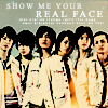
...in Adobe Photoshop CS 8.0 (100% translateable), and beginniner-friendly(ish).
Now. To start off, we of course, have a base. Featuring the lovely bois from KAT-TUN. And we laugh at how Kame is always in the middle, but anyway.

I sharpened mine, but this step is optional, since I found it doesn't work on some.
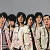
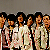
Make a new layer, and floodfill it with a tan/brown colour. I used #D1C0AC. Set it to color burn, 100%.

-->
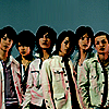
Make another new layer, and floodfill it with a light blue colour (Oh yes, light blue = love.) such as #9DDCF7. Set this to color burn, 100% as well.

-->
Duplicate your base and drag it over the top of the two colour layers (Copy 1). Duplicate this twice more, so you have 3 base copies (Copy 2 and Copy 3). Set the copies to the following layer modes:
Copy 1 - Desaturate, screen, 100%
Copy 2 - Screen, 100% (DO NOT DESATURATE. Or you might, if it's a really bright icon. But for this type of image, please don't.)
Copy 3 - Soft light, 100% (Again, don't desaturate, it takes away too much colour. Unless you need to. Again, play around!)
Which leaves you with this.
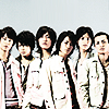
Oh yes. How disgusting and ew. Not to fear, I know what I'm doing 8D!
Next, add this light texture by uh...uh...um...D:! I don't know >>. Just to say so, I don't know where I got any of the textures used, because I'm a ditz who gets half of them from tutorials by just going
"Oooh, pretty *save*" >_>. Please let me know if you know who made them!
But anyway, add the texture and set it to screen, 100%. Depending on your image, rotate it as you please. I rotated mine 90 degrees anti-clockwise, because it was blocking the poor bois faces :D
-->
This gives you:
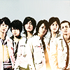
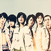
Now you're probably wondering how the heck the icon's going to work out. But never fear, because BLUE EXCLUSION saves everything. So make a new layer, and pick a nice, dark blue colour. I used
#020F2C. Set it to exclusion, 80%. Yey for blue exclusion layers 8D!

-->
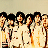
It still looks bad, so make a new layer and fill it with a...pinky brown colour o_O. Well, I used #C59F8E. Set this to color burn, 100%.

-->
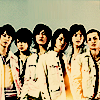
Duplicate that light blue layer from earlier, and drag it to the top. Just leave the layer mode alone, at color burn, 100%. Don't you love how lazy I am?

-->
And um. You're done, technically. But I love complicating things, and no tutorial's complete without yet another light texture. Oh yes. Again, I don't know who it's by. Paste this texture just above your base layer. Yes, that means the BASE base layer. Underneath all the junk we had before. Set it to soft light, 100%. I flipped my texture vertically, because the bright blotch looked bad.

-->
And now you're really done. Add brushes, text, whatever, to make it look spiffier.
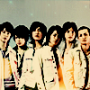
This is my final result:

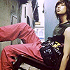
As an example of another outcome of this colouring technique, I shall show you the icon which spawned the tutorial, which won 1st place at apc_icontest during Week 01. Oh yes, you can't tell at all. Again, it depends on your base :)! This tutorial works best with images that lack brightness in colour, because of the overly excessive color burn layers.
-->

to

...in Adobe Photoshop CS 8.0 (100% translateable), and beginniner-friendly(ish).
Now. To start off, we of course, have a base. Featuring the lovely bois from KAT-TUN. And we laugh at how Kame is always in the middle, but anyway.

I sharpened mine, but this step is optional, since I found it doesn't work on some.

Make a new layer, and floodfill it with a tan/brown colour. I used #D1C0AC. Set it to color burn, 100%.

-->

Make another new layer, and floodfill it with a light blue colour (Oh yes, light blue = love.) such as #9DDCF7. Set this to color burn, 100% as well.

-->

Duplicate your base and drag it over the top of the two colour layers (Copy 1). Duplicate this twice more, so you have 3 base copies (Copy 2 and Copy 3). Set the copies to the following layer modes:
Copy 1 - Desaturate, screen, 100%
Copy 2 - Screen, 100% (DO NOT DESATURATE. Or you might, if it's a really bright icon. But for this type of image, please don't.)
Copy 3 - Soft light, 100% (Again, don't desaturate, it takes away too much colour. Unless you need to. Again, play around!)
Which leaves you with this.

Oh yes. How disgusting and ew. Not to fear, I know what I'm doing 8D!
Next, add this light texture by uh...uh...um...D:! I don't know >>. Just to say so, I don't know where I got any of the textures used, because I'm a ditz who gets half of them from tutorials by just going
"Oooh, pretty *save*" >_>. Please let me know if you know who made them!
But anyway, add the texture and set it to screen, 100%. Depending on your image, rotate it as you please. I rotated mine 90 degrees anti-clockwise, because it was blocking the poor bois faces :D

-->

This gives you:

Now you're probably wondering how the heck the icon's going to work out. But never fear, because BLUE EXCLUSION saves everything. So make a new layer, and pick a nice, dark blue colour. I used
#020F2C. Set it to exclusion, 80%. Yey for blue exclusion layers 8D!

-->

It still looks bad, so make a new layer and fill it with a...pinky brown colour o_O. Well, I used #C59F8E. Set this to color burn, 100%.

-->

Duplicate that light blue layer from earlier, and drag it to the top. Just leave the layer mode alone, at color burn, 100%. Don't you love how lazy I am?

-->

And um. You're done, technically. But I love complicating things, and no tutorial's complete without yet another light texture. Oh yes. Again, I don't know who it's by. Paste this texture just above your base layer. Yes, that means the BASE base layer. Underneath all the junk we had before. Set it to soft light, 100%. I flipped my texture vertically, because the bright blotch looked bad.

-->

And now you're really done. Add brushes, text, whatever, to make it look spiffier.

This is my final result:

As an example of another outcome of this colouring technique, I shall show you the icon which spawned the tutorial, which won 1st place at apc_icontest during Week 01. Oh yes, you can't tell at all. Again, it depends on your base :)! This tutorial works best with images that lack brightness in colour, because of the overly excessive color burn layers.

-->