Icon Tutorial #6: Ryou Katsuragi
Requested by inquisitory. Hurhur, I haven't written an icon tutorial in forever XD.
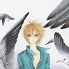
We'll be going from:
to
Made in Adobe Photoshop CS 3.0, not translatable to programs without selective colouring. Geared towards people who know graphics lingo and don't need LOLINDEPTH explanations as to how to change things like layer modes, and also people who know how to make adjustment layers, because I'm too lazy to explain.
Anyway, prepare your base, whatever whatever. For this icon, I think I applied a slight sharpen, but nothing intense, considering it's still a bit blurry. This is something I do with a lot of my icons - I always apply sharpen and fade it to around 20~40% (if I even sharpen at all), because my colouring techniques are very contrast-intensive, meaning that the icon will naturally sharpen itself by the end.

Add a curves adjustment layer aimed at increasing the contrast and adding more depth. I used the following input values, but it may not necessarily pertain to your scan - just do what you think looks best! In fact, generally I don't think a lot when it comes to curves. I tend to just add a point near the top of the curve, and drag it upwards, and a point nearer to the bottom, and drag that downwards. But like I said - each base needs different treatment!
♣ point 1 ➝ output: 188, input: 188
♣ point 2 ➝ output: 47, input: 84

Whee, my favourite (aka mandatory in the Alice-books) step. Make a new layer and fill it with a dark blue (I chose #0D053A) and set the layer to exclusion, 100%.

➝
Make another layer and fill it with a light tan (I chose #E9E9CC), and set it on multiply, 100%.

➝
Neext, the fun part, and when the icon starts to come together a lot better 8D! Add a new colour balance adjustment layer (It's important that this is an ADJUSTMENT LAYER, as in, a seperate entity from everything below. Because merging is for losers-- I said nothing 8D). The aim of this colour balance was to turn the whole colour scheme to a more purplish/blueish hue, so obviously if my settings don't work for you, you may need to fiddle with the numbers a bit more!
♣ midtones: +10 | -41 | -13
♣ shadows: +9 | -18 | +32
♣ highlights: -17 | +5 | +12

Eww what, dull, no-contrastness makes Alice a sad iconmaker ;~;. So, in lieu of that, add a new levels adjustment layer. I'm preeeetty bad at explaining how to use levels, but uh, in any case, draggin the white bar towards the left increases the whites, dragging the black bar to the right increases blacks, and dragging the grey bar towards either direction increases/decreases the amount of "neutral" shades. In any case, the objective of this levels is to increase the contrast, which means adding more white and black :D! I used the following settings:
♣ 20 | 1.00 | 239 (dragged black bar to the left slightly, left the grey bar alone, dragged white bar to the left slightly)

A jolly normal person would say "WHEE I'M DONE, YAY". Well, okay, you could be done, and all (oftentimes, my icons really are that - exclusion, multiply, colour balance, curves), but this icon just seems to lack...something. SO YEAH, TIME TO BRING IN TEXTURES.
I decided that there wasn't very much texturing required at all, and I just needed a little bit of grain to maybe add some "oomph" to it, and fill up the ridiculous amounts of whitespace. I used the following texture by cdg and set it on linear burn, 100%. Multiply may work better depending on the image and the texture you decide on, and of course, the layer opacity should totally be played with!
➝
The next step is possibly optional, but I decided that the colours just didn't "pop" enough for me, so add a new selective colour adjustment layer. The idea was to increase the reds slightly, push up the blues, and give the whole icon a more magenta/peachy tint. Obviously the values given aren't going to apply to all images (e.g. not all images have blue and cyan, and some images are going to have green and stuff), so experiment until you think you've got a similar effect.
♣ reds: -10 | -22 | +37 | 0
♣ cyans: +14 | -22 | +14 | +1 (I actually have no clue what the black on +1 does 8D)
♣ blues: +21 | +16 | -100 | 0
♣ neutrals: +5 | +15 | +3 | 0

TECHNICALLY, you're done. And for some icons, you might really be done. But I wasn't satisfied with how dark the whole icon was, so I added another curves adjustment layer, with only one point aimed at just brightening up the icon.
♣ output: 194, input: 180
Aaaaaand, you're done! That wasn't that long XD!

Other icons made using this tutorial as a guide:

...Ahaha this is terrible. idk what I was doing. There were slight adjustments in the colour balance layer, and obviously a texture (by millepetit) that went underneath it (with some colour balance applied to make it blend better).

Lots of changes made to the selective colour, specifically to tone down the blues. The curves were aimed more at lightening the base layer too, and there was a screen duplicate of the base way at the bottom (You know all those tutorials that go "Prep your base. Now duplicate it and set it on screen"...?). Also, I added a hue/saturation adjustment layer over the top of it to push up the saturation, since it was a little dull XD. This tutorial is totally not good for dark images, as you can tell.
I'd love to see what you guys can come up with this tutorial ♥! Hopefully it wasn't TOO random to follow XD.
♫ Credit not required - tutorial = guideline, after all. But comments & pimping out if you thought this was helpful would be really fab ♥
♫ Whilst credit isn't required, please don't duplicate this tutorial and claim credit for it D8.
♫ Other tutorials?
♫ Request a tutorial?
We'll be going from:

to

Made in Adobe Photoshop CS 3.0, not translatable to programs without selective colouring. Geared towards people who know graphics lingo and don't need LOLINDEPTH explanations as to how to change things like layer modes, and also people who know how to make adjustment layers, because I'm too lazy to explain.
Anyway, prepare your base, whatever whatever. For this icon, I think I applied a slight sharpen, but nothing intense, considering it's still a bit blurry. This is something I do with a lot of my icons - I always apply sharpen and fade it to around 20~40% (if I even sharpen at all), because my colouring techniques are very contrast-intensive, meaning that the icon will naturally sharpen itself by the end.

Add a curves adjustment layer aimed at increasing the contrast and adding more depth. I used the following input values, but it may not necessarily pertain to your scan - just do what you think looks best! In fact, generally I don't think a lot when it comes to curves. I tend to just add a point near the top of the curve, and drag it upwards, and a point nearer to the bottom, and drag that downwards. But like I said - each base needs different treatment!
♣ point 1 ➝ output: 188, input: 188
♣ point 2 ➝ output: 47, input: 84

Whee, my favourite (aka mandatory in the Alice-books) step. Make a new layer and fill it with a dark blue (I chose #0D053A) and set the layer to exclusion, 100%.

➝

Make another layer and fill it with a light tan (I chose #E9E9CC), and set it on multiply, 100%.

➝

Neext, the fun part, and when the icon starts to come together a lot better 8D! Add a new colour balance adjustment layer (It's important that this is an ADJUSTMENT LAYER, as in, a seperate entity from everything below. Because merging is for losers-- I said nothing 8D). The aim of this colour balance was to turn the whole colour scheme to a more purplish/blueish hue, so obviously if my settings don't work for you, you may need to fiddle with the numbers a bit more!
♣ midtones: +10 | -41 | -13
♣ shadows: +9 | -18 | +32
♣ highlights: -17 | +5 | +12

Eww what, dull, no-contrastness makes Alice a sad iconmaker ;~;. So, in lieu of that, add a new levels adjustment layer. I'm preeeetty bad at explaining how to use levels, but uh, in any case, draggin the white bar towards the left increases the whites, dragging the black bar to the right increases blacks, and dragging the grey bar towards either direction increases/decreases the amount of "neutral" shades. In any case, the objective of this levels is to increase the contrast, which means adding more white and black :D! I used the following settings:
♣ 20 | 1.00 | 239 (dragged black bar to the left slightly, left the grey bar alone, dragged white bar to the left slightly)

A jolly normal person would say "WHEE I'M DONE, YAY". Well, okay, you could be done, and all (oftentimes, my icons really are that - exclusion, multiply, colour balance, curves), but this icon just seems to lack...something. SO YEAH, TIME TO BRING IN TEXTURES.
I decided that there wasn't very much texturing required at all, and I just needed a little bit of grain to maybe add some "oomph" to it, and fill up the ridiculous amounts of whitespace. I used the following texture by cdg and set it on linear burn, 100%. Multiply may work better depending on the image and the texture you decide on, and of course, the layer opacity should totally be played with!

➝

The next step is possibly optional, but I decided that the colours just didn't "pop" enough for me, so add a new selective colour adjustment layer. The idea was to increase the reds slightly, push up the blues, and give the whole icon a more magenta/peachy tint. Obviously the values given aren't going to apply to all images (e.g. not all images have blue and cyan, and some images are going to have green and stuff), so experiment until you think you've got a similar effect.
♣ reds: -10 | -22 | +37 | 0
♣ cyans: +14 | -22 | +14 | +1 (I actually have no clue what the black on +1 does 8D)
♣ blues: +21 | +16 | -100 | 0
♣ neutrals: +5 | +15 | +3 | 0

TECHNICALLY, you're done. And for some icons, you might really be done. But I wasn't satisfied with how dark the whole icon was, so I added another curves adjustment layer, with only one point aimed at just brightening up the icon.
♣ output: 194, input: 180
Aaaaaand, you're done! That wasn't that long XD!

Other icons made using this tutorial as a guide:

...Ahaha this is terrible. idk what I was doing. There were slight adjustments in the colour balance layer, and obviously a texture (by millepetit) that went underneath it (with some colour balance applied to make it blend better).

Lots of changes made to the selective colour, specifically to tone down the blues. The curves were aimed more at lightening the base layer too, and there was a screen duplicate of the base way at the bottom (You know all those tutorials that go "Prep your base. Now duplicate it and set it on screen"...?). Also, I added a hue/saturation adjustment layer over the top of it to push up the saturation, since it was a little dull XD. This tutorial is totally not good for dark images, as you can tell.
I'd love to see what you guys can come up with this tutorial ♥! Hopefully it wasn't TOO random to follow XD.
♫ Credit not required - tutorial = guideline, after all. But comments & pimping out if you thought this was helpful would be really fab ♥
♫ Whilst credit isn't required, please don't duplicate this tutorial and claim credit for it D8.
♫ Other tutorials?
♫ Request a tutorial?