PS: lifelike colorization + makeup application
This colorization tutorial was pretty well-received over at icon_tutorial, so I thought I'd share over here, too. It took me a while to develop this technique, and I hope it'll help people who think colorization's a pain.
Go from
to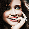
Please forgive the grainy quality of some of my .gif's... they're big images, and the quality was reduced when I saved them as .gif's. They get the main idea across, though.
Alrighty. So, for starters, pick out a black and white image. However, this is important: it is VERY DIFFICULT to colorize a small image and make it look good. It's not impossible, but it's much, much easier to colorize a larger image and then shrink it down to icon size. Trust me. I'm going to be working with this image of Alexis Bledel (which can be found on one of her popular fansites).
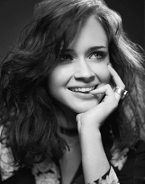
Okay. So, a lot of tutorials for colorizing will tell you to find another image of your subject where they're in the same kind of light, or from the same photoshoot, and use the Eyedropper tool to select color from the colored photo. I hate using that method... I just feel like it doesn't work very well. I prefer to select my own colors from the color palatte myself. It takes some experimentation, but I think you get a better result in the long run. Also, I see that a common theme in other tutorials is to use the "Color" blending mode. I think that Color makes the color look too bright and fake, so I prefer to use the "Overlay" blend mode for colorization. It's more muted.
So. How do we start colorizing? First, create a new layer. I like to use a different layer for every different part of the image (skin, hair, eyes/makeup, clothing, background). I usually start with skin... label your first layer "Skin Base" so that you can keep track. Set the Skin Base layer to Overlay 100%. Alexis is fairly pale and has a little bit of an orangeish undertone to her skin, so for this layer, I selected color #947a67, which is a light brown-orange color, and used a round brush to paint it wherever there was skin. Experiment with colors on the color palatte until you find something that seems to match well. Don't worry if it goes on too pale or looks too orange, pink, or brown... we're going to be creating another skin layer to even out the tone. The first skin layer is probably not going to look entirely natural.
Alright, you should have your base skin tone painted on. Create a new layer, and label it "Skin Overtone." Now, when I painted Alexis, she ended up looking too pale and too orange to be natural. So, I selected a slightly more red/pink tone to even it out a bit (#947267). I then went over her skin again in the second color (MAKE SURE YOU NOW HAVE 2 SKIN LAYERS, NOT ONE). Alright. Her skin was definitely brighter and more lifelike, but it was TOO bright. So, I faded the opacity of the Skin Overtone layer to about 46%. This gave her skin a more evened out, not-too-bright look.
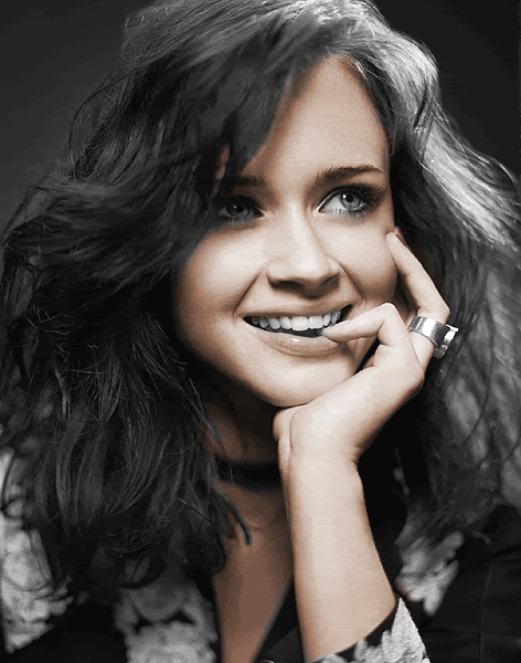
Okay, skin's done. Now let's move onto hair (create a new layer, label it "Hair," set to Overlay 100%). You can look at a colored photo of your subject for a guide to what color their hair is. Alexis' hair is a dark, dusty brown, so I played around with colors on the color palatte until I found an appropriate color (I ended up using #634e38). I painted on the hair color (don't forget eyebrows, but be careful when doing them), then thought it looked just a liiiiittle too bright, so I faded the Opacity of the layer to 75%. Next, to give the hair more life, I decided to create ANOTHER new layer, label it "Hair Highlights," and set to Overlay 100%. On this layer, I used a slightly lighter, redder brown to streak through Alexis' hair and give it highlights, which makes it look more lifelike. The highlights turned out a little too bright, so I turned down the opacity of the highlight layer to 57% (don't you love opacity?).
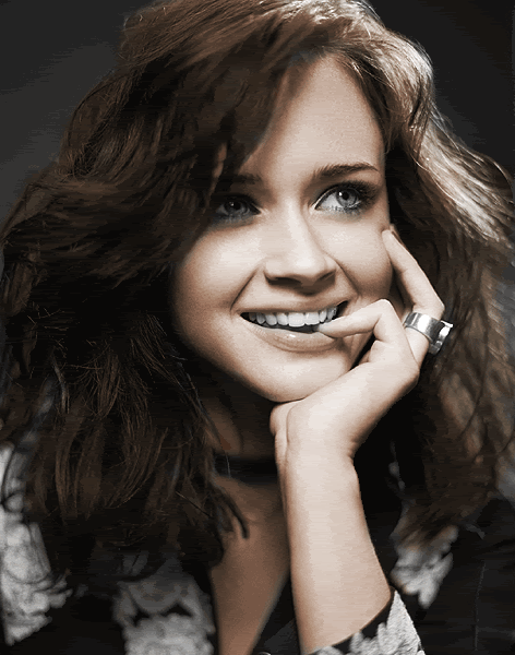
As you may have noticed by now, I'm a big fan of multiple color layers to add more dimension to the color. It works well, you should try it ;)
Next, I created another layer for her clothing (new layer, "Clothing," Overlay 100%). For black clothing in a black and white photo, I feel that using a medium-light gray on Overlay works well to make it look less washed out, so I used #626262 on the black in her jacket. For the flower accents, I used the following colors: #b08396 (pink), #83a7b0 (blue), and #95b083 (green). The hardest part with clothing and jewelry is coloring it by hand and getting into all the little nooks and crannies of the outfit, but as long as you have a steady hand and use an appropriate-sized brush, it's totally do-able (by the way, I use a soft round brush when colorizing, as opposed to a hard one). Again, the color was a little too bright to be natural, so I faded the opacity of the Clothing layer to 55%.
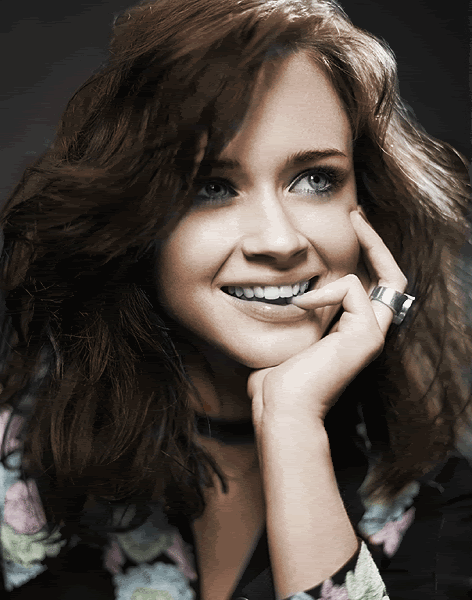
Okay. So hopefully by now, you have an idea of how this process works. All that's left now is to create 2 new layers, "Background" and "Eyes & Makeup." For the background, I used the color #99c7b9 at Overlay 70%.
Eyes and Makeup are a little bit more difficult, but with practice they become easier (it took me about 10 minutes to do eyes and makeup here). The eyes are easier... just pick an appropriate color and paint them in. I actually use two colors; a darker color and a lighter color around the pupil. For Alexis, I used the colors #608284 (base), #94b9bb (highlight). Makeup is a little trickier. If you leave your brush opacity at 100%, you subject will end up looking like a clown. So, for makeup, fade the BRUSH OPACITY (located on the top bar when you have a brush selected) to an appropriate level. For lips, depending on how bright the color, I usually set the brush opacity between 50-60%; 30-40% for cheeks/blush; and 70-100% for eye makeup/eyeshadow. For makeup, you kind of have to use your own preference and discretion. I happen to be a fan of bright makeup, so I'll often do up the eyes brighter than the rest. Here, I used an orangey-brown on her brown bone, and a light green on her lid/under her eye. Her lips and cheeks are both dusty rose-magenta colors. When it comes to applying makeup, it's handy if you can draw ;)
Lastly, to brighten up her ring, I applied #AAAAAA (a light gray) at 100% opacity.

You're done colorizing! YAY! I hope that was straightforward enough... it takes practice. It's not something you're going to get perfect on your first try, so don't be discouraged if you don't. I highly recommend experimenting, and don't be afraid to use multiple layers of color to achieve an effect you like.
These next few steps are optional, but I think they make the picture purdy ;)
Use the Blur tool to smooth and even out your subject's skin even more. Use the Dodge tool, if you please, to brighten eyes, lips, and jewelry. Use the Burn tool to draw underneath the eye ONCE to bring out eyeliner a little more.
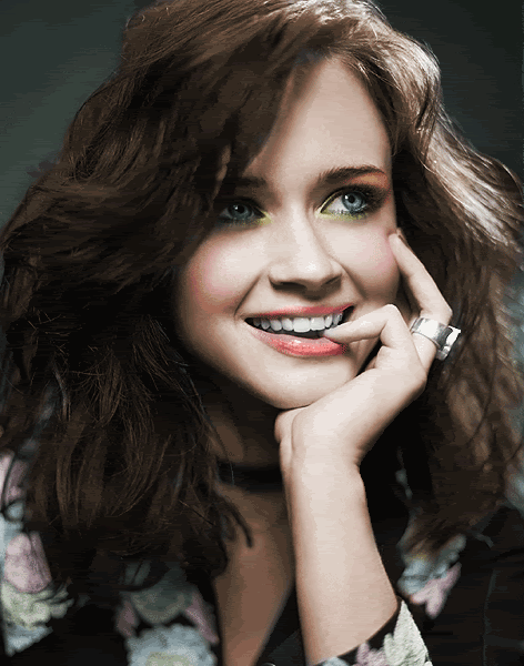
In order to make the color more vibrant, you can do one of two things: duplicate the layer and set it to Soft Light 70-80%, or duplicate the layer, apply a Guassian Blur (Filters ---> Blur ---> Guassian Blur) at 3-5 px, and set to Overlay 45-60%. I prefer the Guassian Blur method for colorizations, because it helps cover any tiny mistakes you made, and makes the subject look very smooth.
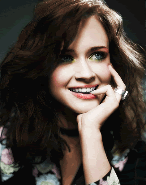
And that's it! You're done! Crop out and resize your icon, and Sharpen if you wish. :)

Go from
to
Please forgive the grainy quality of some of my .gif's... they're big images, and the quality was reduced when I saved them as .gif's. They get the main idea across, though.
Alrighty. So, for starters, pick out a black and white image. However, this is important: it is VERY DIFFICULT to colorize a small image and make it look good. It's not impossible, but it's much, much easier to colorize a larger image and then shrink it down to icon size. Trust me. I'm going to be working with this image of Alexis Bledel (which can be found on one of her popular fansites).
Okay. So, a lot of tutorials for colorizing will tell you to find another image of your subject where they're in the same kind of light, or from the same photoshoot, and use the Eyedropper tool to select color from the colored photo. I hate using that method... I just feel like it doesn't work very well. I prefer to select my own colors from the color palatte myself. It takes some experimentation, but I think you get a better result in the long run. Also, I see that a common theme in other tutorials is to use the "Color" blending mode. I think that Color makes the color look too bright and fake, so I prefer to use the "Overlay" blend mode for colorization. It's more muted.
So. How do we start colorizing? First, create a new layer. I like to use a different layer for every different part of the image (skin, hair, eyes/makeup, clothing, background). I usually start with skin... label your first layer "Skin Base" so that you can keep track. Set the Skin Base layer to Overlay 100%. Alexis is fairly pale and has a little bit of an orangeish undertone to her skin, so for this layer, I selected color #947a67, which is a light brown-orange color, and used a round brush to paint it wherever there was skin. Experiment with colors on the color palatte until you find something that seems to match well. Don't worry if it goes on too pale or looks too orange, pink, or brown... we're going to be creating another skin layer to even out the tone. The first skin layer is probably not going to look entirely natural.
Alright, you should have your base skin tone painted on. Create a new layer, and label it "Skin Overtone." Now, when I painted Alexis, she ended up looking too pale and too orange to be natural. So, I selected a slightly more red/pink tone to even it out a bit (#947267). I then went over her skin again in the second color (MAKE SURE YOU NOW HAVE 2 SKIN LAYERS, NOT ONE). Alright. Her skin was definitely brighter and more lifelike, but it was TOO bright. So, I faded the opacity of the Skin Overtone layer to about 46%. This gave her skin a more evened out, not-too-bright look.
Okay, skin's done. Now let's move onto hair (create a new layer, label it "Hair," set to Overlay 100%). You can look at a colored photo of your subject for a guide to what color their hair is. Alexis' hair is a dark, dusty brown, so I played around with colors on the color palatte until I found an appropriate color (I ended up using #634e38). I painted on the hair color (don't forget eyebrows, but be careful when doing them), then thought it looked just a liiiiittle too bright, so I faded the Opacity of the layer to 75%. Next, to give the hair more life, I decided to create ANOTHER new layer, label it "Hair Highlights," and set to Overlay 100%. On this layer, I used a slightly lighter, redder brown to streak through Alexis' hair and give it highlights, which makes it look more lifelike. The highlights turned out a little too bright, so I turned down the opacity of the highlight layer to 57% (don't you love opacity?).
As you may have noticed by now, I'm a big fan of multiple color layers to add more dimension to the color. It works well, you should try it ;)
Next, I created another layer for her clothing (new layer, "Clothing," Overlay 100%). For black clothing in a black and white photo, I feel that using a medium-light gray on Overlay works well to make it look less washed out, so I used #626262 on the black in her jacket. For the flower accents, I used the following colors: #b08396 (pink), #83a7b0 (blue), and #95b083 (green). The hardest part with clothing and jewelry is coloring it by hand and getting into all the little nooks and crannies of the outfit, but as long as you have a steady hand and use an appropriate-sized brush, it's totally do-able (by the way, I use a soft round brush when colorizing, as opposed to a hard one). Again, the color was a little too bright to be natural, so I faded the opacity of the Clothing layer to 55%.
Okay. So hopefully by now, you have an idea of how this process works. All that's left now is to create 2 new layers, "Background" and "Eyes & Makeup." For the background, I used the color #99c7b9 at Overlay 70%.
Eyes and Makeup are a little bit more difficult, but with practice they become easier (it took me about 10 minutes to do eyes and makeup here). The eyes are easier... just pick an appropriate color and paint them in. I actually use two colors; a darker color and a lighter color around the pupil. For Alexis, I used the colors #608284 (base), #94b9bb (highlight). Makeup is a little trickier. If you leave your brush opacity at 100%, you subject will end up looking like a clown. So, for makeup, fade the BRUSH OPACITY (located on the top bar when you have a brush selected) to an appropriate level. For lips, depending on how bright the color, I usually set the brush opacity between 50-60%; 30-40% for cheeks/blush; and 70-100% for eye makeup/eyeshadow. For makeup, you kind of have to use your own preference and discretion. I happen to be a fan of bright makeup, so I'll often do up the eyes brighter than the rest. Here, I used an orangey-brown on her brown bone, and a light green on her lid/under her eye. Her lips and cheeks are both dusty rose-magenta colors. When it comes to applying makeup, it's handy if you can draw ;)
Lastly, to brighten up her ring, I applied #AAAAAA (a light gray) at 100% opacity.
You're done colorizing! YAY! I hope that was straightforward enough... it takes practice. It's not something you're going to get perfect on your first try, so don't be discouraged if you don't. I highly recommend experimenting, and don't be afraid to use multiple layers of color to achieve an effect you like.
These next few steps are optional, but I think they make the picture purdy ;)
Use the Blur tool to smooth and even out your subject's skin even more. Use the Dodge tool, if you please, to brighten eyes, lips, and jewelry. Use the Burn tool to draw underneath the eye ONCE to bring out eyeliner a little more.
In order to make the color more vibrant, you can do one of two things: duplicate the layer and set it to Soft Light 70-80%, or duplicate the layer, apply a Guassian Blur (Filters ---> Blur ---> Guassian Blur) at 3-5 px, and set to Overlay 45-60%. I prefer the Guassian Blur method for colorizations, because it helps cover any tiny mistakes you made, and makes the subject look very smooth.
And that's it! You're done! Crop out and resize your icon, and Sharpen if you wish. :)